
Mrs. Agnes’s Home Tour
Mrs. Agnes’s Home Tour
Creating 'flow' in a house is the chief principle we stick by as designers, to be able to stitch all the rooms together, however mildly, when we look at it. Our latest project, for a young family of four, did just that!
When we met John and Agnes for the first time they were accompanied by their two sons. The chat was long and we got a glimpse of the whole family dynamics. John and Agnes came across as simple modest and unpretentious people and they were looking for designers who would understand their need of having the space designed to feel like home. An idyllic retreat that is stripped down of anything non-functional but at the same time had a charm.
Our only challenge was, not going overboard with our enthusiasm with this beautiful space and keeping the designs strictly simple and unassuming, yet giving it the flavour of our design philosophy. We set out with this objective in mind and were clear now that a modern Scandinavian aesthetic is what we would build for them.
Foyer
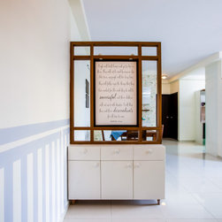
Of one thing the clients were certain of: A Bible verse, that had been an inspiring foundation of their lives together, to be the first thing that greets anyone entering their home. A beautiful verse that it is, we did not want it to just hang on the entry way wall like any other art.
We designed an entryway partition at the foyer, where this verse took centre stage and added some storage below. We strategically placed the partition in a way that it provided enough privacy to the space beyond. To further impart a cheery vibe, we decided to paint the walls in subtle blue gray strips up till the chair rail height.
A few steps into the home and you see the aura is indeed a warm one!
Living
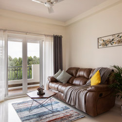
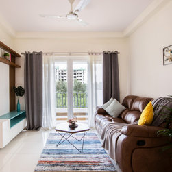
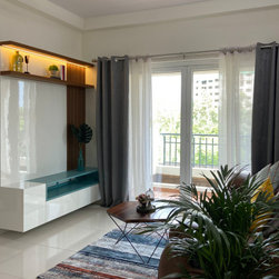
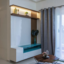
One of the foremost needs John and Agnes, and we felt, was to brighten the heck outta the entire home! A clean space that keeps the eyes moving without feeling stuffy. We stuck to the basics- a crisp TV unit in white, and a white back panel contrasted only by striking wooden rafters on one end. A tan 3-seater recliner comfortably adequate for the small family sits in the living room. A contemporary raw coffee table paired with the bright dyed carpet lends the living room a timeless vibe, while the splash of green in the form of a potted plant, only furthered boosts the sense of freedom it radiates!
Dining
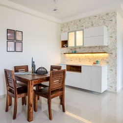
The unassuming white crockery unit and classic wood 4-seater dining ensemble make this space an extension of the living, akin in its philosophy of fluidity. The principal element here is the exquisite floral wallpaper behind the crockery unit. First, to grab eyeballs, we wanted the wall to be expressly distinct. Open and airy, the dining spot needed little else with the delicate flowers to bring out its charm!
Kitchen
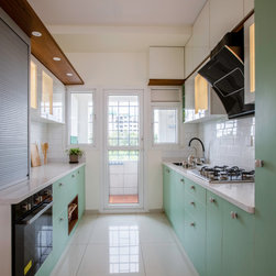
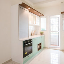
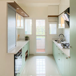
Now this space turned out to be the favourite of anyone who stepped in. We gave the client everything that they possibly thought of here. Ensuring that adding adequate storage while still making the kitchen feel spacious was one challenge we took on. We countered this problem by using light colours and making maximum use of the natural light that flowed into the space.
We avoided overhangs and handles on the loft, opting for a 38mm intrinsic wood grove dividing the shelf into loft and middle cabinets with inbuilt handles. It also transformed into a wooden ledge on the opposite shelf to maintain symmetry.
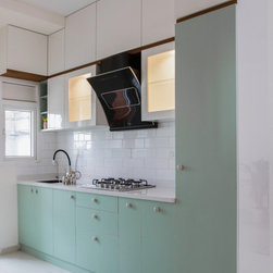
Coming to the colour palette we chose to go ahead with white and a ‘Shy’ Green. While the shutters' shy green shade intimidated the clients initially, it turned out to be the real show-stealer, giving us a Pinterest-worthy kitchen! The specially curated handles of the base and tall cabinets are white knobs with the same green running in stripes on it! We complimented the European hue of the cabinets with a stark, classy white-tiled backsplash.
Kids Bedroom:
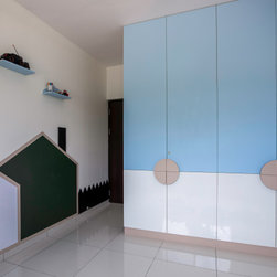
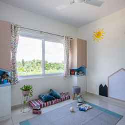
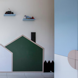
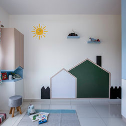
This bedroom, belonging to the adorable pair, Nathan and Ethan, is the ultimate fun and utility! Imagine getting to scribble on walls without getting into trouble for it! That's exactly what we envisaged when we fashioned what we like to call the "doodle-wall," where we used chalkboard laminate within the silhouette of a chic house, fence, and some stray clouds! Perfect design solutions! The clients were also particular about us, including storage by the window. Considering we love play, we built a niche within the shelves. Two tall towers that carry within them a house! Could we please turn into kids again? While the main wardrobe's insides still hold a roomy loft on the top and stacked shelves below, the shutters of the loft and the closet were cleverly swapped externally to break the monotony. This gave way to detached shelves below that is easily accessible to the children. When it came to the colour palette, to keep up with the rest of the home, we picked whites sprinkled with shades of delicate blues and beige around the room!
Master Bedroom:
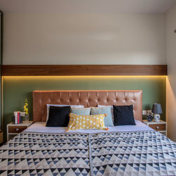
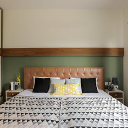
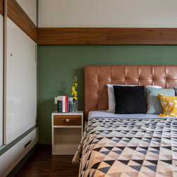
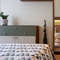
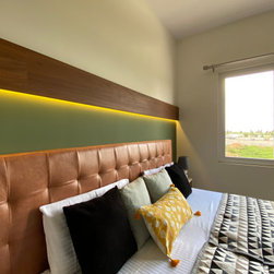
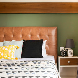
The goal for this master bedroom was to strike the perfect mix of modern yet tranquil. Starting with the hulk bed, it was customized for all four to snuggle contentedly in! Pleased as they were with a 6 feet high wardrobe, they requested an extra chest of drawers that could double up as a TV unit. We were informed the drawers would hold a collection of handbags, and we were enthusiastic about obliging! We love us clients who are particular! While the tufted tan headboard of the bed went effortlessly well with the sage green of the chest, we added some mood lighting within to make it intimate. Last to go in was the dresser, a classic. To tie the look together, we had ledges linking the dresser to the chest of drawers as well as running on the parallel wall above the bed, making the headboard more voluminous. The same area behind the bed mimics the sage green paint, rounding it off harmoniously! The end result is an open-hearted, laid-back home with a mix of chic and simplicity!
Thank You
Aniketh Bafna, Founder - U and I Designs
Sonal Mutha, Creative Head – U and I Designs
Creating 'flow' in a house is the chief principle we stick by as designers, to be able to stitch all the rooms together, however mildly, when we look at it. Our latest project, for a young family of four, did just that!
When we met John and Agnes for the first time they were accompanied by their two sons. The chat was long and we got a glimpse of the whole family dynamics. John and Agnes came across as simple modest and unpretentious people and they were looking for designers who would understand their need of having the space designed to feel like home. An idyllic retreat that is stripped down of anything non-functional but at the same time had a charm.
Our only challenge was, not going overboard with our enthusiasm with this beautiful space and keeping the designs strictly simple and unassuming, yet giving it the flavour of our design philosophy. We set out with this objective in mind and were clear now that a modern Scandinavian aesthetic is what we would build for them.
Foyer
Of one thing the clients were certain of: A Bible verse, that had been an inspiring foundation of their lives together, to be the first thing that greets anyone entering their home. A beautiful verse that it is, we did not want it to just hang on the entry way wall like any other art.
We designed an entryway partition at the foyer, where this verse took centre stage and added some storage below. We strategically placed the partition in a way that it provided enough privacy to the space beyond. To further impart a cheery vibe, we decided to paint the walls in subtle blue gray strips up till the chair rail height.
A few steps into the home and you see the aura is indeed a warm one!
Living
One of the foremost needs John and Agnes, and we felt, was to brighten the heck outta the entire home! A clean space that keeps the eyes moving without feeling stuffy. We stuck to the basics- a crisp TV unit in white, and a white back panel contrasted only by striking wooden rafters on one end. A tan 3-seater recliner comfortably adequate for the small family sits in the living room. A contemporary raw coffee table paired with the bright dyed carpet lends the living room a timeless vibe, while the splash of green in the form of a potted plant, only furthered boosts the sense of freedom it radiates!
Dining
The unassuming white crockery unit and classic wood 4-seater dining ensemble make this space an extension of the living, akin in its philosophy of fluidity. The principal element here is the exquisite floral wallpaper behind the crockery unit. First, to grab eyeballs, we wanted the wall to be expressly distinct. Open and airy, the dining spot needed little else with the delicate flowers to bring out its charm!
Kitchen
Now this space turned out to be the favourite of anyone who stepped in. We gave the client everything that they possibly thought of here. Ensuring that adding adequate storage while still making the kitchen feel spacious was one challenge we took on. We countered this problem by using light colours and making maximum use of the natural light that flowed into the space.
We avoided overhangs and handles on the loft, opting for a 38mm intrinsic wood grove dividing the shelf into loft and middle cabinets with inbuilt handles. It also transformed into a wooden ledge on the opposite shelf to maintain symmetry.
Coming to the colour palette we chose to go ahead with white and a ‘Shy’ Green. While the shutters' shy green shade intimidated the clients initially, it turned out to be the real show-stealer, giving us a Pinterest-worthy kitchen! The specially curated handles of the base and tall cabinets are white knobs with the same green running in stripes on it! We complimented the European hue of the cabinets with a stark, classy white-tiled backsplash.
Kids Bedroom:
This bedroom, belonging to the adorable pair, Nathan and Ethan, is the ultimate fun and utility! Imagine getting to scribble on walls without getting into trouble for it! That's exactly what we envisaged when we fashioned what we like to call the "doodle-wall," where we used chalkboard laminate within the silhouette of a chic house, fence, and some stray clouds! Perfect design solutions! The clients were also particular about us, including storage by the window. Considering we love play, we built a niche within the shelves. Two tall towers that carry within them a house! Could we please turn into kids again? While the main wardrobe's insides still hold a roomy loft on the top and stacked shelves below, the shutters of the loft and the closet were cleverly swapped externally to break the monotony. This gave way to detached shelves below that is easily accessible to the children. When it came to the colour palette, to keep up with the rest of the home, we picked whites sprinkled with shades of delicate blues and beige around the room!
Master Bedroom:
The goal for this master bedroom was to strike the perfect mix of modern yet tranquil. Starting with the hulk bed, it was customized for all four to snuggle contentedly in! Pleased as they were with a 6 feet high wardrobe, they requested an extra chest of drawers that could double up as a TV unit. We were informed the drawers would hold a collection of handbags, and we were enthusiastic about obliging! We love us clients who are particular! While the tufted tan headboard of the bed went effortlessly well with the sage green of the chest, we added some mood lighting within to make it intimate. Last to go in was the dresser, a classic. To tie the look together, we had ledges linking the dresser to the chest of drawers as well as running on the parallel wall above the bed, making the headboard more voluminous. The same area behind the bed mimics the sage green paint, rounding it off harmoniously! The end result is an open-hearted, laid-back home with a mix of chic and simplicity!
Thank You
Aniketh Bafna, Founder - U and I Designs
Sonal Mutha, Creative Head – U and I Designs
Project Year: 2020
Project Cost: ₹20,00,001 - ₹50,00,000