

Recent Activity
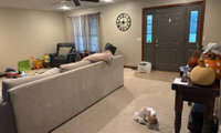

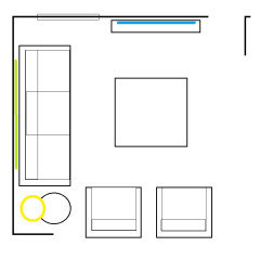
This layout might make your room feel much larger as you enter.

Why aren’t you staying within Delta if you’ve committed to their finish?

It’s over a $1,000 for a tub filler in Champagne gold
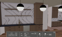

I've said this before and I'll repeat it here: if I had a client who was crowd-sourcing ideas on the internet, I would not be happy. It's bad enough when you have to deal with in-laws, friends, colleagues, et al, who give their advice on your decor. But when you have a myriad of strangers, it's quite insulting.
Unless your designer is not helping you, is not responsive to your needs and wants, then trust him or her to do what's best for you and your home. No one here knows you as well as they do. And if you feel that your designer not all you wanted, then find someone else. Or fire him or her, and ask away on Houzz.
Diana Bier Interiors states what I was thinking. If you already have a designer why are you “crowd sourcing“ here? I think adding ”character” ( however you define that ) is more than just slapping on architectural detail. Your personal belongings, art, accessories, furniture, etc. is helpful in adding ” character”.

"our builder has been helping us with the design process"

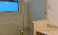
An O-1 visa is by definition, temporary work status. It’s good up to 3 years and renewable in 1 year increments until/unless permanent status is received. We don’t know your financial situation, where you’re coming from or where you’re planning to live, whether you’re already familiar with US appliances, transportation, the climate you’re moving to or other important factors related to home function and value.
I encourage you to slow down and wade into the shallow end instead of diving in head first. There can be a steep learning curve even when just traveling and remodeling is hard enough when you know exactly what you want.
Also, I don’t want to discourage you unnecessarily, but there are parts of the US where home prices have dropped because large populations of immigrants have returned to their countries of origin and simply walked away from homes, cars and jobs due to changes in immigration requirements related to employment. Unless there are compelling reasons to purchase a fixer-upper, consider renting or getting a turn key home instead.
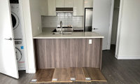
On my screen the second from the right first batch is a match. The right most of the second grouping is the lighter choice. The next step is to get a box of each to lay out for more feedback and to check pattern repeat and tone variation for no surprises. Usably returnable.
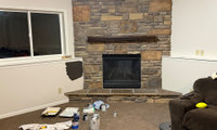
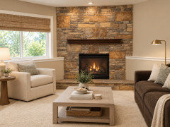
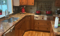
My vote is this one from DIS…and with all the money you save with not doing new counters you can really splurge on great quality lighting and hardware:
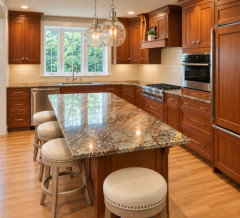
You’re trying way too hard to save a buck when you can save many and get a timeless look. And not throw perfectly nice granite into a landfill. But you do you.

Well, you’ve got more than enough suggestions already, but I’ll add mine: you can’t beat Taj Mahal, and there are still light and creamy slabs with subtle tan veining available. It would look great with your cabs and lighten everything considerably, while keeping things warm. We’ve had no etching or staining in our slabs in over 4 years, and we don’t regret spending the money. I would never mix a natural stone with quartz, however. We paired ours with Zellige tile in Weathered White on the walls, which gives a nice texture and is light w/o looking too white. Good luck.

When the bubble bursts on Taj Mahal, it is going to be staggering. It is already close to, if not already, a caricature.
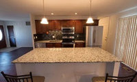
The spacing of your existing pendants are a bit far apart compared to the island. Make sure you check the size of the pendants as you will want them to be well within the footprint of the island (not up to or going over the edge of the island). You may need to reposition the junction boxes closer together so the spacing is correct.

Oh...and....I paid $15 a fixture, NIB, before tax and shipping.
I like THIS one too @ $150ea...
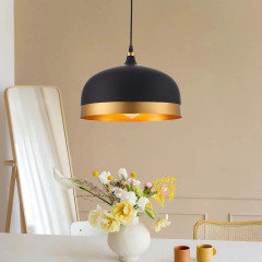

Use some painters tape and rub n buff and add that gold band yourself.

I'm not a niche fan. Too difficult to get the tile right. Complimentary shelves that drain and clean well are a much better alternative.
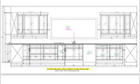
Putting stone and thick grout butting up to finished cabinet panels and painted window trim will be a forever commitment. You aren't updating the backsplash in 15 years without causing damage to other elements.
You will also need to make sure your window jambs are deep enough to allow for trim and the depth of the stone once installed.
Why so few drawers?
I would contact a good independent flooring company & ask for their suggestions. The ideal solution would be if the hardwood floors could be restored.
Can you post your existing plan? Have you had a vetted builder price it for you? The garage location is questionable if it makes it a long haul with groceries to the kitchen. Does your neighborhood support the level of work you are planning (potential resale if that’s a concern). With the work you describe it’s not just numbers of bedrooms and baths it’s the flow of the home and how it actually works that makes it successful or just a ‘hack’. It may make more sense to keep the garage side as is and adding an en-suite to the bedroom side (what were you planning for driveway work with a new garage location -that seems like a lot of dollars not wisely spent). But seeing the whole plan would help.

Do NOT add a shower to a powder room. It morphs to bathroom, and a mental mind wah wah of how to hide the bathing.: ( Drives me insane when a builder does it next to "flex space" .Commit, and its one or the other.
We can only guess. We need ato scale plan of the house as it sits now , then one with the addition added . Garage conversions are of expensive becuase the garage is not living space as it is and adding bathrooms are also pricey . Where I live the garage will need to be ripped down and so really an addition is what you are doing.. Also codes in your area decide if this additional space is allowed . So a bit more info and those plans are a must for help here.
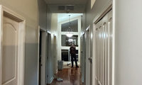

Remove both. Neither mirror reflects anything worth looking at. If you want more light, improve the lighting.

End it where the uppers end, that's what my very experienced tilesetter recommends.
And I wouldn't install the tile vertically. They look to be 2x8 tiles, which is going to be awkward if the space between the upper cabinets and the counter is the standard 18". You'll have little cuts left over at the top, which are going to look bad.
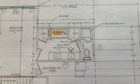
As I commmented earlier up stream, "There is enough wrong about this bathroom design that . . . " I do not feel confident that the rest of the house's design is good and the OP should be open to starting over with a local competent design professional. That being said, in the vacuum the bathroom is presented I offer this concept.
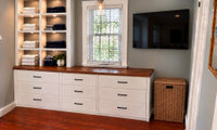
Of the two pendant lights that you show, I like this one the best. It’s a nice choice.
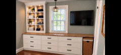
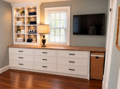
To tell you the truth, though - I, too, am having a hard time wrapping my head around the pendant light idea. I think it does look a bit kitchen-like. I agree that a table lamp there might give you nice light, as well as a nice look. So, it’s another option for you.
If you didn’t have an available outlet, there are battery operated lamps, also.
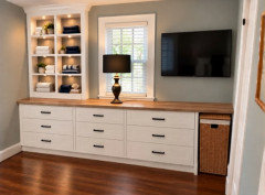
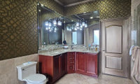
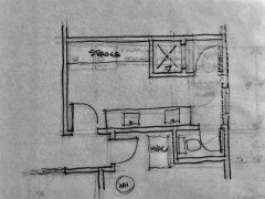
This all comes down to the inches you have. What is the overall length of each leg? Try using blue tape and layout over your current mirror 2 scenarios based on actual product you find - select a medicine cabinet (you need the storage) and a mirror (the mirror would assume a corner tower because again you need the storage). I personally don’t like corner towers for what they do in terms of compartmentalizing your 2 sides. It will make each side feel smaller. Open shelves just look cluttered but you will find that by going with 2 smaller mirrors or medicine cabinets that the corner will feel ‘bare’. Emily’s image shows a large floral arrangement to try to counter this but is that something you would actually do? Try the blue tape to get a feel for it. Jehanz you haven’t mentioned if you are open to going down to one sink? You’ve ruled this out? This bathroom I worked on years ago had a limited footprint so the client went with a trough type sink with 2 faucets and a large medicine cabinet. However, this overall length was about 58-60”. Again, it all comes down to the inches you have. Try the blue tape which will help you visualize it.
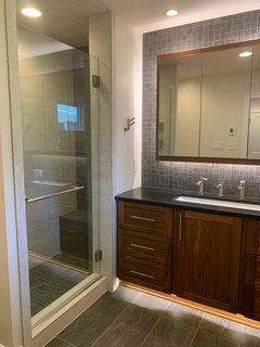
Note: The above scenario was custom (in order to make that particular sink work with maximized drawer space). Also, this particular client could not do sconces or lighted mirrors due to eye issues so the custom solution was to hide tape light behind a custom wood frame detail surrounding the triple medicine cabinet. Since the vanity was sandwiched between 2 walls one would never see the sides….I’m not suggesting this medicine cabinet / light detail for you - just to show you that you could significantly increase your storage and maybe still have 2 faucets if you think outside the box of what you currently have.

Center the mirrors and lights on the sinks, not on the wall — and because this is a full reno, right now is the cheapest chance you will ever get to fix those off-center lights. While the walls are open, moving each light box to its sink's centerline is a small job; after tile and paint it becomes a patch-and-repaint job.
On your specific questions:
- Keep the sinks centered on their base cabinets, as you suspected. The doors/drawers and the drain all line up that way, so the mirrors and lights should move to the sinks, not the other way around.
- One mirror or medicine cabinet per sink, centered on that faucet, works better than one long mirror here — especially on a corner layout like yours, where each sink sits on its own leg. A mirror a few inches narrower than the sink base below it, with a few inches of clearance above the backsplash, looks intentional and is easier to hang plumb.
- Given the tight side by the door, a light fixture centered over each mirror is the practical choice. Sconces light faces more evenly, but each one needs wall room on both sides of the mirror that you do not have on that side.
- A lit mirror or lighted medicine cabinet is a good fit for this layout, with one planning catch: each one needs power behind it, and a recessed cabinet needs the wall opened/framed to its depth. Decide before the walls close and have the electrician set a box behind each sink location — it is a five-minute conversation now and a wall repair later.
- Keep your recessed ceiling lights as general lighting, but let the mirror lights do the face lighting, ideally on their own dimmer. Ceiling light alone is what creates the harsh shadows at a vanity.
- One demo note: large glued-on mirrors like your current one come off in pieces. Have whoever removes it tape the face first and work it loose gradually so the drywall behind it survives — or plan on a skim coat before the new mirrors go up.
This is great, thank you @Theodore Cohen
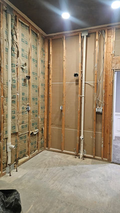
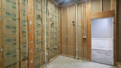
Here are updated photos after demo. I will be able to move the light fixtures, but probably can not do the recessed medicine cabinet mirrors.
Will also be changes the triple switch to a smaller 3 rocker combo switch to save space for a mirror.
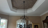
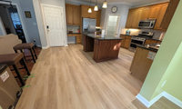

I like the green that Emily has selected in her rendition but will suggest that you also paint the island the same color as the rest of the cabinetry. That will help eliminate the difference between cabinetry and flooring altogether.
Emily’s AI image removed the cherry toned wood floors in the adjacent area. I think it’s going to look like 2 different homes unless you either continue the same flooring like Emily’s image or you keep some cherry toned wood in the kitchen. Either way, it’s not ideal to have fake wood floor right next to real wood.
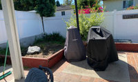
I have sprinklers running through there also that need capping
thank you.. what about 40 inch
That works as well!
I think your bathroom turned out very nice! May I suggest one small easy to do tweak? Your baseboard and door trim white is very bright white compared to the off white vanities. You could either match the vanity color or better yet paint the base and trim to match the wall color. It would really elevate the look!
Yes I can see that in the pictures. Technically, the trim and cabinets are supposed to be the same colour but cabinet paint I find never quite looks the same. I think the difference is more pronounced in the pictures but I will definitely consider painting the trim the same as the wall colour. Thank you for your suggestion!