
Park Avenue Lobby Renovation
INTRODUCTION
This project consists of the redesign of the lobby at 1035 Park Avenue, a 15-story apartment building designed by Henry Pelton in 1925 and developed by the Park Avenue Methodist Episcopal Church also designed by Pelton and is still standing today on East 86th street.
The building’s façade is composed of a three-story base above which rises the main building mass: the brick walls are enlivened by limestone quoins and other limestone trim and the Park Avenue entrance is framed by a three-story limestone Renaissance Revival design, whose light color contrast with the darker brick wall.
Our goal was to design spaces that would be compatible with the building’s style and materials and provide an appropriate transition between the public and the domestic realm. The design had to meet a limited budget and address the existing spaces’ small size and low ceilings.
EXISTING CONDITION
The small (8’0” x 9’0”) vestibule entered directly from the street was visually cluttered by a bulky bench/radiator enclosure and a blocky doorman desk with storage underneath. The 17’-0” x 14’-0” lobby itself had an 8 feet high flat plaster ceiling, and an originally free-standing structural column had been conjoined to the north wall in order to create a closet which made the lobby seem even smaller.
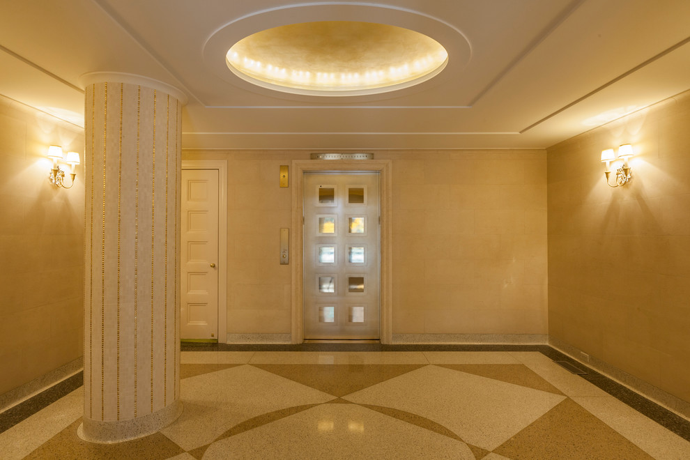
THE DESIGN
The new design is in sympathy with the building’s architecture but in a pared down style. We limited our palette of materials to those existing in the building (terrazzo for the floor, limestone for the walls, bronze for accents) and we choreographed the spatial progression with visual cues using gold colors such as the new bronze doorman desk, the recessed gold leafed ceiling cove and the new bronze paneled elevator door: these eye catchers play against the neutral limestone perimeter walls. The key decision was to make the structural column free standing and cylindrical: this allowed the space to breathe. Gold tile fluting adds delicacy to the cylinder.
The 1980s ceiling was flat, dull and oppressive: we created a series of borders and established a center focus with a new, gold leafed, oval ceiling cove. In order to get enough height for the cove because it is under a major steel beam we lowered the whole ceiling by one inch, but the visual relief of the lighted cove and subtle articulation of the ceiling borders succeed in making the space seem higher.
The new terrazzo floor creates a sense of scale and movement through a large-scale pattern with a center oval, matching the lighted cove above, intersected by diagonal lines.
The plasterboard walls lacked the architectural quality appropriate to a public or semi-public space: we clad them in over-scaled (12”x24”) limestone slabs that meet the ceiling with a cavetto. The cavetto visually extends the walls’ height and gives them weight and thickness.
The vestibule was cluttered by the bulky doorman desk. The new, minimal, wall mounted bronze desk is now one of the important spatial cues of the new design, which are:
• The new bronze doorman’s desk
• The gold leaf ceiling cove
• The new bronze elevator door (one’s destination after all!), whose design echoes the paneled design of the historic doors of the church
CONCLUSION
The design aims to get all the details right and to create an understated, coherent, whole. While the previous treatment of the space offered no connection to the building’s architecture, the new design with its use of materials in a restrained classical mode is an appropriate spatial and stylistic statement.
photo by Henrik Olund
Park Ave Llobby