Wondering How to Pick the Right Blue Paint?
Periwinkle, turquoise, midnight or sky .... here's help choosing the blue for you

Many people say blue is their favourite colour. In order to appreciate blue’s popularity, you must understand what this colour signifies to most people: Dependability, honour, renewal, stability. Combine these meanings with how blue typically makes one feel –refreshed, tranquil, serene – and you have a colour that hits the mark in terms of its benefits. Although blue can be a great hue for your home, certain blues (or too much of them) can feel depressing. On the other hand, vibrant blues can be too stimulating. To avoid both, I’m sharing a few tips to help you select the best blue for you.
Turquoise blue
Turquoise has remained a popular trend colour for several years now. It’s a warm, ocean blue heavily influenced by green. Lighter tones of turquoise are perfect for the bedroom. They are serene and relaxing and pair well with a host of other hues.
Here’s how to work with turquoise
Turquoise has remained a popular trend colour for several years now. It’s a warm, ocean blue heavily influenced by green. Lighter tones of turquoise are perfect for the bedroom. They are serene and relaxing and pair well with a host of other hues.
Here’s how to work with turquoise
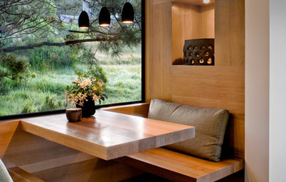
Pale blue
If you’re leaning towards white walls but you love blue, try a pale blue tint. This is a very Zen-like colour that will not overwhelm your space, and it will make your white trim and furnishings look even more brilliant.
If you’re leaning towards white walls but you love blue, try a pale blue tint. This is a very Zen-like colour that will not overwhelm your space, and it will make your white trim and furnishings look even more brilliant.
Cool blue
Many people equate the colour red with an Asian-inspired space. However, a cool muted blue also makes a great choice for this type of theme. Blue (and green) symbolises renewal and immortality in China. What a terrific colour to serve as a backdrop for blue and white porcelain ware. I also love using this “mature” shade of blue for teen boys’ rooms!
Check out these personality-filled rooms for teen boys
Grey blue
Deep greyish blues work very well in contemporary spaces. This is a nice alternative to pure greys, which can sometimes look dull. You may find that just painting one accent wall with this colour is enough to add dimension to your room without making it feel closed in.
Deep greyish blues work very well in contemporary spaces. This is a nice alternative to pure greys, which can sometimes look dull. You may find that just painting one accent wall with this colour is enough to add dimension to your room without making it feel closed in.
Silver blue
Lighter silvery blues make an interesting neutral colour. These tones work very much like beiges and tans because you can bring in any other colour to the space and make it work. These lighter blues won’t limit you, but they do bring a cool feeling to a space.
Lighter silvery blues make an interesting neutral colour. These tones work very much like beiges and tans because you can bring in any other colour to the space and make it work. These lighter blues won’t limit you, but they do bring a cool feeling to a space.
Periwinkle blue
Periwinkle is a lighthearted blue. With its purple undertones, periwinkle is lively and somewhat playful. In certain lighting conditions, this colour can look more purple than blue, and this could change throughout the day. Periwinkle is perfect for a casual space and perfectly unexpected for a more formal room.
See how to mesmerise with colourful tiles in the bathroom
Aquamarine
Aquamarine is a softer version of turquoise, but as the name indicates, it has a watery, ocean-like feel. This colour is ideal for bathrooms but also makes a surprisingly cool colour for a family room.
Aquamarine is a softer version of turquoise, but as the name indicates, it has a watery, ocean-like feel. This colour is ideal for bathrooms but also makes a surprisingly cool colour for a family room.
Teal blue
To add drama to your space, go for the deeper bold blues. Teal is a deep shade of turquoise that will truly make a statement in any room.
To add drama to your space, go for the deeper bold blues. Teal is a deep shade of turquoise that will truly make a statement in any room.
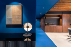
Midnight blue
Another bold and beautiful blue is midnight blue, such as the one used in this photo from Ten June. Darker than cobalt, navy and royal blue, this colour is probably the deepest of blues. You’ll need colour courage with this one, but if you use midnight blue along with white or light colours, you can achieve amazing results.
Read more:
Surprising Ways to Use Blue in Your Home
Tell us:
Which shade of blue has your heart and how have you used it around your house? Share images and your ideas in the Comments below.

I think the most beautiful blues are the ones that mimic a clear blue sky at midday. You know – a sky with no clouds and no haze … just endless blue. This colour is very saturated but not jarring. This type of blue is vivid so it does bring energy to a room, but because it mimics the sky (and sea) this blue is very delightful and easy on the eyes.