What Colour Curtains Go With Cream Walls?
Here are exciting and surprising curtain colours that match cream walls

Cream is a versatile and compatible hue – it easily embraces most colours. If you have a cream-coloured living room and are wondering which curtains will best pair with the walls, this picture book might help you make up your mind. Do take notes, as I did, too.
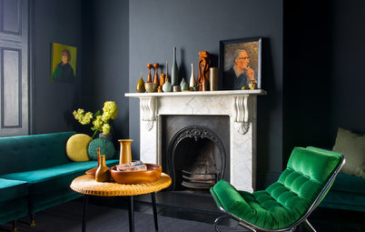
Green
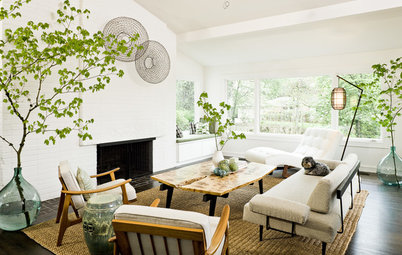
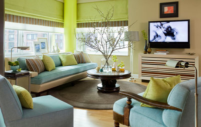
The long green curtains look pleasing and bright against the cream walls, Hung in the windows, the curtain’s outdoorsy effect gets pronounced, and it injects a nature-inspired look. Here, too, a chair in the same shade of green ties in the colour scheme with rest of the room.
The long green curtains look pleasing and bright against the cream walls, Hung in the windows, the curtain’s outdoorsy effect gets pronounced, and it injects a nature-inspired look. Here, too, a chair in the same shade of green ties in the colour scheme with rest of the room.
White
The idea of using white curtains with cream walls seems counter-intuitive. However, looking at this space, I’m convinced otherwise. I like how the two neutral shades create a layering effect, enhancing the pristine clean and crisp look of the interior even more.
Find an interior designer to design your home
Grey
A hue from the neutral family, grey can add depth to a room. Here grey curtains on cream-coloured walls do just that – creating a smart, sophisticated looking space.
A hue from the neutral family, grey can add depth to a room. Here grey curtains on cream-coloured walls do just that – creating a smart, sophisticated looking space.
Orange
Looking at this image, the visual of mango sorbet and cream comes to mind. Look how the flowing orange curtains contrast with the cream walls and create an eye-catching combination.
Looking at this image, the visual of mango sorbet and cream comes to mind. Look how the flowing orange curtains contrast with the cream walls and create an eye-catching combination.
Red
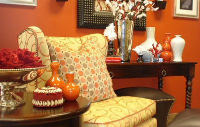
Moving on to darker hues, can there be a colour sharper and bolder than red? This is a great combination – wine-red curtains for cream-coloured walls. Usually bright colours are not paired with cream, but see how in this interior the predominating cream is cleverly punctuated with burgundy, creating a smart, sophisticated scheme.
Moving on to darker hues, can there be a colour sharper and bolder than red? This is a great combination – wine-red curtains for cream-coloured walls. Usually bright colours are not paired with cream, but see how in this interior the predominating cream is cleverly punctuated with burgundy, creating a smart, sophisticated scheme.
Yellow
We all know that bright, cheerful hues get even more enhanced when paired with neutral colours. This bedroom gets a slice of sunshine with the colour combination, where mild cream walls meet vibrant yellow curtains and blind.
See how these spaces light up with yellow
We all know that bright, cheerful hues get even more enhanced when paired with neutral colours. This bedroom gets a slice of sunshine with the colour combination, where mild cream walls meet vibrant yellow curtains and blind.
See how these spaces light up with yellow
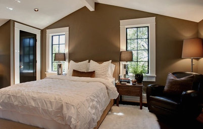
Brown
The espresso-hued brown curtains add a large dollop of deep colour to the untouched cream walls, creating a striking contrast. The cinnamon-brown sofas add another layer to the brown-and-cream palette of the room, all tied together by the carpet. The result is a sense of spaciousness (from the walls) and warmth (from the browns).
Here’s how to work with the colour brown
Two shades
Instead of using a single colour on the curtains, this interior uses the magic of two – one complementing, one contrasting. The cream upper half of the curtains merges with the walls, while the lower half injects a cool, pleasing shade of blue-grey into the room.
Read more:
A Guide to Choosing Curtains
Tell us:
Do you have cream walls at home? How have you decorated around it? Share images and your thoughts in Comments below.
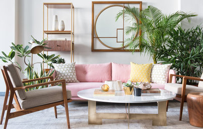
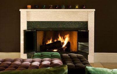
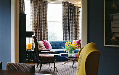
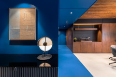
Those who enjoy the clean, soft look of cream walls can add subtle-hued curtains that don’t stray too far from the same neutral theme while still injecting a hint of contrast. See how the blue adds just the lightest touch of colour inside this cream shell, and shares the same tint as the armchair.