Pick the Right Color Palette to Showcase Your Art
Set your artwork off to its best advantage with the ideal background colors throughout your home

You've finally found that perfect piece of art you've been looking for — now what? Artwork is such an important part of a decorating scheme. Because your art can be anything from an investment piece to a work of personal value, it's essential to integrate your pieces with the right colors. A Houzz user recently faced this very dilemma: How do you use color to highlight your art? If you're feeling stuck too, consider some of the following tips to give your artwork its well-deserved spotlight.
1. Similar hues. Choose a wall color that is similar to the background of your artwork. This deep purple wall is a similar color to the background of this piece, creating cohesion and flow.
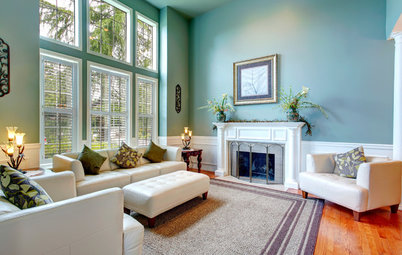
2. Complementary shades. Reference the good old color wheel and choose complementary shades for your walls. This abstract with tones of yellow and orange sings against bold turquoise walls.
An abstract with bold oranges comes alive against this purple wall.
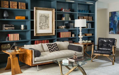
3. Same color, different shades. Consider using colors from the painting, only in different shades. This painting has a pretty simple color scheme; pairing it with a deeper shade of blue on the walls creates visual interest.
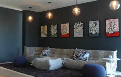
This red, yellow and orange piece steals the scene against a series of walls in the same colors.
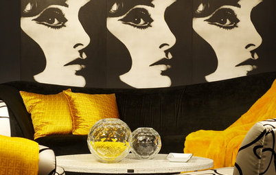
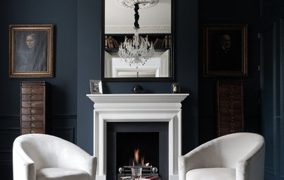
4. Stick to specific palettes. Certain pieces work really well with certain types of colors. If you want to make a series of black and white photographs feel powerful, pair them with dramatic red walls for an enticing impact.
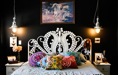
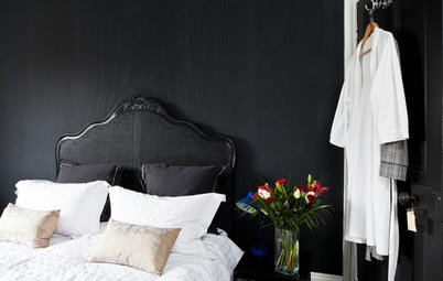
Bright or neon pieces stand out against deep black or gray walls. If you’re wary of painting an entire space such a dark color, just paint a single accent wall where the artwork is hanging.
Bright pieces with brown undertones take center stage against deep brown walls.
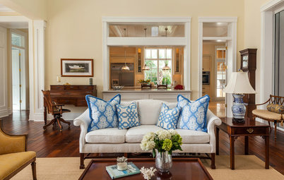
5. Keep it neutral. Sometimes neutral walls are the best way give your artwork the attention it deserves. Without any color competing behind it, this artwork becomes a focal point.
This piece evokes a quiet, tranquil moment on the water. That feeling is exaggerated against simple white walls that allow the photograph to do the talking.
The subtle beauty of these paintings is conveyed best against quiet, neutral walls.
6. Play with furniture and accessories. Your wall color isn’t the only thing that can help your artwork stand out. Creating a balance between the colors of the artwork and the furniture in the room will help the artwork become more of a presence.
Even though it's hanging all the way across the room, the pink artwork feels like a part of the scheme with a chair in the same color.
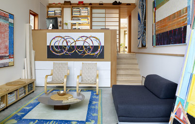
Pull the color of your art palette into accessories or accent pieces too. These rugs pull the red from the paintings down to the floor.
More:
10 Design Strategies for Art Lovers
More:
10 Design Strategies for Art Lovers