
How to Mix Patterns Like a Professional
See which combinations of stripes, geometrics, florals and more work best to give a personality boost to your rooms
tidgboutique
18 November 2019
Toronto Interior Design Group is a trusted one-stop-shop residential interior design concierge boutique-style firm crafting timeless interiors.
Toronto Interior Design Group is a trusted one-stop-shop residential interior design... More
Introducing a new pattern to a space adds a lot of life, energy and personality in a way a solid colour rarely can. But why restrict yourself to playing with just one pattern? Combining two or more may seem daunting, but if you follow some of these formulas, you’ll be mixing and matching like a pro in no time.
First, to make it easier to understand how different patterns relate, let’s identify four major categories of patterns. In reality, patterns are endless in number, but when it comes to mixing different types, we’ll start by looking at the main ones.
1. Stripes
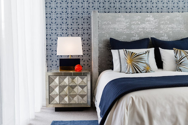
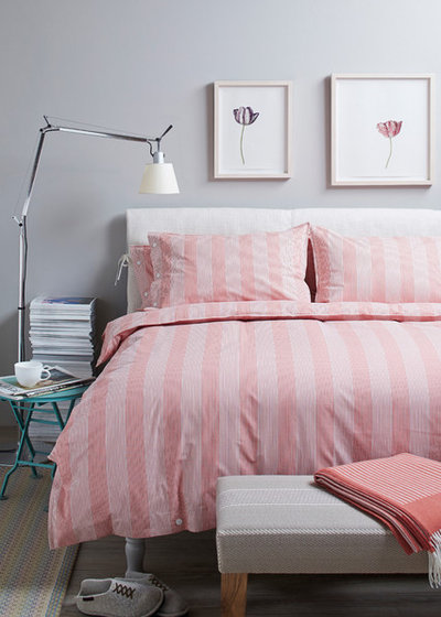
Classic navy-and-white or black-and-white stripes are the most classic and timeless, but you can use stripes to add bright colours as well. In a tone-on-tone effect like this pink bedding, the hue is actually softer and less dramatic than when used as a solid.
Either way, stripes work beautifully with other stripes or with completely different patterns.
Some designers also consider polka dots to be in the category of neutral patterns, with a repeating shape so simple that it reads as more of a texture. The round lines add an extra sense of softness, which can feel a bit feminine or romantic and make a space welcoming.
Foolproof plan 1: Dots and stripes
Mix a few different sizes of stripes, and maybe a polka dot too, and you’ve got a hard-to-go-wrong scheme with plenty of personality and energy.
Mix a few different sizes of stripes, and maybe a polka dot too, and you’ve got a hard-to-go-wrong scheme with plenty of personality and energy.
2. Geometrics
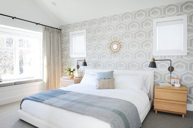
A geometric pattern is made of repeating forms that are usually very simple and linear, often using basic shapes like triangles, squares and circles. Technically, stripes are a geometric pattern, but in interior design a true geometric is one notch more complex than that, such as this wallpaper with its repeating hexagons.
A geometric pattern is made of repeating forms that are usually very simple and linear, often using basic shapes like triangles, squares and circles. Technically, stripes are a geometric pattern, but in interior design a true geometric is one notch more complex than that, such as this wallpaper with its repeating hexagons.
Geometrics can be much more complex than a simple repeating shape, however. This room shows a simple striped rug, a chevron pillow and richly patterned side chairs: All are geometric, using simple angular lines, but the degree of complexity varies greatly.
Using just angular geometrics, with no curves, is one of the easiest ways to mix multiple patterns without worry.
Using just angular geometrics, with no curves, is one of the easiest ways to mix multiple patterns without worry.
Foolproof plan 2: Same-scale geometrics
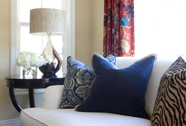
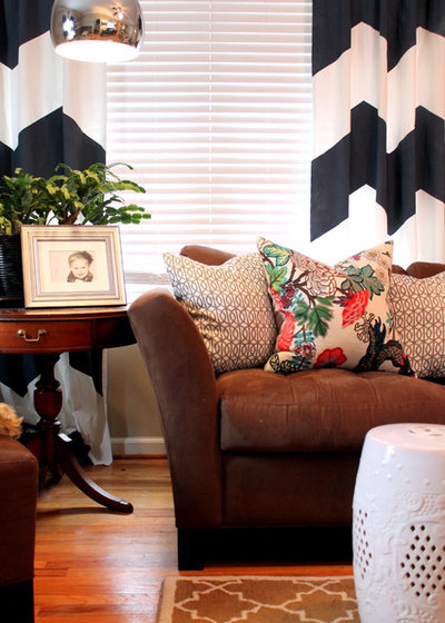
Another easy way to mix multiple geometric patterns is to choose patterns with a similar thickness to the lines. These pillows use very different patterns, but they all contain thin lines at approximately the same scale. A single pillow in a chunky pattern might look out of place, but since they all share a similar line weight they look coordinated.
Another easy way to mix multiple geometric patterns is to choose patterns with a similar thickness to the lines. These pillows use very different patterns, but they all contain thin lines at approximately the same scale. A single pillow in a chunky pattern might look out of place, but since they all share a similar line weight they look coordinated.
3. Florals
Florals are essentially the complete opposite of stripes: They feature complex, curving lines in patterns that feel natural and wild.
Florals are essentially the complete opposite of stripes: They feature complex, curving lines in patterns that feel natural and wild.
Botanical prints also include leafy patterns that don’t feature blossoms but have a similar organic nature, and, just as in nature, these differing prints tend to mesh together easily (as long as their lush color palettes coordinate).
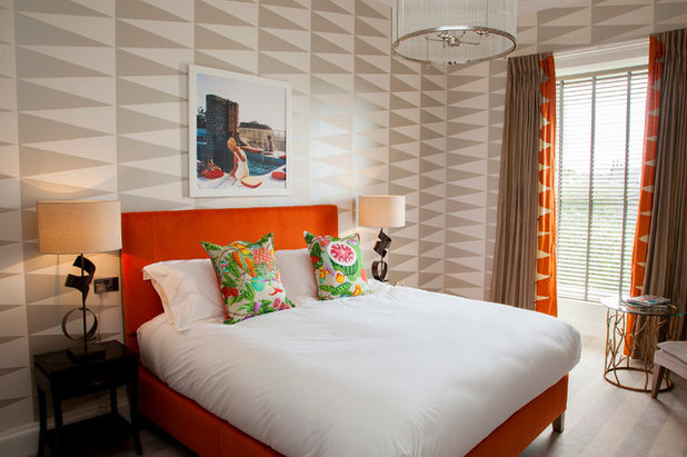
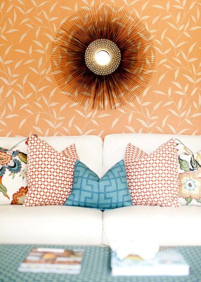
Foolproof plan 3: Sharp angles with bold florals
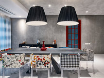
Opposites attract. Combine a neutral, angular geometric featuring triangles (or basic stripes) and let a pop of colour against the sharp lines.
Find an interior designer to help design your living room
Opposites attract. Combine a neutral, angular geometric featuring triangles (or basic stripes) and let a pop of colour against the sharp lines.
Find an interior designer to help design your living room
4. Organics
There are lots of other organic patterns that take inspiration from nature or feature motifs or images that are non-geometric. Animal prints fall under this category, as well as natural textures like marbling or strié (which looks a bit like wood grain, but in fabric or paper).
A zebra stripe, being essentially just a variation on a basic black-and-white stripe, is a great element to toss into any design (in a small dose) to add a little organic drama.
This is where things start to get a bit complicated, since there are many patterns that can sit in a grey area between geometric and organic, such as ikat patterns or tribal-inspired prints, which feature somewhat geometric-looking repeating lines but with an organic rawness.
Luckily, there are other aspects of a pattern we can look at to guide us in how to mix and match.
Luckily, there are other aspects of a pattern we can look at to guide us in how to mix and match.
Foolproof plan 4: Black and white
It’s about as classic as they come: Mixing several patterns in strict black and white virtually always works, even if the scales and styles are different. To play it extra safe, keep all the patterns at least 50 percent white so you don’t accidentally overdo the black, unless you’re going for a gothic look.
It’s about as classic as they come: Mixing several patterns in strict black and white virtually always works, even if the scales and styles are different. To play it extra safe, keep all the patterns at least 50 percent white so you don’t accidentally overdo the black, unless you’re going for a gothic look.
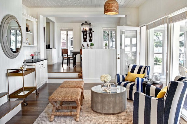
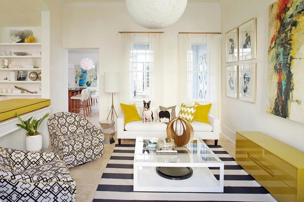
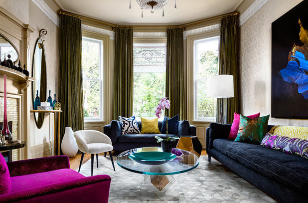
Scale
The size of a pattern can be at least as important as its style. A very small pattern can easily be missed from a distance, while a bold pattern will command attention even from across the room.
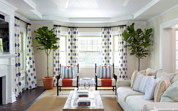
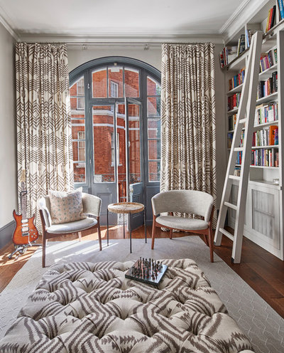
Mixing scales of patterns can be tricky, though not if you take one of these two approaches: going all different or all the same. This room uses the former approach, with a large-scale stripe on the chairs and a much-smaller-scale pattern on the rug. The chairs are clearly able to dominate, and the contrast of the almost textural rug pattern looks intentional.
The size of a pattern can be at least as important as its style. A very small pattern can easily be missed from a distance, while a bold pattern will command attention even from across the room.
Mixing scales of patterns can be tricky, though not if you take one of these two approaches: going all different or all the same. This room uses the former approach, with a large-scale stripe on the chairs and a much-smaller-scale pattern on the rug. The chairs are clearly able to dominate, and the contrast of the almost textural rug pattern looks intentional.
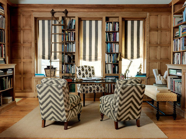
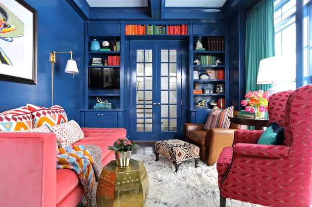
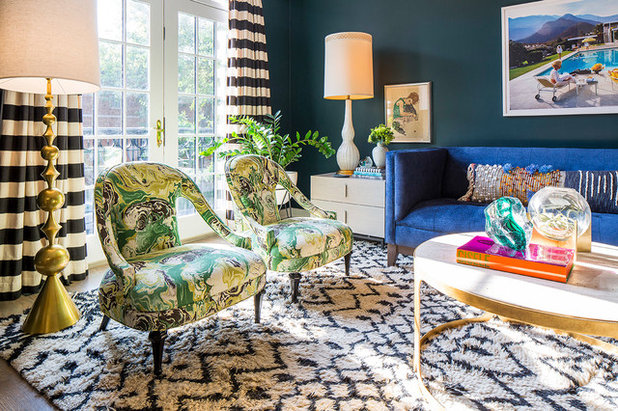
This room uses three patterns at the same scale: one stripe, one chevron and one more organic pattern. They all appear to be the same “size,” with the linear stripes and chevrons at about the same spacing as the objects in the more complex print. The science isn’t exact, but to a casual glance no one pattern sticks out as being much larger or smaller than the others.
Naturally, it also helps that these differing fabrics are in roughly the same color scheme as well. Combining differing strategies for mixing patterns definitely helps get a great result.
Naturally, it also helps that these differing fabrics are in roughly the same color scheme as well. Combining differing strategies for mixing patterns definitely helps get a great result.
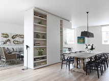
Ways to mix a lot of pattern
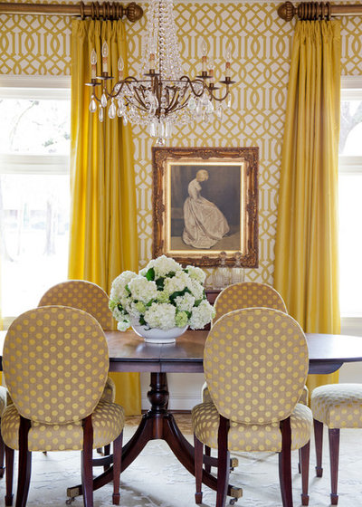
Traditional rugs. Rugs in rich, traditional patterns are a bit like stripes in that they can almost be treated like a neutral with no pattern at all. Their fine, intricate designs and rich, sophisticated colours make them easy to mix with other patterns that are either more subtle, more bold or both.
Traditional rugs. Rugs in rich, traditional patterns are a bit like stripes in that they can almost be treated like a neutral with no pattern at all. Their fine, intricate designs and rich, sophisticated colours make them easy to mix with other patterns that are either more subtle, more bold or both.
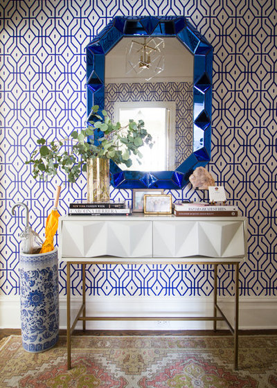
Traditional motifs
Like a traditional rug, other delicate, timeless patterns such as toile and fine china prints can be easily tossed into a space and contrasted against other traditional elements or much more contemporary designs.
This room feels rich and sumptuous partly because it includes three diverse patterns, but to the casual glance, only the geometric wall treatment feels like a true pattern. The traditional umbrella stand and rug appear much less graphic, blending in perfectly yet holding their own.
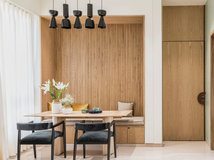
Chevron
Chevron is a classic for a reason: This simple pattern is just one notch more bold than a classic stripe, meaning it’s still easy to mix with nearly anything, but it also gives a real sense of dynamic energy because of its many diagonal lines.
Foolproof plan 5: The powerful trio
Here’s a potent recipe: Mix a chevron or plain stripe with a smaller geometric and a cheerful floral to achieve an easy yet dramatic look.
Other approaches
The 60-30-10 approach
This is a great ratio for mixing two or more major patterns with a small accent. Choose a major pattern to dominate the space and let that be about 60 percent of the visible pattern, such as this large area rug. Then choose a second, coordinating pattern to be 30 percent, like these striped drapes. Lastly, let just about 10 percent be a bold, contrasting choice, such as these marbled fabric chairs, or try a mix of pillows.
The math doesn’t need to be exact, but if you clearly have a structure of dominant and non-dominant patterns, the whole set can be bold yet coherent.
This balance can often be achieved by repeating one pattern in multiple places, such as in this room, which features the same fabric on the ottoman and drapery. A second pattern is found in the subtle rug, and then a single pillow gives a touch of a third pattern.
Keep in mind, the pattern you’re seeing the most of shouldn’t be so bold that it becomes overwhelming when you use that much of it. The more you plan to use, the less intense the main pattern should be.
Keep in mind, the pattern you’re seeing the most of shouldn’t be so bold that it becomes overwhelming when you use that much of it. The more you plan to use, the less intense the main pattern should be.

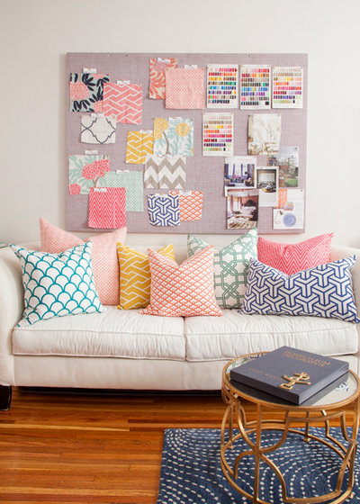
The pillow approach
Rather than picking a dominant pattern, you can take the opposite route and let all of the patterns be equally small accents. This is most often seen in mixed pillow collections where no two are alike. By using just a small dash of each pattern, you make sure than no single pattern stands out. This approach is fairly easy because you can add and subtract accessories over time, with low commitment. Just be sure to include a few solids, and choose patterns from distinctly different categories.
Rather than picking a dominant pattern, you can take the opposite route and let all of the patterns be equally small accents. This is most often seen in mixed pillow collections where no two are alike. By using just a small dash of each pattern, you make sure than no single pattern stands out. This approach is fairly easy because you can add and subtract accessories over time, with low commitment. Just be sure to include a few solids, and choose patterns from distinctly different categories.
Feel ready to go pro status? You can combine the last two approaches to mix a ton of pattern and keep it all balanced. In this space, about 60 percent of the pattern is in the subtle wall treatment, with 30 percent in the geometric rug and 10 percent spread between the eclectic, mismatched pillows.
If that seems like too much for you, just stick to a simpler technique. However, keep in mind that items like pillows are easy to move between rooms (or return to the store) if you find the look isn’t quite adding up. Play with it until it feels just right, and trust your own eye.
Read more:
Add Depth to Your Decor With Geometric Patterns
5 Patterns That Will Make You Go OMG
Tell us:
Tell us your success story of mixing patterns.
What are you working on?

Related Stories
Working with professionals
Busted! 5 Myths About Working With an Interior Designer
By Tanya Khanna
We put to bed the biggest misconceptions about working with design professionals
Full Story
Working with professionals
Can Hiring an Interior Designer Save You Money?
We dispel the biggest misconception that working with an interior designer will drive up the cost of the project
Full Story
Working with professionals
What Are the Benefits of Hiring an Interior Designer?
From furnishing working drawings to beautifying the home, find out how an interior designer plays multifunctional roles
Full Story
More Room Guides
Turn One Room Into Two With These Genius Ideas
Carve out an extra room within your home with these fab room-splitting tips and tricks
Full Story
Bedroom Guides
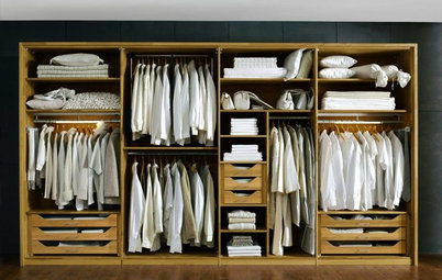
What Are the Ideal Wardrobe Measurements?
Here are dimensions for different types of wardrobe designs that ensure maximum functionality and storage
Full Story
More Room Guides
7 Types of Glass That Allow in Light & Privacy
These glass products and treatments will increase privacy without losing natural light
Full Story
Decorating Ideas
9 Ways to Make Minimalism Work in Indian Homes
Here are smart ways to harmoniously combine the minimalist ethos with Indian aesthetics and lifestyles
Full Story
Most Popular
Which False Ceiling Material is Better: Gypsum or POP?
Here is all you need to know about the difference between gypsum and POP before you commit to a ceiling
Full Story
Most Popular
Where to Use Which Paint?
Know your emulsions from your acrylics, and the right types for painting the home's interior & exterior
Full Story
Life
10 Bad Habits That Are Making Your Home Messier...
By Jo Simmons
...and how to break them! Tweak your mess-forming behaviours and help tidy up your interior
Full Story
This why some of us call in professional designers. Great article.
Love all the color and patterns in these rooms!! I'm not much of a "neutrals" person -- I prefer bright, jewel-toned color, and have lots of it in my house. Although I live in a small (600 sq ft) apartment, I have not scrimped on color and pattern. Walls are all a very pale gray, almost more a white with a gray undertone, as are the kitchen cabinets, floors are laminate in a greige color -- this all gave me a good neutral pallette to work with. I've used a lot of my favorite color (purple), some olive green, and black and white buffalo plaid in both living room and bedroom. A small ottoman in the living room is in the plaid, curtains are plaid tiers on the bottom and solid purple up top. I have a couple of small toss pillows in the plaid, and some decorative boxes on a gray ladder bookcase in the corner, a couple of which have the plaid, others are floral prints in black and white and green. Sofa and accent chair are covered with olive green slipcovers (I have a cat who sheds profusely, so covers are mainly because of her), and there is another round ottoman in front of the accent chair that is purple. End tables are glass and chrome so not to look too heavy, and lamps are brushed nickel. Other furniture (desk & chair and entertainment center) is black. My rugs (kitchen runner and larger area rug in LR -- spaces are open to each other) are in the same geometic pattern in dark purple, gray, black and a bit of white. Plants (both real and faux) add additional green to the decor. In the bedroom, furnituree is cherry, bedding and curtains are also in the buffalo plaid, (round) rug (partially under the bed) is natural colored jute with black trim (for texture) and small area rugs on each side of the bed are a tribal print in black and white. I have touches of yellow in pillows and floral accents to lighten up the black and white scheme, and to add some splashes of color. Bathroom is done in purple also in shower curtain, rugs and towels.
I knew that such a small place would need decor that would flow from room to room, and I think I accomplished that while still being able to use my favorite colors. I'm happy with it, and I guess that's all that counts, right??!!
I love this rug, but I’m just not sure if it will go in my open living area where the turquoise one is now. Any advise?