Fantastic Colour Schemes for Modern Living Rooms
An inventive mix of shades can create an elegant, bold or dramatic setting. We list our 8 favourite colour combos

Step back and take a good look at your drawing room. Does it feel slightly lacklustre? If yes, how about giving it an update with a smart, eye-catching, fresh colour scheme? Here are eight examples to back up our point.
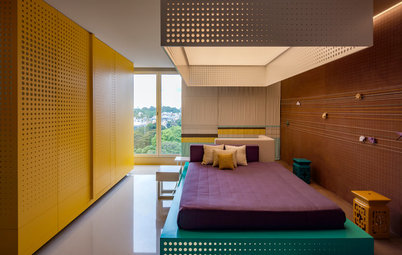
2. Brown, beige and yellow
So many of our homes are awash in brown and beige. If you had doubts that a cheerful yellow probably wouldn’t work with a sedate brown, this modern living zone is here to prove you wrong. The dramatic pairing seen on the sofas makes a bold design statement and enhances the ambience of the area. The lively lilac of the centre table is another unusual pairing, but as purple is the complementary shade to yellow, it balances the mix. Pretty, isn’t it? Also, the softly tinted walls provide the perfect backdrop for the bolder hues to rise and shine.
Wondering how to work with brown colour?
3. Quiet shades with colourful accents
The living room’s shell is grey, brown and beige, which get a punch of bright, vibrant colours with the bold white and ocean-blue of the seating, table accessories and lighting and the vivid multicoloured cushions.
The living room’s shell is grey, brown and beige, which get a punch of bright, vibrant colours with the bold white and ocean-blue of the seating, table accessories and lighting and the vivid multicoloured cushions.
4. Black and white
How many of us are brave enough to invite black into our living rooms? The striped flooring and the cushions offset this otherwise all-white room. I like this audacious choice, because it gives the room a solid personality and is reflective of the owners’ bold and confident design choices.
How many of us are brave enough to invite black into our living rooms? The striped flooring and the cushions offset this otherwise all-white room. I like this audacious choice, because it gives the room a solid personality and is reflective of the owners’ bold and confident design choices.
5. Purple, white and brown
Did you know that purple (well, okay, ultra violet, to be precise – but you get our drift) is the Pantone Colour of the Year 2018 ? This hue takes over the living room through the extra-long sofas tufted in purple fabric, contrasting beautifully with the bleached curtains, walls and ceiling, and the brown flooring.
Did you know that purple (well, okay, ultra violet, to be precise – but you get our drift) is the Pantone Colour of the Year 2018 ? This hue takes over the living room through the extra-long sofas tufted in purple fabric, contrasting beautifully with the bleached curtains, walls and ceiling, and the brown flooring.
6. Gold, silver, brown and grey
Who can deny it – the magic of metallics can make even a sceptic stop and take notice. Like it or hate it, experimenting with gold and silver always results in a striking scape: take this room, for example. In this grey-painted room, the sofa, framed in gold and tufted in brown, the centre table in gold and silver and the shining magazine holder, all make for an eye-catching modern colour scheme for a living room. Its seat and cushions bridge the brown and metal divide with their richly woven gold, beige and brown. Last but not least, how can the vintage-style side tables and the wall clock go unnoticed?
Here’s how to master metallics at home
7. Blue, green and beige
This combination reminds me of calm waters, clear skies and the outdoors – they play off each other so well. With the beige walls providing a light canvas, the mint-green blinds, column and cushions and the soft blue seaters all come alive, creating a pleasing, inviting picture. The borders, cushions and panels display a bright stripey mix of green and brown, pulling the room together and adding a touch of vibrance, without which it might have been a tad too quiet.
This combination reminds me of calm waters, clear skies and the outdoors – they play off each other so well. With the beige walls providing a light canvas, the mint-green blinds, column and cushions and the soft blue seaters all come alive, creating a pleasing, inviting picture. The borders, cushions and panels display a bright stripey mix of green and brown, pulling the room together and adding a touch of vibrance, without which it might have been a tad too quiet.
8. Shades of red and light brown
It’s a fiery hue, not for the timid or faint-hearted. It suggests adventure, passion, excitement. Look at the bold red walls, the maroon highbacks, lighter red patterned carpet and the wooden flooring and ceiling niche … can’t take your eyes off this room, can you? You must have noticed the painting on the far wall – its sunny outdoorsy theme and clear bright blue, green and pale apricot balance the room’s reds, which might otherwise have been a little overwhelming. That is key when using strong colours: balance them.
Read more:
Get the Look: 10 Stunning Drawing Room Colour Combos
Tell us:
What living room colour schemes have you used in your home? Share images and tell us in Comments below.

Lately, grey seems to be the go-to colour. In this living room, it conjures up a mesmerising atmosphere while the sofa’s salmon hue creates a nice contrast, adding a lively effect to the room, as do the white vintage chandelier and teal painting. All the lighter hues make sure the room doesn’t look too sombre with the dominating dark grey.
Take a look at these 17 rooms sporting grey walls