Before & After: A Chic Modern-Scandi Makeover for a Drab Kitchen
An awkward layout, wasted space and a gloomy colour scheme – see how this kitchen was transformed
Georgia Madden
11 July 2022
In a Q&A format, we talk to the designers – and examine the creative thinking – behind some of Houzz’s most loveable rooms.
Images by Ryan LInnegar. Answers by Maria Roussos, director at Schemes & Spaces.
Who lives here: A couple with two young children
Location: Oatley, NSW
Room purpose and size: An open-plan family kitchen measuring 15 square metres in a 1940s weatherboard home
Designer: Maria Roussos, director at Schemes & Spaces
Approximate budget: AU$60,000
Builder: Urban Elevations
Joinery: Matjestic Kitchens & Joinery
How did you use Houzz for this project?
This client was actually a referral, but the original client that led to the referral found me on Houzz.
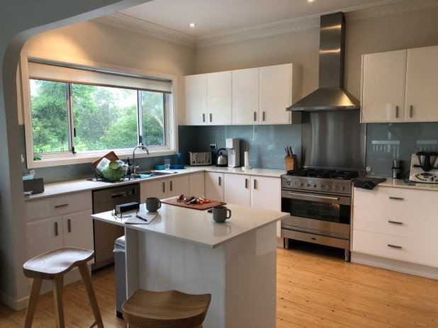
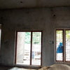
The kitchen before works.
Brief
The owners sought to improve the functionality of their existing kitchen with a contemporary design that was unique to their home.
The kitchen redesign was part of a larger renovation of a single-storey, circa 1940s weatherboard house, which included redesigning two bathrooms and a master wardrobe, and sanding and resealing the home’s existing floorboards.
How important is the kitchen to this family?
Like most families, daily life revolves around the kitchen. School-age children need to be catered to regularly and the family is very focused on healthy meals.
Did they have any must-haves for the new design?
Yes – a generous pantry, an appliance cupboard, a double sink, a French-door fridge, and a pull-out bin.

The kitchen before works.
What was the original kitchen like?
It was a U-shaped kitchen, with a tiny island floating in the middle and lots of wasted floor space.
There was very little bench space, an odd corner pantry, a visually overpowering canopy rangehood, too-small overhead cabinets, and a freestanding fridge. The whole area was vaguely separated from the living/dining area by a curve-edged opening.
Ready to renovate your dated kitchen? Find a kitchen designer near you on Houzz
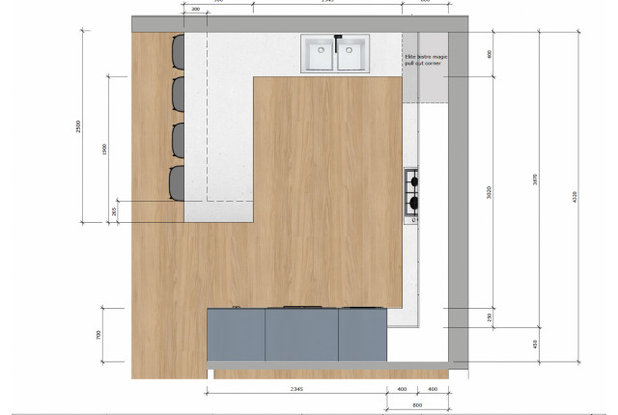
The kitchen floor plan.
What was your starting point for the new design?
The deep blue colour of the lower joinery, the joinery around the fridge and on the peninsula.
Was it important to blend the kitchen style with the rest of the house?
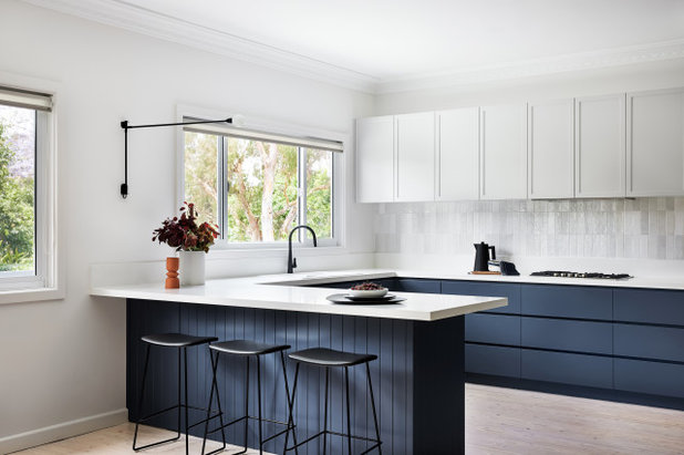
I called this project ‘Scandi Cottage’ – it’s a weatherboard cottage, but the interior throughout has a Scandi feel, with whitewashed floorboards, plenty of natural light, and clean and uncluttered spaces. We also stuck to a simple palette of blue, white and neutrals throughout.
What was your starting point for the new design?
The deep blue colour of the lower joinery, the joinery around the fridge and on the peninsula.
Was it important to blend the kitchen style with the rest of the house?
I called this project ‘Scandi Cottage’ – it’s a weatherboard cottage, but the interior throughout has a Scandi feel, with whitewashed floorboards, plenty of natural light, and clean and uncluttered spaces. We also stuck to a simple palette of blue, white and neutrals throughout.

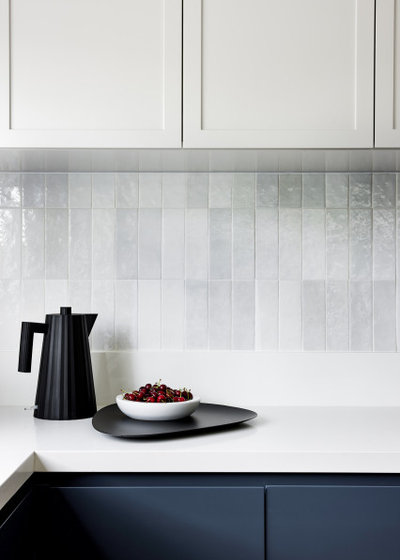
What are the main elements of the materials palette?
Glazed ceramic wall tiles, engineered stone benchtops and a two-pack polyurethane finish for the cabinetry.
And the colour palette?
The colour palette includes the steel blue, stony white and the soft neutral variations of the handmade splashback tiles. These are punctuated by small injections of black in the kitchen tap, the wall light and pantry cabinet pulls.
And the key fixtures and furnishings?
The dark fridge, white sink and the black wall light.
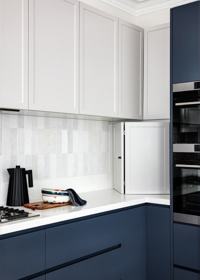
What does the V-groove panelling add?
The client loves V-groove panelling and we felt it provided texture and interest. The vertical lines are echoed in the tiled splashback.
Browse more beautiful blue Australian kitchens
Glazed ceramic wall tiles, engineered stone benchtops and a two-pack polyurethane finish for the cabinetry.
And the colour palette?
The colour palette includes the steel blue, stony white and the soft neutral variations of the handmade splashback tiles. These are punctuated by small injections of black in the kitchen tap, the wall light and pantry cabinet pulls.
And the key fixtures and furnishings?
The dark fridge, white sink and the black wall light.
What does the V-groove panelling add?
The client loves V-groove panelling and we felt it provided texture and interest. The vertical lines are echoed in the tiled splashback.
Browse more beautiful blue Australian kitchens
What was your thinking behind the layout?
We wanted the kitchen to be part of the open-plan living and dining space, but also offer a breakfast bar and more bench space for prep. We achieved this by removing the side and overhead walls and introducing a peninsula island that extends from where the side wall stood. This accommodates the stools and hides some of the working parts of the kitchen.
What look and feel did you want to create?
A contemporary kitchen that was sympathetic to the style of the rest of the home. To do this, we opted for modern-Shaker cabinetry with a hint of weatherboard cottage. The deep steel blue of the lower joinery and island echoes the navy on the home’s exterior.
What challenges did you have to work around?
We had to keep the existing window as well as the cornice, which continues into the living and dining area.
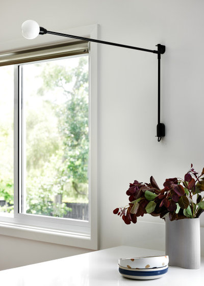
Why did you choose a wall light over a pendant?
For two reasons: first, as there was a natural wall space here between the two windows, and secondly because there is already a feature pendant light over the table in the adjoining dining area.
Using one or more pendant lights over the bench would have been too much. This way, we have an alternate light source over the bench as well as a decorative element for the wall and kitchen area.
We had to keep the existing window as well as the cornice, which continues into the living and dining area.
Why did you choose a wall light over a pendant?
For two reasons: first, as there was a natural wall space here between the two windows, and secondly because there is already a feature pendant light over the table in the adjoining dining area.
Using one or more pendant lights over the bench would have been too much. This way, we have an alternate light source over the bench as well as a decorative element for the wall and kitchen area.
Why do you think this kitchen works?
It is both aesthetically pleasing and super-functional. It has a great balance of storage and open space, loads of benchtop space, and a corner appliance cupboard to hide messy items.
The colour and textures provide interest, but keeping the overhead cabinets soft and neutral enhances the feeling of space and light.
Materials palette:
Your turn
Does a modern Scandi-style kitchen appeal to you? Tell us in the Comments below. And don’t forget to save your favourite images for inspiration, like this story and join the conversation.
More
Catch another great kitchen transformation here with this Before & After: An Airy London Kitchen Packed With Family Storage
It is both aesthetically pleasing and super-functional. It has a great balance of storage and open space, loads of benchtop space, and a corner appliance cupboard to hide messy items.
The colour and textures provide interest, but keeping the overhead cabinets soft and neutral enhances the feeling of space and light.
Materials palette:
- Benchtop: Snow from Caesarstone.
- Splashback: Casablanca Pearl Gloss tiles from Skheme.
- Tap: Gessi Emporio Concealed Pull-Out Kitchen Mixer.
- Wall light: Potence Pivotante MiniNemo from Cult Design.
- Joinery: Porter’s Paints Blue Steel for the base cabinetry and around fridge; and Dulux Vanilla Quake for the overhead cabinetry in a satin finish.
- Walls in White Calm: Dulux.
Your turn
Does a modern Scandi-style kitchen appeal to you? Tell us in the Comments below. And don’t forget to save your favourite images for inspiration, like this story and join the conversation.
More
Catch another great kitchen transformation here with this Before & After: An Airy London Kitchen Packed With Family Storage
What are you working on?

Related Stories
Kitchen Guides
10 Key Kitchen Dimensions You Need to Know
Here are key kitchen dimensions that will help you design like a pro
Full Story
More Room Guides
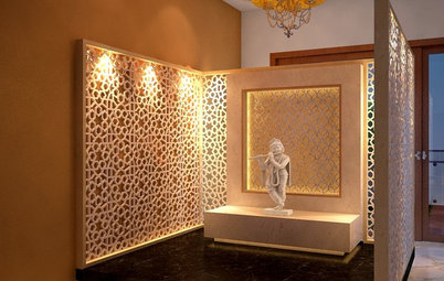
35 Serene Puja Room Designs
Take a leaf out of these elegantly designed, beautiful prayer rooms on Houzz
Full Story
Decorating Guides
What Are the Benefits of Hiring an Interior Designer?
From furnishing working drawings to beautifying the home, find out how an interior designer plays multifunctional roles
Full Story
More Room Guides
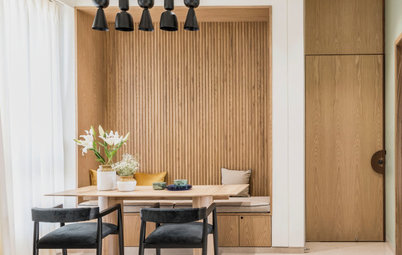
Turn One Room Into Two With These Genius Ideas
Carve out an extra room within your home with these fab room-splitting tips and tricks
Full Story
Bedroom Guides
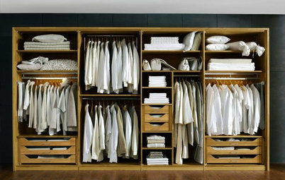
What Are the Ideal Wardrobe Measurements?
Here are dimensions for different types of wardrobe designs that ensure maximum functionality and storage
Full Story
Architecture
These Indian Homes Know How To Combat Harsh Climate
See how these homes by SPASM, Kumar Moorthy & Associates and JPLUSDARCHITECTS mitigate the ramifications of harsh climate ahead of time
Full Story
Architecture
How to Find an Architect That's Right for You
Make the construction and renovation of your home a pleasant and memorable journey by selecting the right architect
Full Story
Bathroom Guides
Step-by-Step: A Guide to Renovating Your Bathroom
Planning to renovate your bathroom? Learn about the different stages involved in the remodelling process
Full Story
Living Rooms
30 Best Sofa Designs
This guide gives a rundown of sofa types that will leave you spoilt for choices
Full Story
Small Spaces
7 Stylish Ways to Dry Your Laundry In a Small Apartment
Has your drying rack become a perpetual eyesore in your home? These dapper laundry drying solutions have you covered
Full Story
LOVE the Blue Steel - best blue I have seen on houzz - noted. love the mix of cabinet styles. agree w ducks - I think to the ceiling always looks best, and that greasy dust on top of cabinets is nasty.
I love this design. Clean yet warm with a soft coastal feel.
Love to have seen a photo of the wall with the oven & fridge, heat colour choices!👏