8 Sophisticated Paint Colours to Try
Ready for a shade that doesn’t rhyme with beige? Try one of these rich hues for your next room makeover

Grey and its neighbour greige have become go-to hues for many designers, homeowners and stagers in recent years, and with good reason: These neutrals are subtle, sophisticated and have wide appeal. But if you’re getting a little greige fatigue, consider adding one (or more) of these equally sophisticated hues to your palette. From navy to smoky blue to buttermilk, these colours are elegant, easy to work with and sure to please.
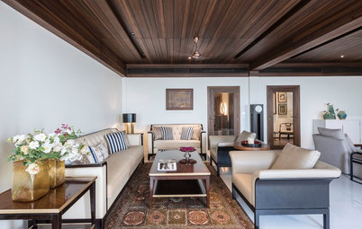
2. Milk chocolate. A light brown that’s warm but not too warm, this hue looks especially sophisticated on woodwork. Milk chocolate pairs well with ivory, plum, taupe and deeper shades of brown. Try it in the living room or bedroom.
How to pick the right colour of brown
How to pick the right colour of brown
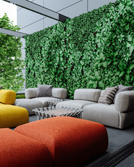
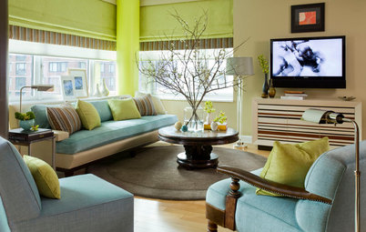
3. Smoky blue. Like a moody sky or turbulent sea, this colour is rich and dramatic. And because it’s strong without being overpowering, it works equally well as an accent or main colour. Try smoky blue in the dining room, mudroom, bath or kitchen alongside crisp white, black and shades of grey.
Blue: A colour you should take to bed
Blue: A colour you should take to bed
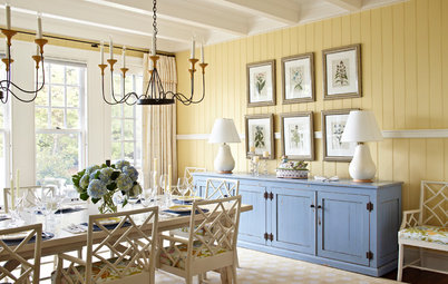
4. Buttermilk. Warmer than off-white but not as cloying as full-on yellow, buttermilk is a friendly, uplifting hue. Try it in the kitchen, breakfast nook, living room or anywhere you’d like a warm, cozy atmosphere. Buttermilk looks especially at home among natural wood tones, and including some black in the design for contrast keeps the look fresh.
5. Taupe. Looking for a baby step away from grey? Try taupe, which sits squarely in the middle of the neutral spectrum. It’s not too warm or too cool, making it easy to coordinate with just about any other colours or wood tones in your home.
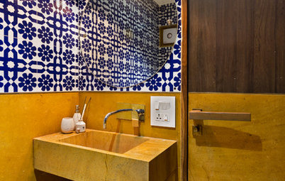
Wall paint: Shaker, C2 Paint
Wall paint: Shaker, C2 Paint
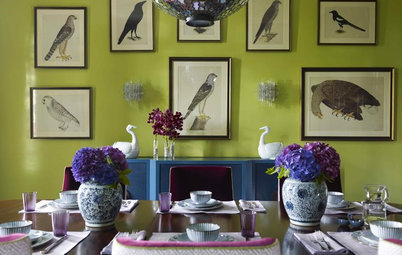
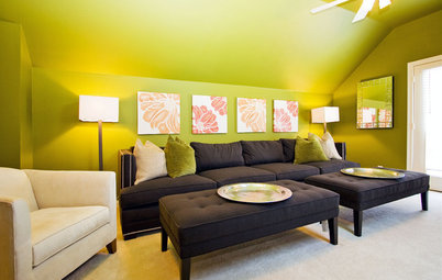
6. Neutral green. With both grey (cool) and brown (warm) undertones, a green like this has a timeless, historic feel that works especially well with rich woods and warm whites. Try it in the living or dining room paired with wood floors and natural wood finishes.
7. Purple-grey. Purples can be tricky, but a shade with a lot of grey in it is far easier to work with than others. Violet Verbena is a purple-grey with a soothing, not too sweet feel. Try it in the bedroom or bath paired with grey, cream, oatmeal and natural fibres.
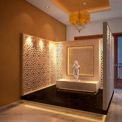
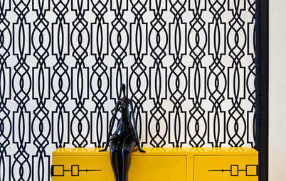
8. Black. Black is bold but also classic, making it a solid choice for cabinetry in the kitchen or bath. It’s become more common as a wall colour in recent years, but it still feels edgy to go all-black on the walls. Test it out as an accent wall in the living room or hall or in a small space like the laundry room. Black also works well as a backdrop for art or lining open shelves filled with fresh green plants.
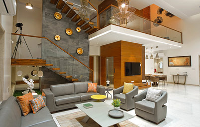
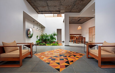
See the rest of this home
Read more:
The Secret to a Long-Lasting Wall Paint Job
Where to Use Which Paint?
Tell us: Are you still loving shades of grey or are you ready to move on? Share your favourite wall colour in the Comments.
See the rest of this home
Read more:
The Secret to a Long-Lasting Wall Paint Job
Where to Use Which Paint?
Tell us: Are you still loving shades of grey or are you ready to move on? Share your favourite wall colour in the Comments.
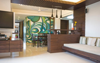
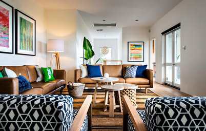
See the rest of this home