


8 Smile-Inducing Paint Palettes
Let the good times roll with happy hues and paint selections to jolt you out of the season's blues
Jennifer Ott
7 March 2017
San Francisco-based architectural color specialist and design writer. Jennifer's work has been featured in many print and online publications. Her recently-published book, "1000 Ideas for Color Schemes," is a beautifully illustrated and easy-to-navigate guide that takes the guesswork out of selecting the perfect color palette for your home or special event. For more information on Jennifer Ott Design, visit http://jenottdesign.com/.
San Francisco-based architectural color specialist and design writer. Jennifer's... More
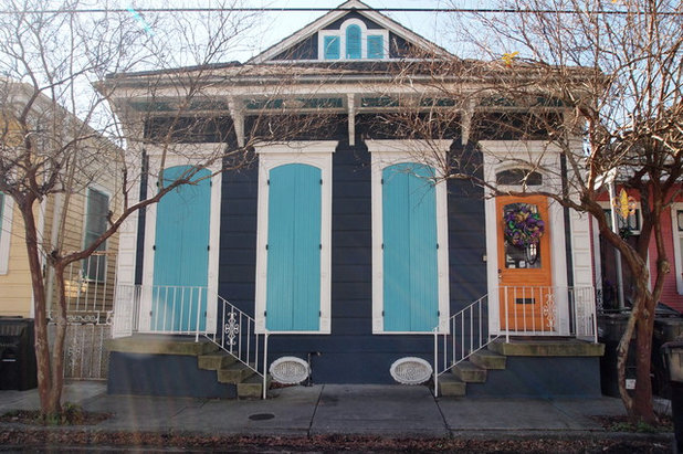
It’s been an especially dark, wet and gloomy winter here in San Francisco, where I reside. So I’ve taken to searching and collecting images of bold, bright and colourful homes in New Orleans in an effort to perk up myself — just in time for Mardi Gras (February 28).
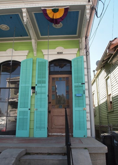
1. Bold blues and greens
The colour scheme shown here is a bit over-the-top for most homes in most locations, but you could add at least one, maybe two of these hues as an accent colour in or outside your home.
The colour scheme shown here is a bit over-the-top for most homes in most locations, but you could add at least one, maybe two of these hues as an accent colour in or outside your home.
If you love these colours but desire a more restrained look, pair a bolder hue or hues with plenty of neutrals. Stick to small accents of the bolder hues for a dash of fun colour.
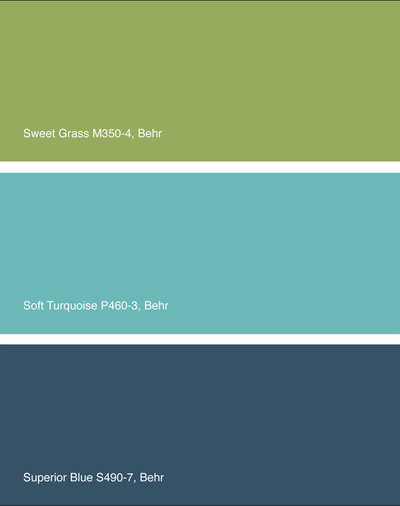
For a similar palette: Sweet Grass, Soft Turquoise and Superior Blue, all from Behr.
For a similar palette: Sweet Grass, Soft Turquoise and Superior Blue, all from Behr.
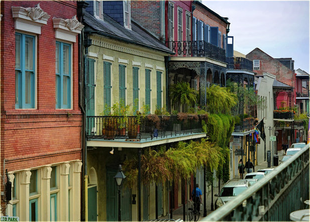
Photo by marneejill, via Flickr
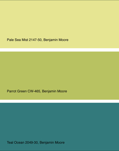
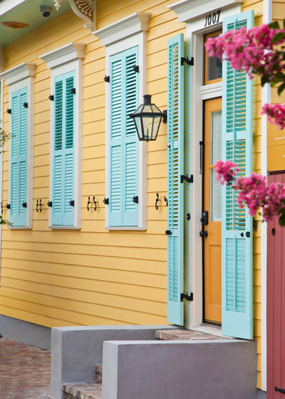
2. Lemon, lime and teal
The colour scheme on the second house from the right in the image above is a great example of using vibrant colours in a harmonious way.
Because these three shades reside next to one another on the colour wheel, they meld together well, rather than fight with one another, as high-contrast colours tend to do.
For a similar palette: Pale Sea Mist, Parrot Green and Teal Ocean, all from Benjamin Moore.
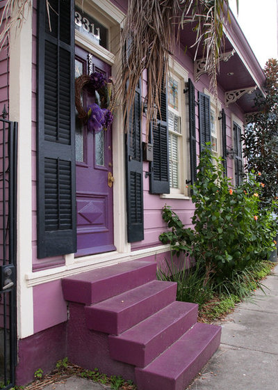
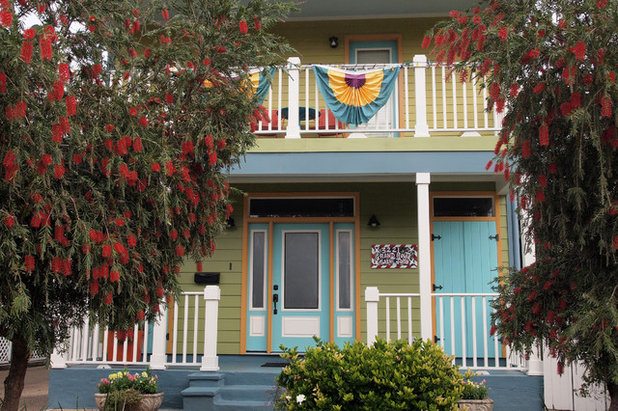
3. Purples and pinks
On April Fool’s Day last year, I rendered an exterior with wild, juicy colours, not dissimilar to those shown here and then posted it on social media with a comment that I was going to be meeting with a client later that day to pitch the scheme.
My friend Cliff from New Orleans initially fell for it. Once he realised he had fallen for my prank, he pointed out in his defence, that in his neighbourhood it would not be considered a crazy colour combination at all.
This luscious colour scheme, while bold, definitely looks pretty in pinks and purples. If you go for such a palette, be sure to pick a pink that has a bit of grey in it, which will keep it from looking too sugary sweet — unless that’s the vibe you are going for, of course!
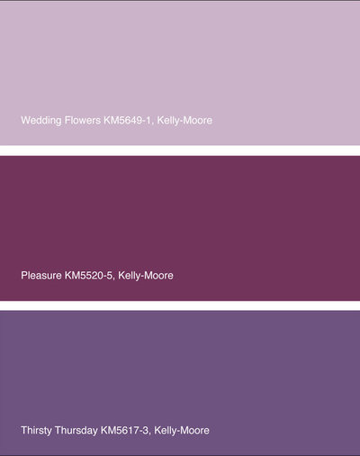
For a similar palette: Wedding Flowers, Pleasure and Thirsty Thursday, all from Kelly-Moore Paints.
For a similar palette: Wedding Flowers, Pleasure and Thirsty Thursday, all from Kelly-Moore Paints.
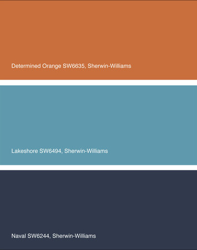
4. Orange with shades of blue
I like that the primary house colour here is a neutral dark navy. It’s still a dramatic hue, but not as in-your-face as many of the other house colours profiled so far.
The more vibrant orange and watery blue are used as accents, keeping the vibe toned down.
For a similar palette: Determined Orange, Lakeshore and Naval, all from Sherwin-Williams.
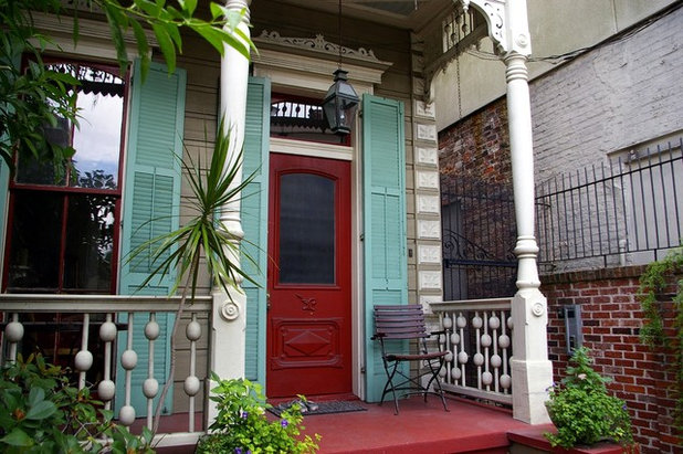
Photo by Allen Brewer, via Flickr
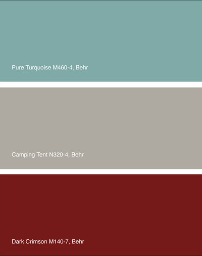
5. Turquoise and ruby
Blue and red can be tough shades to bring together, because they contrast with each other so much, which often culminates into a rather busy colour scheme.
Make it work by keeping one of them a softer, lighter shade such as the turquoise shown here. A warm grey background colour also helps bridge the two hues.
For a similar palette: Pure Turquoise, Camping Tent and Dark Crimson, all from Behr.
9 Ways to Play With Contrast in Your Living Room
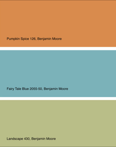
6. Soft green with orange and blue accents
I love the vintage, mid-century modern vibe of this colour scheme. The green is rather neutral, due to its grey undertones, so it’s a terrific choice as the main hue on a home’s exterior or interior.
Add small splashes of blue or orange to give it a little zing.
For a similar palette: Pumpkin Spice, Fairy Tale Blue and Landscape, all from Benjamin Moore.
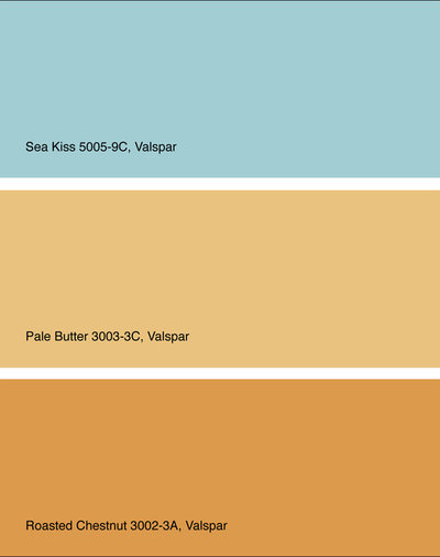
7. Robin’s egg blue with butter yellow and bold gold
Here’s an example of a colourful scheme that is a bit softer than some of the previous ones. The buttery yellow and pretty blue are rather light yet still saturated, so they have a nice whimsical quality.
Any of these shades would make a terrific accent wall in a home, with the other two colours serving as solid supporting hues.
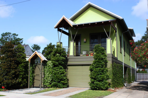
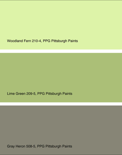
8. Sea of greens
Leafy green is trending for 2017. If you are a fan, now is a good time to stock up on furnishings for your home in this fresh hue, as they will be more plentiful. Of course, if you worry you might tire of this colour sooner rather than later, stick to paint or other easy-to-change items when injecting the vibrant hue.
For a similar palette: Woodland Fern, Lime Green and Grey Heron, all from PPG Pittsburgh Paints.
Read More:
12 Ways Colour Can Energise Your Home
Greenery: 7 Ways to Bring the Pantone Colour of the Year Home
How to Use Colour in Your Living Room
Tell us:
How have you used a vibrant colour in or outside your home? Tell us in Comments below.
What are you working on?

Related Stories
Working with professionals
Busted! 5 Myths About Working With an Interior Designer
By Tanya Khanna
We put to bed the biggest misconceptions about working with design professionals
Full Story
Working with professionals
Can Hiring an Interior Designer Save You Money?
We dispel the biggest misconception that working with an interior designer will drive up the cost of the project
Full Story
Working with professionals
What Are the Benefits of Hiring an Interior Designer?
From furnishing working drawings to beautifying the home, find out how an interior designer plays multifunctional roles
Full Story
More Room Guides
Turn One Room Into Two With These Genius Ideas
Carve out an extra room within your home with these fab room-splitting tips and tricks
Full Story
Bedroom Guides
What Are the Ideal Wardrobe Measurements?
Here are dimensions for different types of wardrobe designs that ensure maximum functionality and storage
Full Story
More Room Guides
7 Types of Glass That Allow in Light & Privacy
These glass products and treatments will increase privacy without losing natural light
Full Story
Decorating Ideas
9 Ways to Make Minimalism Work in Indian Homes
Here are smart ways to harmoniously combine the minimalist ethos with Indian aesthetics and lifestyles
Full Story
Most Popular
Which False Ceiling Material is Better: Gypsum or POP?
Here is all you need to know about the difference between gypsum and POP before you commit to a ceiling
Full Story
Most Popular
Where to Use Which Paint?
Know your emulsions from your acrylics, and the right types for painting the home's interior & exterior
Full Story
Life
10 Bad Habits That Are Making Your Home Messier...
By Jo Simmons
...and how to break them! Tweak your mess-forming behaviours and help tidy up your interior
Full Story
BEAUTIFUL COLORS!! I love the bright colors and the architecture!!
The top image, above, was the inspiration for my 1958 southwest coastal FL house. Found somewhere in Sherwin Williams Historic New Orleans Collection. The The second two pics show "after" and "before." If you look closely enough, the shot on the left, you'll see the inside of door frame and windows are trimmed in a teal. This side faces directly west, harsh afternoon sun, so I anticipate some fading, but not much.
The house had been white since it was built. Cleared 17 years of cactus and overgrowth. Landscaping, working wood shutters, and double wooden screen door to come.
Exterior colors set the tone for the sunroom entry way. There are two of these Ficks Reed pieces facing each other. These are newly-done cushions and accent pillows.
And this is the guest room with matching twin beds, but different accent pillows. Hanging on the wall behind each bed is a vintage mirror.
The walls in the dining room were once white, is now similar to the exterior of the house. A ceiling fan was replaced with this tropical light fixture found at a thrift store. I'm not happy with the two roll-up shades from Home Depot, that, if you look closely enough, the rings to draw it up aren't in the same place so the folds aren't even. That has to be addressed. The table is a 120 year old oak library table.
The wool rug under the library table came from a Habitat for Humanity thrift store in Sarasota, FL. It's wool, one color, a nice lime-y green and is 18' x 24'. It almost covered the entire floor. The label stated it came from Rugs as Art. It was flawless, and the perfect compliment to the rest of the room and the adjoining room.