


8 Big Colour Trends From Maison & Objet
What are the colour trends as we head into 2020? We found the answer at the Maison & Objet trade fair
Agnès Carpentier
11 September 2019
For a while now, we’ve been leaning on single colours, like peacock blue or anthracite, to spice up a wall or a whole room. At this edition of the Maison & Objet trade fair we’re seeing a much more subtle use of colour, with multiple contrasting or harmonising hues played off against one another.
Since 1995, Maison & Objet in Paris has been the international meeting point for professionals in lifestyle, interiors and design. Twice a year, it brings together more than 3,000 exhibiting brands and nearly 90,000 visitors, almost half of whom come from other countries. Houzz editors were at the Villepinte Exhibition Center to find talent and identify tomorrow’s trends. Here are the eagerly awaited colour trends as we head into 2020.
Since 1995, Maison & Objet in Paris has been the international meeting point for professionals in lifestyle, interiors and design. Twice a year, it brings together more than 3,000 exhibiting brands and nearly 90,000 visitors, almost half of whom come from other countries. Houzz editors were at the Villepinte Exhibition Center to find talent and identify tomorrow’s trends. Here are the eagerly awaited colour trends as we head into 2020.
1. The art of colour palettes
Of course, trendy and novel colours like burnt orange, olive green and blood red were well represented. However, what we really noticed in the aisles of this September 2019 edition of Maison & Objet were the many colour palettes. There were very few monochrome booths: Many featured subtle colour mixes based on triadic colour contrasts or analogous harmonies* of three to five hues, combining primary and secondary colours. We are sure to start seeing them on walls soon.
* A triadic colour contrast is made up of any three colours that form an equilateral triangle on the colour wheel, like the three primaries – blue, yellow and red, as in Mondrian paintings. An analogous harmony refers to the combination of neighbouring colours on the colour wheel, such as wine red, burnt orange and blood red.
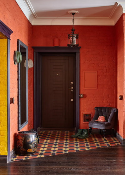
2. Warm harmonies with blood red, orange and mustard
These are clearly the novel hues for this year. Harmonies of warm and invigorating colours –burgundy, wine red, blood red, burnt orange, mustard and golden brown – create decor that’s sunny, energetic and perfect for re-enchanting our interiors.
These are clearly the novel hues for this year. Harmonies of warm and invigorating colours –burgundy, wine red, blood red, burnt orange, mustard and golden brown – create decor that’s sunny, energetic and perfect for re-enchanting our interiors.
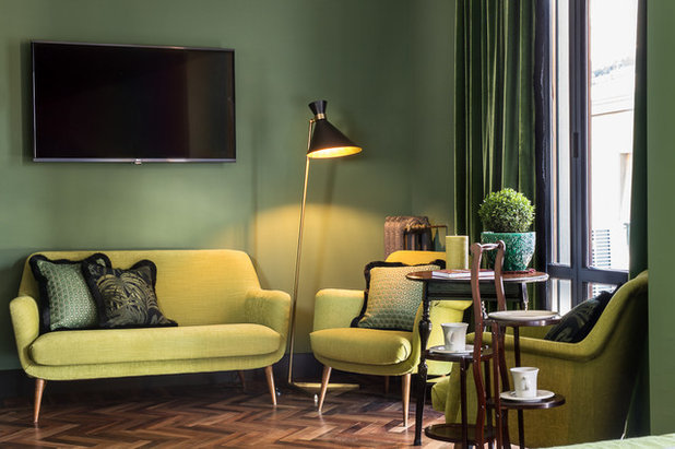
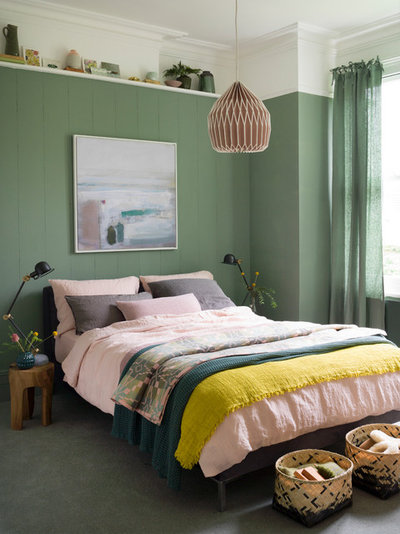
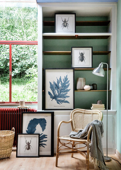
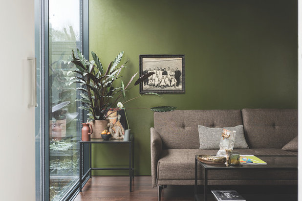
3. Cool combinations in khaki, yellow-green, linden and almond green
Among cool spectrums, it’s impossible to ignore this combination of shades of green. Fir green, the big colour of 2019, still appears here and there, while the new green on the block is tinged with yellow and tends towards a warmer khaki-olive.
Find an interior designer to help design your home
Among cool spectrums, it’s impossible to ignore this combination of shades of green. Fir green, the big colour of 2019, still appears here and there, while the new green on the block is tinged with yellow and tends towards a warmer khaki-olive.
Find an interior designer to help design your home
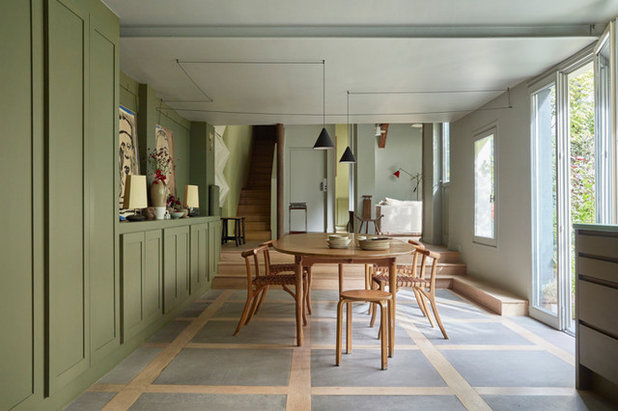
We also saw a lot of verdigris, linden and almond green that survived the Scandinavian era. A breath of nature is always welcome in our interiors.
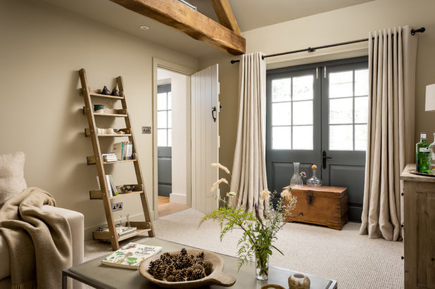
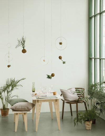
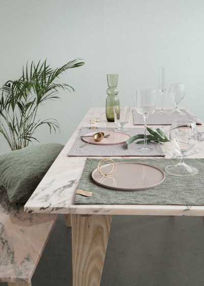
4. Sweet harmony in beige, taupe, greige, honey and fawn
These colours are, frankly, timeless classics rather than novelties. However, there’s no better way to spice them up than to combine multiple shades of these colours themselves: taupe (and onwards through the spectrum up to brown) has made a big comeback, and there are also mustard yellow, fawn and sienna. These reassuring palettes make us want to cuddle up under a blanket.
These colours are, frankly, timeless classics rather than novelties. However, there’s no better way to spice them up than to combine multiple shades of these colours themselves: taupe (and onwards through the spectrum up to brown) has made a big comeback, and there are also mustard yellow, fawn and sienna. These reassuring palettes make us want to cuddle up under a blanket.
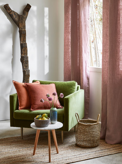
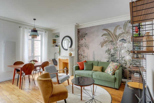
5. Spring contrast in khaki green, yellow green, pink, orange and sienna
This edition of Maison et Objet gave us the answer to a crucial question: What should I match with khaki or olive green?
Take a look at furniture on Houzz
This edition of Maison et Objet gave us the answer to a crucial question: What should I match with khaki or olive green?
Take a look at furniture on Houzz
For kicking these serene colours up a notch, nothing beats a powder pink, peach, coral or mustard: contrasting colours that add warmth without being overbearing, like pretty flowers in a meadow. These colour schemes create an atmosphere inspired by nature and evoke spring cheer.
Looking for bedroom designs? Take a look at these rooms from around the world
Looking for bedroom designs? Take a look at these rooms from around the world
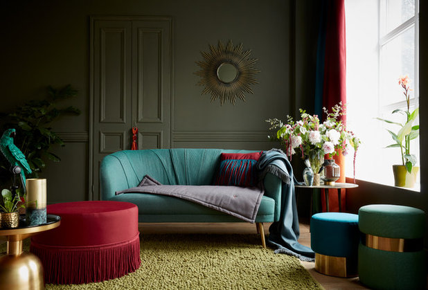
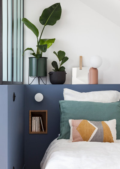
6. Classic chic contrast in bordeaux, blue-green, anthracite and beige
The bordeaux-green contrast needs to be treated with caution: Easily slipping into a Christmas colour scheme, it changes its register when skilfully matched with olive, linden, peacock blue, anthracite or beige. It is a surefire way to a chic family home.
The bordeaux-green contrast needs to be treated with caution: Easily slipping into a Christmas colour scheme, it changes its register when skilfully matched with olive, linden, peacock blue, anthracite or beige. It is a surefire way to a chic family home.
7. Delicate contrast in blue, orange and pink
Among blues, we’re seeing peacock blue, klein blue and denim stepping into the limelight.
We’ve seen a lot of blue in the last few years, but now blues as a whole seem to be in sharp decline.
Among blues, we’re seeing peacock blue, klein blue and denim stepping into the limelight.
We’ve seen a lot of blue in the last few years, but now blues as a whole seem to be in sharp decline.
At this edition of the fair, we saw a more nuanced approach to blue with touches of pink, sienna and fawn – which form a less aggressive contrast than orange. It is a delicate evolution of the ethereal pink-blue duo that we have just seen too much of.
8. Two notes
Having spoken about colours and matching, we would like to conclude with two observations.
First, matte, dull and earthy colours, manifestations of a renewed affirmation of our desire for nature, remain trendy.
Having spoken about colours and matching, we would like to conclude with two observations.
First, matte, dull and earthy colours, manifestations of a renewed affirmation of our desire for nature, remain trendy.
In addition, the colour harmonies and contrasts we’ve discussed above work for dark and light colours alike: It’s up to you to choose anything from olive, orange and coral to almond green, powder pink and peach. Without a doubt, the future promises to be artistically colourful!
Read more:
Rethink These 7 Decor Trends
Future of Lights: 9 Trends From Euroluce 2019
Tell us:
What do you think about think about these colour trends?
Read more:
Rethink These 7 Decor Trends
Future of Lights: 9 Trends From Euroluce 2019
Tell us:
What do you think about think about these colour trends?
What are you working on?
Related Stories
Houzz Tours
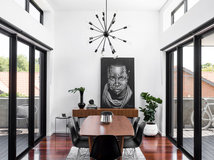
Houzz Tour: A Modern Extension Brings Together the Old & the New
A contemporary extension, purposely designed in contrasting materials, unites the old with the new in this family home
Full Story
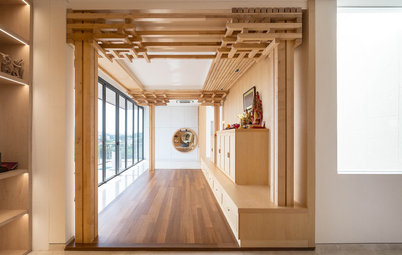
Houzz Tours
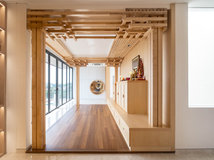
Houzz Tour: A Prayer Room Dedicated to Divinity
This expansive space for worship and cultural appreciation exudes Zen-like quietude and serenity
Full Story

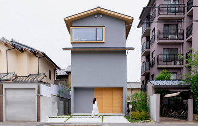
Small Spaces
Houzz Tour: A Tiny, 600-Sq-Ft House Sits by the River
Clever architecture turns this surprisingly small Japanese house into a family home – with stunning river views
Full Story
Decorating Ideas
8 New Design Trends Launched at US Kitchen & Bath Industry Show
See new tapware styles, appliance colours and shower features launched at the KBIS 2022 trade show
Full Story
Decorating Ideas
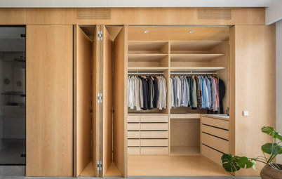
The 10 Most Popular Closets From Around the World
A glance at Houzz users' favourite closets from 2021 shows that clever design thinking pays in even the smallest spaces
Full Story
Houzz Tours
Houzz Tour: Tactile Furnishings Inject Warmth Into a New Home
By Jill Morgan
Cleverly layered fabric, furniture and travel finds add character & personality to an all-white home
Full Story
Houzz Tours
Houzz Tour: This Kyoto Home Will Evolve With Its Owner
By 杉田真理子
She was ready to buy, but wants a family in the future. With lots of blank spaces, this home can change with her
Full Story
Bathroom Guides
32 Unforgettable Bathrooms From Around the World
A wild mix of materials, hand-drawn decorations, floral tiling... feast your eyes on these truly individual approaches
Full Story
More Room Guides
40 Incredible Hallways To Take You From One World To Another
Here's a selection of narrow to wide, modern to traditional passageways infused with colour, art and space-boosting ideas
Full Story
Houzz Tours
Houzz Tour: Pastels and Greys Take Over This Family Home
Subtle shades accompany the ever-changing Nordic decor of this Danish home
Full Story
I love it beautiful bold not sterile and cold makes you feel cozy inviting but we all have our preferences so do your home to your taste as long as u are happy with it
The wonderful thing about paint is it can be changed once you grow tired of it. Try an accent wall or a ceiling and you will be surprised how much paint can make a difference.
Very inspiring. yes we live in a hot country but we still have cold winters in some areas and most houses have a dark room or a small unexpected space where a dash of a warm splash of invigorating color can add joy to our lives. I love seeing all the possibilities of all colors. there is a time and a place for all colors, it would be quite ridiculous if color experts left out all warm colors just because we have a hot summer. lets enjoy the color resurgence and turn to a interior designer/color expert to show you how to use ALL the colors to enhance our lives.