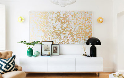
9 Colours to Amp Up the Living Room
Chill out in a living room decked in cool-spectrum shades straight from the runway

You’ve seen them everywhere this fall, showing up in fashion, housewares and home interiors – colours on the cool side of the spectrum, like vibrant greens, bold blues, lush violets and steely greys.
But few of us can afford to, nor would want to, completely change our living room with each passing colour trend. I always encourage clients to go for low-intensity neutrals for things that are costly or complicated to redo. In the living room these items would be furniture, flooring and elaborate custom window treatments.
But when it comes to the relatively affordable elements in a living room – paint, simple window treatments, pillows and other low-cost accessories – by all means take the plunge and invest in a few items in your favourite trendy hues. If you stick to colours you love, you’ll want them around for a good long while.
Check out this assortment of gorgeous cool-hued living and family rooms, along with sample colour palettes inspired by each space.
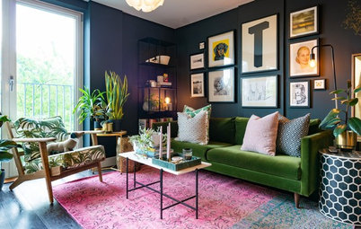
Grey has been my go-to neutral for a while now. I find it more crisp and clean looking than ubiquitous beige. But grey lacks the warmth of beige, so try pairing it with warm wood tones or a warm accent hue, such as the yellow-green used here. I recently designed a space layered in different shades of medium to light greys, and it has a super sophisticated vibe. With a base of grey tones in a room, you can add a dash of any other colour you want, even beige.
Example palette: Get a similar look with (clockwise from top left, all from Mythic Paint): Bedford Park 134-4, Adobe Sun 082-5, Arapaho Valley 079-6 and Sierra Grande 143-2.
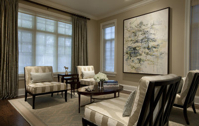
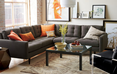
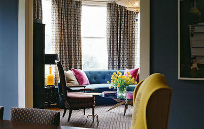
I know I said to stick with neutral colours when selecting furniture, but there is just something so fabulous about these magenta-hued club chairs. I love them! But notice that the magenta is the only vibrant hue in the space. If those chairs had to compete with a green wall and a blue sofa, they would quickly go from awesome to overload.
So go ahead and pick up furniture in your favorite bold hue if you see a piece you just have to have, but edit the other colors in the space so that the intensely hued element remains the star.
So go ahead and pick up furniture in your favorite bold hue if you see a piece you just have to have, but edit the other colors in the space so that the intensely hued element remains the star.
Example palette: Get a similar look with (clockwise from top left, all from Benjamin Moore): Twilight Magenta 2074-30, Stormy Sky 1616 and Tundra 2133-70.
Example palette: Get a similar look with (clockwise from top left, all from Valspar): Fluorescent Lime 6007-9C, Sea Song 5003-8A, Cincinnatian Hotel Hannaford 3007-10C and Jalapeño Jelly 6005-6A.
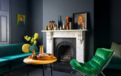
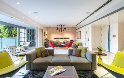
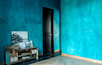
Green and red can be tricky colors to pull together. They are opposite each other on the color wheel, which means they offer the most contrast to each other. One trick to soften the contrast is to use less intense shades of one or both hues.
This wall is a very pure green, but it’s a fairly light shade of it. The red here is very dark and lush, more of a maroon shade — which can work as a neutral. Also, because the colors are used for different items in the room (wall paint and furniture), they won’t conflict. This unexpected palette works really well in this cool, modern space.
This wall is a very pure green, but it’s a fairly light shade of it. The red here is very dark and lush, more of a maroon shade — which can work as a neutral. Also, because the colors are used for different items in the room (wall paint and furniture), they won’t conflict. This unexpected palette works really well in this cool, modern space.
Example palette: Get a similar look with (clockwise from top left, all from Kelly-Moore): Dark Cherry Tart AC223-5, Tule Fog KM3778-1, Green Apple Peels KM3375-3 and Spring's Eve KM3895-3.
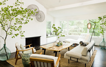
For those who love light, clean, airy spaces, you can't go wrong with shades of white on your walls, ceilings and furnishings. But it's nice to inject some color to liven things up.
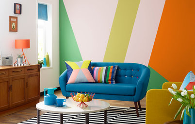
If you do, why not go bold? The grounding black and vibrant orange hues work nicely with the lighter blue shades here. This example also effectively uses colors opposite each other on the color wheel (blue and orange). They work well together because the blue is kept lighter and toned down.
If you do, why not go bold? The grounding black and vibrant orange hues work nicely with the lighter blue shades here. This example also effectively uses colors opposite each other on the color wheel (blue and orange). They work well together because the blue is kept lighter and toned down.
Example palette: Get a similar look with (clockwise from top left, all from Sherwin-Williams): Raindrop SW6485, Nuance SW7049, Copper Harbor SW6634 and Granite Peak SW6250.
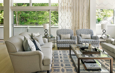
I usually feature very bold hues in my Houzz palettes, but I can definitely appreciate a softer approach. In fact, bright, vibrant color can sometimes distract from interesting artwork, furniture, accessories or a nice view out the window. This living room feels light filled, airy and inviting. Darker colors are used as small accents here and there — perfect for someone who prefers more toned-down, neutral hues. The harmonious mix of soft gray, green and blue makes for a soothing and sophisticated living room.
Example palette: Get a similar look with (clockwise from top left, all from Pratt & Lambert): Light Olive 18-23, Wraith 28-32, Carriage Stone 28-19 and Forget-Me-Not 24-8.
Work with a painter to find the perfect wall and ceiling colors for your home
Work with a painter to find the perfect wall and ceiling colors for your home
More soothing grays and blues, but in this example we also have bits of crisp white and deep, dark chocolate brown for a very elegant, modern palette.
Example palette: Get a similar look with (clockwise from top left, all from Pittsburgh Paint): Aqua Blue 353-5, April Sky 554-3, Seal Skin 416-7 and Gray Flannel 541-6.
As much as I love working with gray, another neutral I'm turning to more and more is navy blue. Softer than black, it still offers drama and plays well with all other colors. As an accent color via pillows and the window treatment here, it forms a nice triad with the lighter gray-blue and the olive green.
Example palette: Get a similar look with (clockwise from top left, all from Benjamin Moore): Sea Wind OC-139, Pine Brook 490, Alfresco 1672 and Hudson Bay 1680.
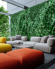
Don’t neglect your outdoor living spaces when it comes to injecting cool color. The days may be getting shorter and cooler, but why not plan ahead for spring and summer? Fall is, after all, a good time to pick up outdoor furniture and furnishings at a discount.
This space abounds with cool color. And because the vibrant colors are expressed via fabric and paint, it would not be that difficult to change them down the road.
This space abounds with cool color. And because the vibrant colors are expressed via fabric and paint, it would not be that difficult to change them down the road.
Example palette: Get a similar look with (clockwise from top left, all from Sherwin-Williams): Green Bay SW6481, Loyal Blue SW6510, Sassy Green SW6416 and Alpaca SW7022.
Tell us: What are your favorite cool colors for decorating your home?
Tell us: What are your favorite cool colors for decorating your home?