Kitchen of the Week: Geometric Tile Wall in a White Kitchen
Skylights, bifold doors, white walls and dark cabinets star in this light-filled kitchen addition
Cathy Rebecca
11 December 2015
London-based freelance journalist
When the owners purchased this home, it had already been extended at the back, but poorly. “A sort of outhouse had been incorporated into the building,” says Trevor Brown of Trevor Brown Architect, whom the clients enlisted to remedy the situation. Although the owners initially wanted just to improve what was already there, after a few discussions with Brown, it became clear that much more potential could be unlocked with a new addition.
Kitchen at a Glance
Who lives here: A couple and their two children
Location: Northeast London
Size: 269 square feet (25 square meters)
Architect: Trevor Brown
Architect Trevor Brown went for a monochrome palette in the kitchen addition to contrast with the rest of the home. The clients had chosen fairly bold, rich greens and blues at the front of the house, which is “quite dark,” Brown says, “so we used dark colors to engage with this coziness. But at the back of the house, with so much light here, we felt it suited being white.”
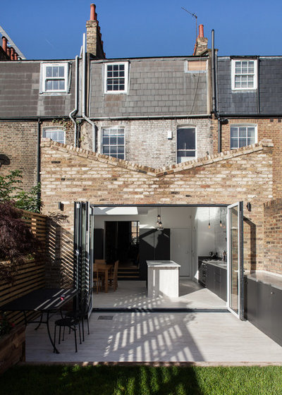
The building is listed as a historic property, so Brown had to discuss his plans carefully with conservation officials. It became clear that his design for the addition would give the period property a new lease on life.
He mirrored the slope of the roofline of the properties on the right-hand side to create a butterfly roof for the addition, which is characteristic of homes in the area.
He mirrored the slope of the roofline of the properties on the right-hand side to create a butterfly roof for the addition, which is characteristic of homes in the area.
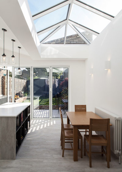
Given the home’s historical status, the architect was restricted somewhat when it came to glass. “I would typically suggest something flat, with minimal joints, but this orangery-style pyramid roof light is much more in keeping with the period of the property,” Brown says.
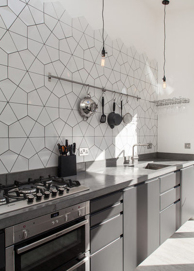
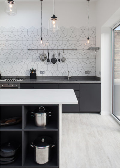
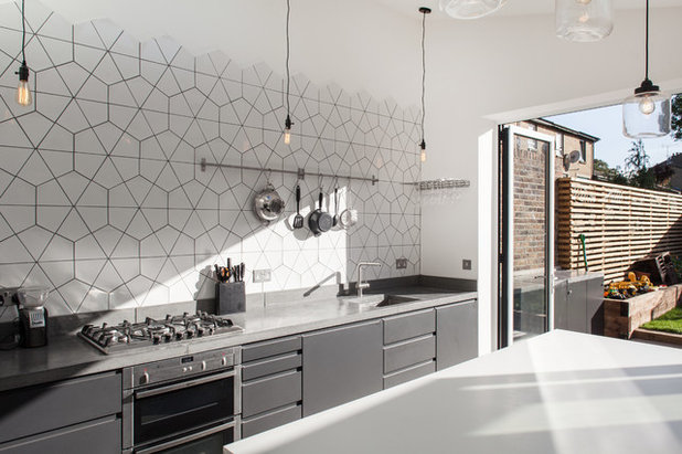
To fit in the necessary kitchen storage and counter space, Brown went for a long bank of cabinets along one wall. “We played with different layouts, but there wouldn’t really have been space for another island. Plus, the client wanted to be sure to separate the cooking space clearly for her children,” he says. The kitchen cabinet structure is from Ikea, with cabinetry from Homestyle.
Cooktop: John Lewis; oven: Neff; utensil rail: Ikea
Cooktop: John Lewis; oven: Neff; utensil rail: Ikea
Rather than installing upper cabinets, Brown wanted to create a feature wall above the countertop. “Because of the height of the room, you’d always have space above the top cupboards that would accumulate clutter,” he says, “and the units would have to be broken above the sink. Rather than installing a couple of isolated cupboards here, I fitted an extra one elsewhere.” Two full-height cupboards flank the steps up to the living room, one providing extra storage, the other for the fridge.
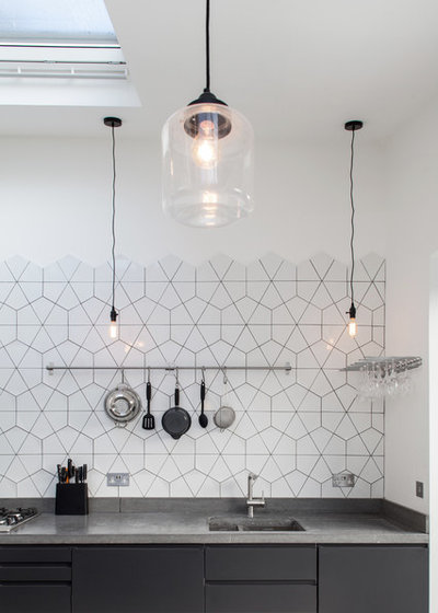
To make a feature of this space, Brown went for kite-shaped tiles that create a stunning and unusual hexagonal pattern. “Fitting it took a little magic from the tiler,” Brown says.
Diamond tiles: Solus Ceramics
To make a feature of this space, Brown went for kite-shaped tiles that create a stunning and unusual hexagonal pattern. “Fitting it took a little magic from the tiler,” Brown says.
Diamond tiles: Solus Ceramics
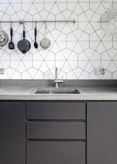
Brown opted for a sealed concrete countertop with dark gray cabinets to offset the white walls and give the home something robust that would stand up to family life. “I find it quite tricky when you have stainless steel with white finishes — it can look a bit stark and bland — so I wanted to do something to offset that,” he says.
The concrete creates a lovely variety of textures. “It’s simple and you can’t be too fussy with it. You never know quite what finish you’re going to get,” Brown says.
Concrete counters: Mortise Concrete; sink and faucet: Blanco
The concrete creates a lovely variety of textures. “It’s simple and you can’t be too fussy with it. You never know quite what finish you’re going to get,” Brown says.
Concrete counters: Mortise Concrete; sink and faucet: Blanco
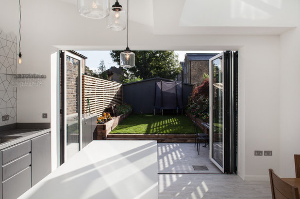
Bifold doors open to the garden, which Brown redesigned. “It’s often the case that you need to redo a garden after renovation work because it tends to become a bit of a building site,” he says. He installed two steps up to a raised grassy area, with beds on either side, one for flowers and the other for the children to play in.
At the end of the garden, he put in a rather unusual shed. “They often have an inconvenient recess next to them that tends to fill up with clutter,” Brown says. To avoid this, he installed a long, shallow design that spans the width of the garden, with multiple doors for easy access. He also reversed the angle of the butterfly roof on the addition for the shed’s roof.
At the end of the garden, he put in a rather unusual shed. “They often have an inconvenient recess next to them that tends to fill up with clutter,” Brown says. To avoid this, he installed a long, shallow design that spans the width of the garden, with multiple doors for easy access. He also reversed the angle of the butterfly roof on the addition for the shed’s roof.
The bifold doors are aluminum, and Brown chose to have a white frame on the inside, black on the exterior. “I didn’t want to use white on the outside, as it can look a little like PVC. However, I felt that black on the inside might be a bit too stark against the white walls, so we went for a white frame on the interior side of the door.”
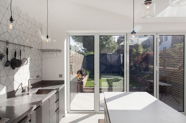
The architect chose a simple lighting scheme. “I like minimalist lights without shades,” he says. “The room felt quite pared back, and once we’d decided on the tessellating tiles, we wanted the lights to be as simple as possible so as not to detract from the pattern.”
Lighting: LightInTheBox
Lighting: LightInTheBox
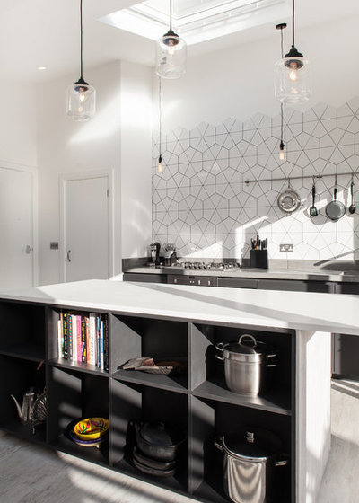
The island plays a crucial part in zoning the room and adding storage. On one side is open shelving, painted in the same color as the cupboards, which brings a bit of life to the room. “The client owned some very nice pots and recipe books, so we wanted to have a space to store them,” Brown says. On the other side of the island are three sets of deep drawers.
A small powder room sits just off the kitchen. “It’s really convenient for entertaining,” Brown says, “and we tucked the boiler away in there too. It really is very compact, but we didn’t want it to eat into the kitchen too much.” A second door leads into the hallway.
A small powder room sits just off the kitchen. “It’s really convenient for entertaining,” Brown says, “and we tucked the boiler away in there too. It really is very compact, but we didn’t want it to eat into the kitchen too much.” A second door leads into the hallway.
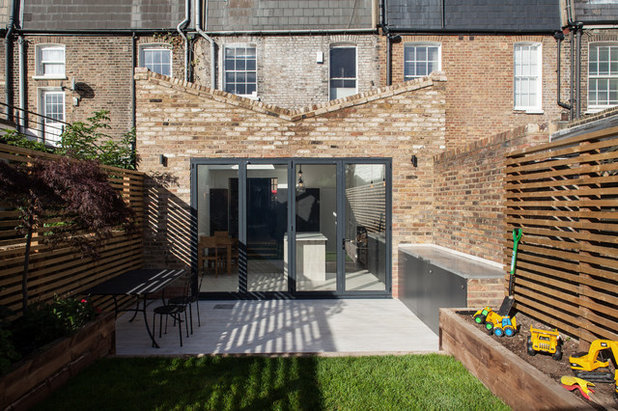
There’s a real sense of connection between the kitchen and the garden. The doors open wide, the counter surface continues atop the garden storage cabinets, and the same flooring is used for the patio, to give the sense that the room is much bigger than it is. The cabinets are weatherproofed and painted in the same dark gray, and the flooring — porcelain tiles with a slight wood effect — have sufficient grip to be used both indoors and out.
More
Graphic Black and White Kitchens for 10 Styles
A Dozen Ways to Work In Patterned Tile
More
Graphic Black and White Kitchens for 10 Styles
A Dozen Ways to Work In Patterned Tile
What are you working on?

Related Stories
Kitchen Guides
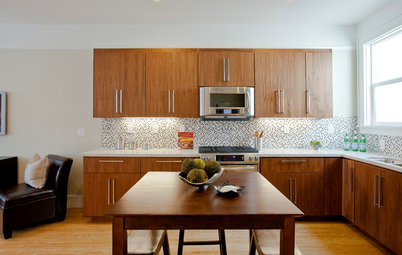
10 Key Kitchen Dimensions You Need to Know
Here are key kitchen dimensions that will help you design like a pro
Full Story
More Room Guides
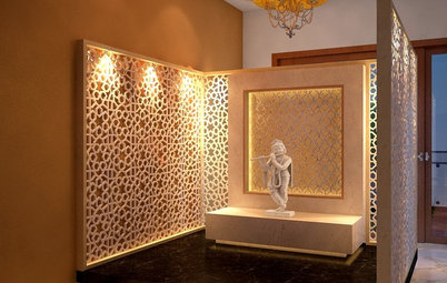
35 Serene Puja Room Designs
Take a leaf out of these elegantly designed, beautiful prayer rooms on Houzz
Full Story
Decorating Guides
What Are the Benefits of Hiring an Interior Designer?
From furnishing working drawings to beautifying the home, find out how an interior designer plays multifunctional roles
Full Story
More Room Guides
Turn One Room Into Two With These Genius Ideas
Carve out an extra room within your home with these fab room-splitting tips and tricks
Full Story
Bedroom Guides
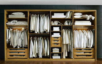
What Are the Ideal Wardrobe Measurements?
Here are dimensions for different types of wardrobe designs that ensure maximum functionality and storage
Full Story
Architecture
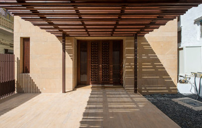
These Indian Homes Know How To Combat Harsh Climate
See how these homes by SPASM, Kumar Moorthy & Associates and JPLUSDARCHITECTS mitigate the ramifications of harsh climate ahead of time
Full Story
Architecture
How to Find an Architect That's Right for You
Make the construction and renovation of your home a pleasant and memorable journey by selecting the right architect
Full Story
Bathroom Guides
Step-by-Step: A Guide to Renovating Your Bathroom
Planning to renovate your bathroom? Learn about the different stages involved in the remodelling process
Full Story
Living Rooms
30 Best Sofa Designs
This guide gives a rundown of sofa types that will leave you spoilt for choices
Full Story
Small Spaces
7 Stylish Ways to Dry Your Laundry In a Small Apartment
Has your drying rack become a perpetual eyesore in your home? These dapper laundry drying solutions have you covered
Full Story
Wow what a great space! Love it! Everything is very clean and minimal. The bifold doors are very beautiful! Bring a lot of natural light into the space and also makes it feel very homey.
I adore this kitchen. Very thoughtful, clean and intriguing. The tile is so fresh and a departure from your typical transitional kitchen. Very well done!
http://www.kitchenandbedroomdoors.co.uk/kitchen_door_designs.asp