


9 Ways to Use Classic Blue, Pantone’s 2020 Colour of the Year
This calming hue, pulled from the sky at dusk, is meant to reassure in a tumultuous time
Jennifer Ott
7 December 2019
San Francisco-based architectural color specialist and design writer. Jennifer's work has been featured in many print and online publications. Her recently-published book, "1000 Ideas for Color Schemes," is a beautifully illustrated and easy-to-navigate guide that takes the guesswork out of selecting the perfect color palette for your home or special event. For more information on Jennifer Ott Design, visit http://jenottdesign.com/.
San Francisco-based architectural color specialist and design writer. Jennifer's... More
“We are living in a time that requires trust and faith,” says Leatrice Eiseman, the executive director of the Pantone Color Institute, in a release announcing the company’s 2020 Colour of the Year. “It is this kind of constancy and confidence that is expressed by Classic Blue, a solid and dependable blue hue we can always rely on.” Eiseman goes on to explain that Pantone’s selection is aimed at challenging us to “think more deeply, increase our perspective and open the flow of communication.”
That’s a tall order for a colour, but it seems the folks at the colour management company feel what the world needs most in 2020 is a reassuring pat on the back, and this is the colour to make that pitch.
That’s a tall order for a colour, but it seems the folks at the colour management company feel what the world needs most in 2020 is a reassuring pat on the back, and this is the colour to make that pitch.
Classic Blue is a deep “true” blue colour in that it doesn’t veer green or violet. It’s lighter than navy but darker than sky blue, making it a “Goldilocks” hue – it’s just right. I liken it to blue denim jeans that you can pair with a shirt of any other colour. It’s an easy hue to work into a home, because it plays so well with other colours and can be used in and on any style of home, from traditional to contemporary.
If you’re a fan of this dashing choice, let’s explore the various ways you can bring it into your home.
If you’re a fan of this dashing choice, let’s explore the various ways you can bring it into your home.
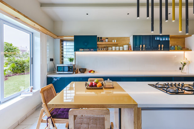
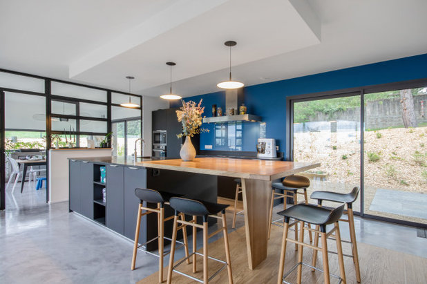
1. Kitchen cabinets
Navy blue has been a popular kitchen cabinet colour lately, but I think slightly lighter and bolder Classic Blue and similar hues could give navy a run for its money. Here the blue adds depth and richness to an otherwise white-and-wood kitchen.
Find an interior designer
Navy blue has been a popular kitchen cabinet colour lately, but I think slightly lighter and bolder Classic Blue and similar hues could give navy a run for its money. Here the blue adds depth and richness to an otherwise white-and-wood kitchen.
Find an interior designer
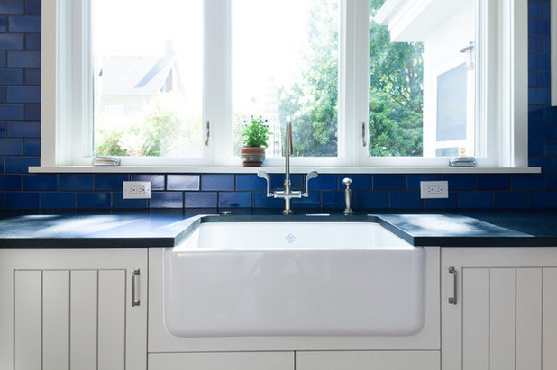
2. Backsplash
You can also go for a blue backsplash. This can be a more wallet-friendly way to introduce the colour in your kitchen, especially if your backsplash is relatively small.
You can also go for a blue backsplash. This can be a more wallet-friendly way to introduce the colour in your kitchen, especially if your backsplash is relatively small.
Here’s a painted blue backsplash wall that’s cleverly covered in glass where needed, to protect the wall from heat and from food and grease spatters.
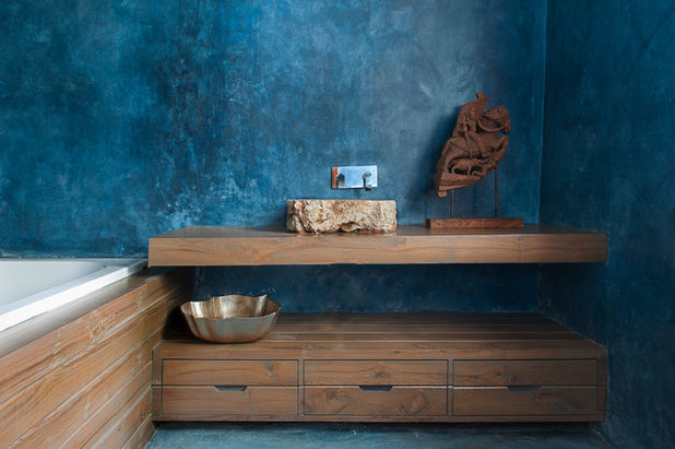
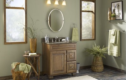
3. Bathroom
Of course the kitchen shouldn’t get all of the colour fun. Check out the dazzling blue wall in this gorgeous bathroom.
Blue is a smart colour selection for a bathroom, because we tend to associate it with the sea and the sky. If you want to channel a resort vacation – or pretend you are perpetually on one – blue is your hue.
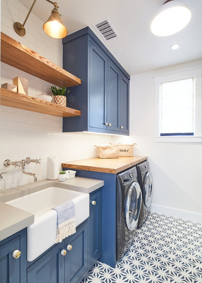
4. Laundry room
Most of us have a strong dislike for doing laundry, but if you can make the space as inviting as this one, I think the chore would be much more tolerable.
If you are unsure about bringing such a bold blue into your kitchen or bathroom, maybe go for it in the laundry room instead. Unlike a kitchen, it’s not a room you spend loads of time in (unless of course you have lots of loads to do). Either way, it adds a fun touch of colour to a room that’s not necessarily a public space that gets seen by many.
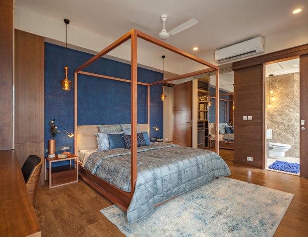
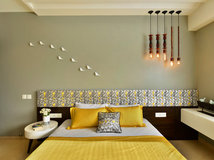
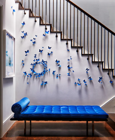
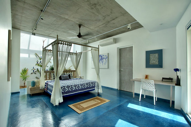
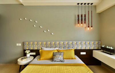
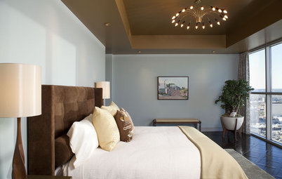
5. Bedroom
If you tend to feel frazzled and stressed out at the end of the day, blue might be the right hue for your bedroom. Cool colours tend to make us feel calmer, making blue a good choice to chill out with.
I like this wall covering not just for the colour but also for the texture it brings. A blue painted wall might feel a bit flat, especially if the paint has a matte finish and the wall is left unadorned. A wall covering like this adds an interesting texture that can stand on its own.
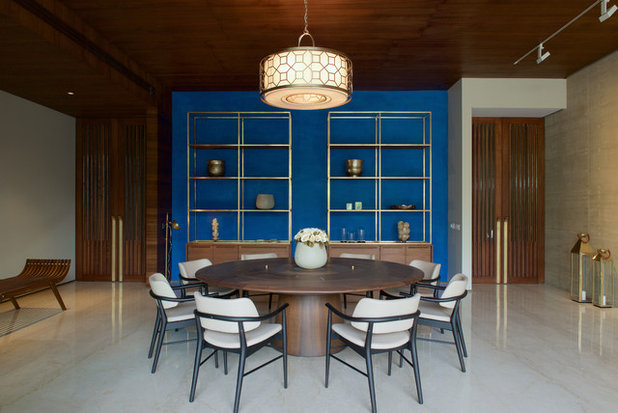
6. Accent wall
Because it’s rather dark, I think Classic Blue works best in relatively small doses, such as on an accent wall. Keep in mind that cool colours visually recede, so painting a wall blue is a good trick for making a small room appear larger.
Because it’s rather dark, I think Classic Blue works best in relatively small doses, such as on an accent wall. Keep in mind that cool colours visually recede, so painting a wall blue is a good trick for making a small room appear larger.
7. Furniture and decor
You can add it in even smaller doses, such as through furniture, artwork and decorative accessories. This is one of the easiest and low-commitment ways to add colour to a home. If you enjoy constantly changing the look and feel of your home, and playing with the latest trends, think about employing trendy colour via decorative accessories.
You can add it in even smaller doses, such as through furniture, artwork and decorative accessories. This is one of the easiest and low-commitment ways to add colour to a home. If you enjoy constantly changing the look and feel of your home, and playing with the latest trends, think about employing trendy colour via decorative accessories.
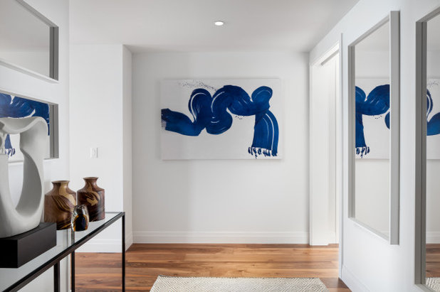
Here’s another example of bringing colour into a home in small decorative doses. This abstract painting features a Classic Blue-like hue, and it really dresses up this home’s entry. It’s simple, elegant and very stylish.
8. Flooring
It’s important to mention that you should never pick a colour to decorate with just because it’s trendy. That being said, if you like a colour that has been deemed a Colour of the Year, then it’s a good time to shop for furnishings and materials in that hue, because they’ll likely be easier to find.
Take your flooring. This is not something you are going to change out every time Pantone or your favourite paint brand announces a new Colour of the Year. So make sure you truly love it, and then go for it.
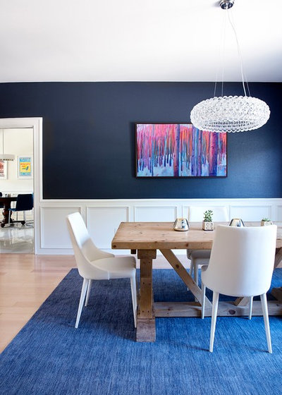
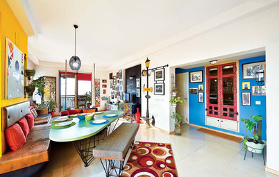
Of course, a less permanent way to bring in colour on the floor is with an area rug. This beautiful carpet plays off the colours in the painting nicely. And if you grow tired of the hue you’ve chosen, it’s relatively easy to change it.
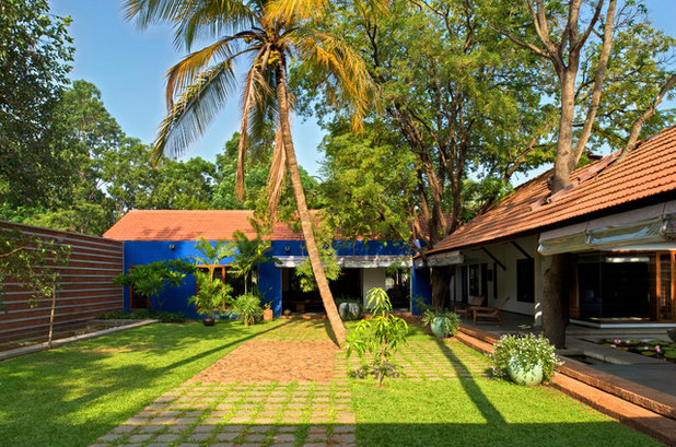
9. Exterior
One of my favourite ways to design with blue hues is to take them outside.
One of my favourite ways to design with blue hues is to take them outside.
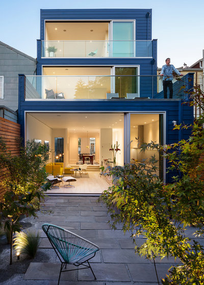
And, as I mentioned in the introduction, this colour works on any style of home, from traditional – as in the previous example, to contemporary – as shown here. It’s a colour that feels at home outside, because it conjures natural elements such as water and sky.
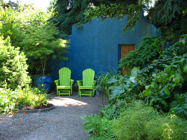
It also makes a nice backdrop for lush landscaping. Blue and green are analogous colours, meaning they sit right next to each other on the colour wheel. They have a harmonious feel when used together, since they don’t contrast each other the way colours opposite on the colour wheel do.
Read more:
Colour Me Bold: 11 Ways to Energise Your Home
How to Choose Colours for Your Home
Tell us:
What do you think about the new Pantone Colour of the Year?
Read more:
Colour Me Bold: 11 Ways to Energise Your Home
How to Choose Colours for Your Home
Tell us:
What do you think about the new Pantone Colour of the Year?
What are you working on?


Related Stories
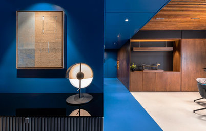
Photo Books
35 Trending Wall Colours From Urban Indian Homes
Take your pick from versatile neutrals to brilliant jewel tones, from raw concrete hues to abstract colour blocking
Full Story
Most Popular
Where to Use Which Paint?
Know your emulsions from your acrylics, and the right types for painting the home's interior & exterior
Full Story
Decorating Guides
How to Decide on a Colour Scheme for the Whole House
Don't be daunted. With these strategies, building a cohesive scheme for your entire home is less difficult than it seems
Full Story
Indian Homes
Is Too Much Colour a Bad Thing? These Indian Homes Say No
Go bold or go home ... these spaces do both admirably
Full Story
Colour Guides
When Colours Are Not What They Seem
By Tess Dolan
Understand the tricks colours can play on you and what can be done to avoid pesky pairings in the home
Full Story
Decorating Guides
Timeless Wall and Sofa Colour Combinations
Here is a compilation of wall and sofa colour combos that help achieve a balance or create an intriguing contrast in the living room
Full Story
Most Popular
11 Paint Colours That Complement Wood Details
Pair your wood trim and cabinets with the right shade of wall paint to bring out the beauty in both
Full Story
Decorating Ideas
12 Ceiling Colours That Aren't White & Why You Would Want Them
These surprising ceiling colours will have you looking up to them and away from the ubiquitous white
Full Story

Photo Books
22 Ways to Use Colour in Your Home
Our coffee-break escape offers you five minutes' worth of images to inspire and delight. Jump right in...
Full Story
Kitchen Guides
24 Alluring Kitchen Colour Ideas & Combinations
Do you want your kitchen to be its own person (so to speak)? Here we look beyond neutrals to beautifully coloured kitchens
Full Story
Now that is classic!
This blue......every house we’ve owned......it’s there somewhere! Two blue kitchens. Dining room. Bedroom. And of course, rugs!
Our go to colour for 45 yrs.
I've used this color in two houses. What is the flooring in photo no. 9?