Maison & Objet: Top 7 Colour Trends for 2019
What colors are we going to be seeing in 2019? We went to the Maison & Objet trade fair in Paris to find out

Since 1995, Maison & Objet in Paris, France has been one of the most important international meetings for professionals in lifestyle, interiors and design. Held twice a year, the trade fair brings together about 3,000 exhibitors and nearly 90,000 visitors, half of whom come from outside France. Houzz editors scouted the stands at the latest edition to find this year’s biggest ideas, including the colours we can expect to see on everything from bedspreads to walls this coming year.
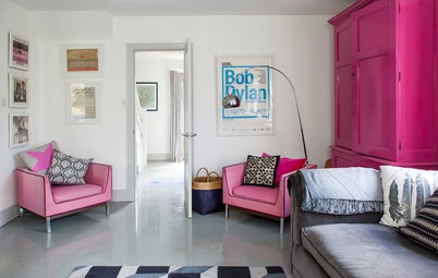
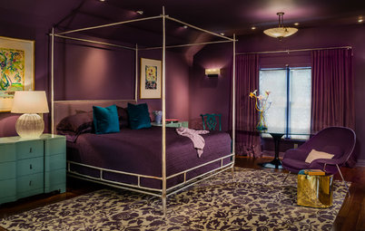
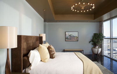
1. Bordeaux
We have seen it in fashion collections and will now be seeing more of it in interior design. From a very dark blood-red to frankly purplish, look for it on walls, velvet seats, daybeds and couches.
Wondering how to work with red walls?
We have seen it in fashion collections and will now be seeing more of it in interior design. From a very dark blood-red to frankly purplish, look for it on walls, velvet seats, daybeds and couches.
Wondering how to work with red walls?
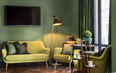
2. Brunswick green and British racing green
Already popular in 2018, green is a colour people still want to see more of, especially with the growing trend of green living. Fir green, the protagonist at last year’s Maison et Objet, has given way to a greyer shade that leans towards khaki.
However, though greenery can be calming, large swaths painted in British racing green, cedar or moss may be more daring propositions. Can you still have a healthy glow at breakfast against a dark-green background? However, green is sure to have its day thanks to the vogue for classic chic.
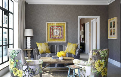
3. Coral to rust
This warm colour palette, often matched with green for contrast, revolves around last December’s Pantone Colour of the Year: Living Coral, a blend of orange and pink. Other shades of pink – like blush pink, salmon and dusty rose – and burnt orange were also widely represented at this year’s event. And we can bet on the continued popularity of rust and tawny yellows.
This warm colour palette, often matched with green for contrast, revolves around last December’s Pantone Colour of the Year: Living Coral, a blend of orange and pink. Other shades of pink – like blush pink, salmon and dusty rose – and burnt orange were also widely represented at this year’s event. And we can bet on the continued popularity of rust and tawny yellows.
4. From mustard to curry
This warm colour palette will be a good match to shades of yellow like old gold, mustard, saffron, honey and turmeric to liven up the year.
Matte gold is another big trend, and we are also noticing a craze for gold fittings and brushed-brass lamps. These will add brilliant notes of enchantment to homes in 2019.
See how spaces can light up with yellow
5. Bright, natural hues
This year, neutral colours and lighter, more natural tones will run the gamut from cream and beige to shades of honey, and from sienna to mouse-grey. These remain safe bets, especially in classical interiors or as contrasts to Bohemian style.
This year, neutral colours and lighter, more natural tones will run the gamut from cream and beige to shades of honey, and from sienna to mouse-grey. These remain safe bets, especially in classical interiors or as contrasts to Bohemian style.
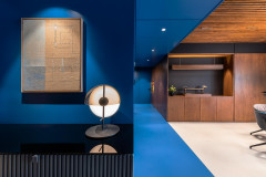
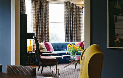
6. From peacock-blue to petrol
Blue has been a strong presence in decor in recent years, and has by no means left the limelight. Indeed, it tends to be the first colour people dare to use when they take the plunge away from white. This year teal, which we have seen over and over recently, has given way to the darker peacock blue. Take note: Subtle variations in shade make all the difference.
Petrol blue and grey-blues with reassuring retro tones have also gained the upper hand. Furthermore, we can count on seeing more ultramarine, Klein blue, and even electric navy blue.
Here’s how to pick the right shade of blue paint
7. Shades of grey
Finally, black, anthracite and storm grey are sure to seize the living room walls of the most daring decorators, making a clean break from the restrained white bases we have seen in recent years. We can see a trend for black kitchens in this movement too. The 2019 home is going to rock’n roll.
Read more:
Colour Me Bold: 11 Ways to Energise Your Home
Tell us:
Which colour trend are you most excited to experiment with? Tell us in the Comments below.

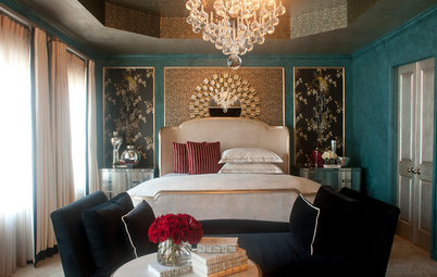
Turning away from the last few years’ obsession with Scandinavian white, pastels and light-coloured wood, we now plunge into a dark universe that draws on English Victorian influences. It’s a “classic with a twist,” trend-spotter Vincent Grégoire says. What we see is bourgeois style mixed in with contemporary spirit. In this retro movement, the most popular colours are not bright but earthy and matte, as if dug up from a historic past.