


9 Striking Paint Effects to Try at Home
Want to make a statement with your wall colour? Take a look at these smart decorating tricks
Victoria Harrison
22 September 2018
Editor, Houzz UK and Ireland
From vertical ‘steps’ of colour and shaded demarcations to ombre wall effects, there are so many different ways to play with paint and create decorative paint techniques. Here are 9 of the most creative ideas on Houzz.
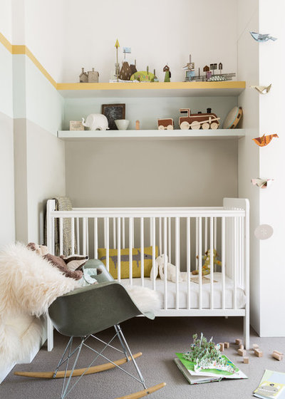
Zone vertically
This little nursery nook is soothing and restful while still packed with interest and detail, thanks in part to the clever use of paint colours.
By stepping the colours up from dark to light, it gives a cocooning feeling at the lower level which gets lighter and brighter as your eye travels up towards the ceiling.
By taking the first colour up to the lower shelf it provides a larger wash of the main colour behind the cot, but the shelf acts as a natural point to break the colour and introduce the next step, and again with the shelf above.
The strip of bright yellow along the edge of the top shelf also adds a zip of sunshine that continues in a slim band around the rest of the room, adding a tiny shot of powerful colour to the otherwise restful scheme.
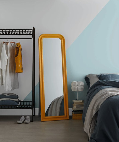
Mark an open-plan space
How to separate the different zones in an open-plan space? Step forward directional wall paint. Here, a simple diagonal line divides a calm and restful blue tone above the bed from a crisp shade of white that demarcates the wardrobe area.
If you have an open-plan space that you’d like to carve up into different zones, try marking out two or three main ‘areas’ and allocate each one a colour that matches the mood you want to create in this space, such as restful, energising or playful.
Here’s how to tackle the decorating dilemma in open plan spaces
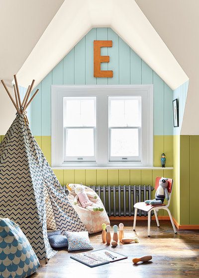
Highlight an unusual feature
This window nook is such a lovely shape it would have been a shame to treat it as just another wall by painting the entire room all one shade.
By using colour to draw attention to the shape, it becomes a beautiful feature in its own right, and by confining the wash of blue to the beautifully shaped slice of wall in this alcove it creates a bright and fun play nook, perfect for a children’s room.
If the rest of the room had been entirely neutral, however, this splash of blue might have been a little jarring, but by continuing the lower wall colour out into the rest of the room, it connects the space and allows the nook to feel like a carefully considered part of an overall scheme.
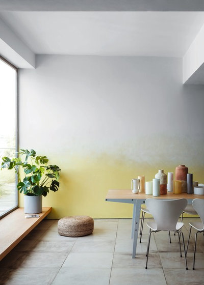
Ombre dark to light
If this paint effect gives you flashbacks to the rag-rolling techniques of the 19080s, don’t be scared. Ombre paint effects are a modern update on the textured paint style, and when done right they can create a fresh and modern effect to a room.
Here, a sunshine-yellow shade has been softly blended into a crisp white to give interest, depth and fun to a plain wall.
If you’re a paint-effect beginner, stick to just two shades, apply the lighter colour first then blend, blend, blend the darker shade to create a soft and seamless colour transition. Or, better still, find a professional decorator in your area to do it for you.
See how these spaces light up with the colour yellow
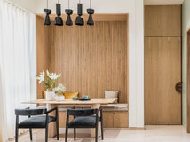
Gild the ceiling
Here’s another room that plays with different colours in the same tonal range, this time dark blue and green have been placed next to each other for an effect that almost reads as one colour at first glance, but which adds depth and interest upon closer inspection.
The stand-out feature of this room, however, is the gold-painted ceiling. Did you miss it at first? Often overlooked, the ceiling, or the ‘fifth wall’, is a great place to experiment with colour, and in this room the warm gold tone creates a soft cocooning effect. Another paint trick that will achieve a similar result is to take the wall colour and apply a cohesive wash of it over the coving and ceiling, doing away with the sharp line-break effect of white-painted coving or ceiling.
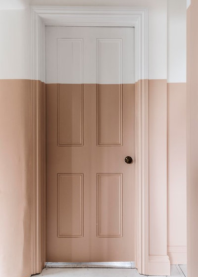
Make a clean line
This homeowner has taken a line of colour from ground level to halfway up a wall along their landing, and they have fully committed to the look, bringing the half-wall effect right around the doorframe and the door itself.
The reason for this bold move? The property has a few different types of roof – gable, pitched and flat – so the mismatched ceilings presented a challenge when it came to painting the landing. The couple had chosen this nude plaster colour for the walls, which they really loved. However, it would have looked quite confusing to paint up to the different angles and heights of the ceiling.
By keeping the top section white, they unified the different ceilings to make it feel more cohesive.
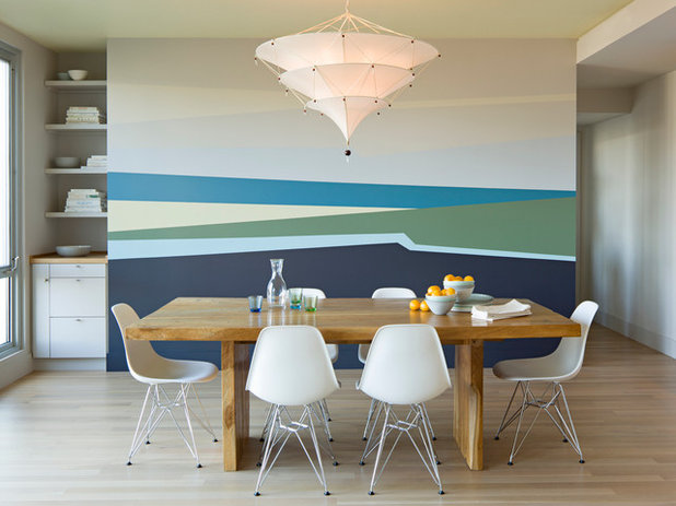
Create a mural
What do you see when you look at this wall… a sweep of sandy beach? A wash of ocean blue? Just a few lines of colour can result in a fun visual effect and bring life and interest to a flat surface. If you want something that looks like a large-scale piece of art on a shoestring budget, try getting creative with your paint application.
This design could be replicated relatively easily with some good pre-planning, a roll of masking tape, a selection of tester pots and a dollop of patience. If in doubt, ask a professional decorator to help you.
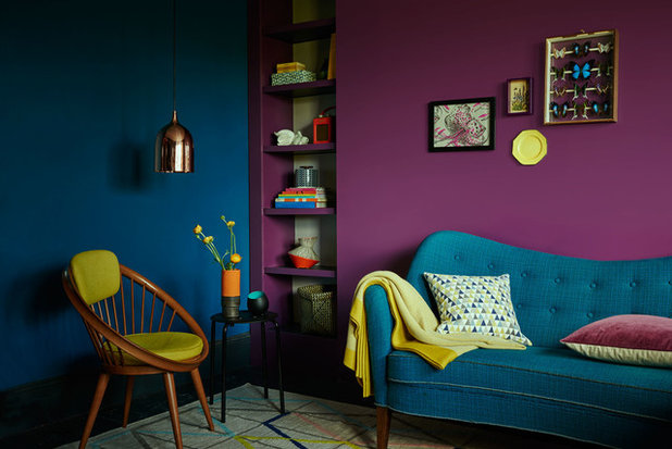
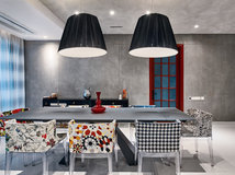
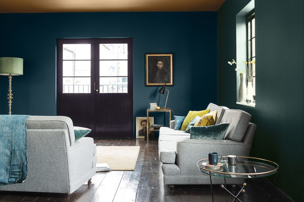
Team up power shades
Why have one feature wall when you can have two! In this dark and dramatic room scheme, a rich purple and saturated teal cosy up against each other to create a double-whammy of deep colour. This works so well because they are both the same tone, which means one shade isn’t lighter or darker than the other – a good rule of thumb when pairing up different colours. Imagine if the photo above was in black and white, these two colours would both read as roughly the same shade of grey.
Dark colours are also a wonderful backdrop for brighter shades and warm metallics. Just look at the way the citrus-yellow accents leap out against the blue and purple, and see how the warm copper-coloured pendant light glows from the wash of teal blue behind.
Learn how to use blue in your home
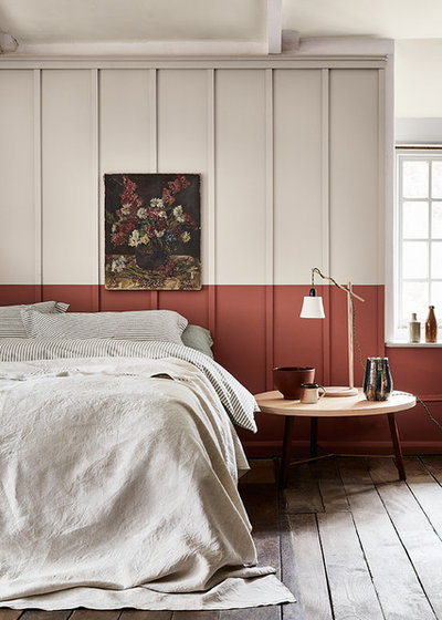
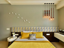
Create a headboard
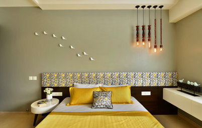
If you take a quick, first look at this photo you might notice the beautiful teracotta-coloured headboard. Then, give it a closer look and you’ll realise it’s actually just a smart paint trick that marks out a ‘headboard’ on the panelled wall behind the bed in this lovely bedroom.
By carrying the paint effect over, and not just using it on the area directly behind the bed, it also gives the illusion of the ‘headboard’ panelling running along the lower section of the wall.
To create a similar effect in a bedroom, choose a darker colour for the lower wall, and choose two colours from the same paint ‘family’ (ie two warm tones, or two cool tomes) for a cohesive look rather than a jarring effect.
Read more:
The Secret to a Long-Lasting Wall Paint Job
Tell us:
How have you used paint in your home? Tell us in the Comments below.
What are you working on?

Related Stories
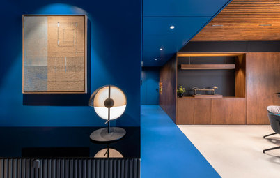
Photo Books
35 Trending Wall Colours From Urban Indian Homes
Take your pick from versatile neutrals to brilliant jewel tones, from raw concrete hues to abstract colour blocking
Full Story
Most Popular
Where to Use Which Paint?
Know your emulsions from your acrylics, and the right types for painting the home's interior & exterior
Full Story
Decorating Guides
How to Decide on a Colour Scheme for the Whole House
Don't be daunted. With these strategies, building a cohesive scheme for your entire home is less difficult than it seems
Full Story
Indian Homes
Is Too Much Colour a Bad Thing? These Indian Homes Say No
Go bold or go home ... these spaces do both admirably
Full Story
Colour Guides
When Colours Are Not What They Seem
By Tess Dolan
Understand the tricks colours can play on you and what can be done to avoid pesky pairings in the home
Full Story
Decorating Guides
Timeless Wall and Sofa Colour Combinations
Here is a compilation of wall and sofa colour combos that help achieve a balance or create an intriguing contrast in the living room
Full Story
Most Popular
11 Paint Colours That Complement Wood Details
Pair your wood trim and cabinets with the right shade of wall paint to bring out the beauty in both
Full Story
Decorating Ideas
12 Ceiling Colours That Aren't White & Why You Would Want Them
These surprising ceiling colours will have you looking up to them and away from the ubiquitous white
Full Story

Photo Books
22 Ways to Use Colour in Your Home
Our coffee-break escape offers you five minutes' worth of images to inspire and delight. Jump right in...
Full Story
Kitchen Guides
24 Alluring Kitchen Colour Ideas & Combinations
Do you want your kitchen to be its own person (so to speak)? Here we look beyond neutrals to beautifully coloured kitchens
Full Story
love the creativity
My son and I just recently completed this mural in his room. He designed and taped it I just mixed the colours. What’s the worse thing that can happen? It’s only paint.
We have sloping ceilings in the upstairs bathroom in our old Victorian, and I painted an ombre ellipses to disguise it.