
Beige Or Grey: Which Neutral is Right For You?
A designer shares 10 tips for working with the neutral shade that works best for you

When I start a project with a client, one of the first things I like to determine is if they’re more of a beige or a grey. What I mean by that is, nearly all projects need a neutral colour that works as a general backdrop, or canvas, that will steer the direction of the design. I generally find that clients gravitate to one neutral more than the other. Selecting a neutral doesn’t mean we won’t use other colours in the space; it just means the palette will start with an underlying neutral tone. People’s preferences for beige or grey tend to trump trends, but one is often trendier than the other. But no matter which one is currently the most popular, beige and grey will always stand the test of time.
2. Warm things up with beige
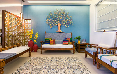
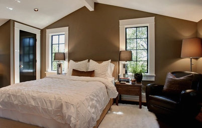
If you lean toward beige, you’ll often like browns, taupes and warmer colours. Even if you want your space to be all wood, you’ll still need to choose your backsplash, countertops and fixtures. Oil-rubbed bronze or copper fixtures work particularly well in beige spaces. Creamy marbles and limestones with brown and gold veining also work well.
Browse through images of beige spaces
3. Not all greys are cold
Greys come in so many different temperatures. There are plenty of warm greys out there to keep your space looking cozy. When working with greys, it’s important to choose those with the same undertone (blue, green, red or pure grey.) You can choose fabrics, paints and accessories that have a multitude of shades, some lighter, some darker, as along as the undertone is the same.
Greys come in so many different temperatures. There are plenty of warm greys out there to keep your space looking cozy. When working with greys, it’s important to choose those with the same undertone (blue, green, red or pure grey.) You can choose fabrics, paints and accessories that have a multitude of shades, some lighter, some darker, as along as the undertone is the same.
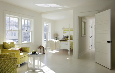
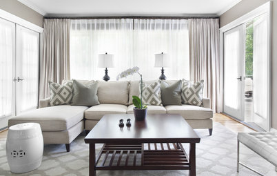
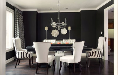
4. Beige loves contrast
Beige looks really great when it’s paired with much lighter and much darker elements. If you don’t bring in contrast when using beige, you run the risk of your space looking “muddy” in colour.
Learn how to play with contrasts in the living room
Beige looks really great when it’s paired with much lighter and much darker elements. If you don’t bring in contrast when using beige, you run the risk of your space looking “muddy” in colour.
Learn how to play with contrasts in the living room
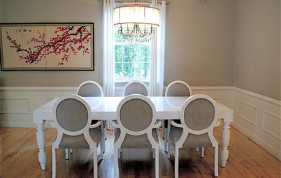
5. Dark greys look best with light or medium wood tones
If you choose a dark wood, the beauty of the grey and the wood might get lost. If you must use dark wood, choose a lighter shade of grey. And by the way, dark woods look fabulous with beige.
If you choose a dark wood, the beauty of the grey and the wood might get lost. If you must use dark wood, choose a lighter shade of grey. And by the way, dark woods look fabulous with beige.
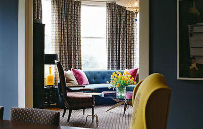
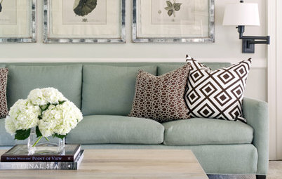
6. Grey is colour’s best friend
Greys really help colours pop, especially against a darker grey. The nice thing about having grey as your backdrop colour is that it gives you the option of switching out your accent colour. It’s very easy to refresh a grey canvas by simply adding or changing colours.
Here’s how to pick the right shade of grey
7. Beige and colour can get along too
It’s important that you choose beiges with the same undertone. Softer colours work well with beige. If you introduce dark browns to your palette, it opens up your options for brighter and more vibrant colour choices.
It’s important that you choose beiges with the same undertone. Softer colours work well with beige. If you introduce dark browns to your palette, it opens up your options for brighter and more vibrant colour choices.
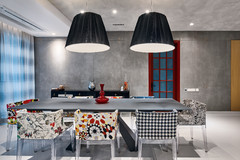
8. Beige and grey look fantastic with black elements
Black doesn’t have to darken a space. In fact, black will often make a space appear brighter if used to create contrast. Shades of charcoal will have the same effect when used in light grey spaces. But it’s best to stay away from using charcoal in beige spaces since they will most likely clash.
See which colours work with black
9. Grey works well with many types of stone
There are lots of stones that have grey veining or undertones. Carrara marble, Statuario marble, Statuarietto marble and slate are all great examples. Stone is a classic finish that will never go out of style. But please don’t mix these types of marbles with beige stone. If you can’t find another stone to coordinate with your chosen marble or slate, look into a porcelain tile to work with your natural stone.
There are lots of stones that have grey veining or undertones. Carrara marble, Statuario marble, Statuarietto marble and slate are all great examples. Stone is a classic finish that will never go out of style. But please don’t mix these types of marbles with beige stone. If you can’t find another stone to coordinate with your chosen marble or slate, look into a porcelain tile to work with your natural stone.
10. When it’s OK to mix
On rare occasions, it’s possible to find greys or beiges that have a blurry line distinguishing the two. That’s when you can mix them. But it’s a challenging endeavour. And what may be even more difficult is finding a person who loves both beige and grey equally.
Read more:
How to Create Magic With Light Grey
How to Make a Beige Room Pop
Tell us:
Which neutral do you lean towards more? How have you used it around your house? Share images and your ideas in the Comments below.

Even if you don’t want to use a lot of grey or beige, it’s still important to determine which way you lean. Beige and grey look fabulous with natural materials, such as wood. But your finishes (your countertops, appliances, fixtures) will need to follow a particular direction. Some may disagree with me, but it doesn’t work well to use beiges and greys together, unless the distinction between the two is blurry. In this kitchen, the countertops and wall colour indicate that this person’s preference is grey.