Paris Houzz: A 280-Sq-Ft Flat Squeezes in Comforts of a Big Apartment
This custom-made layout brings all the functions of a much larger apartment to this tiny space

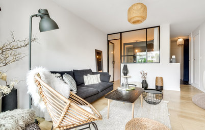
In France, more and more people work in Paris during the week and then spend weekends with their families in the provinces. Hotels and friends’ sofas have their limits, and when the situation becomes permanent it makes more sense to invest in a pied-à-terre. This 26 square metre (280 square feet) studio in an old building in the dynamic Montorgueil district of Paris was designed to be just such a crash pad.
The studio was originally run-down, but also bright and quiet. That it overlooks a courtyard in a central part of the French capital was another bonus. It was a dream apartment for this young owner. So, he asked the interior designers at Atelier Daaa, whose projects he had seen on Houzz, to optimise it for his lifestyle and give it a makeover, so that he could feel good in it despite being far away from his family. After three months of work, the apartment got a totally new look.
The studio was originally run-down, but also bright and quiet. That it overlooks a courtyard in a central part of the French capital was another bonus. It was a dream apartment for this young owner. So, he asked the interior designers at Atelier Daaa, whose projects he had seen on Houzz, to optimise it for his lifestyle and give it a makeover, so that he could feel good in it despite being far away from his family. After three months of work, the apartment got a totally new look.
Before
Originally the studio had a closed yellow kitchen with a black-and-white floor. It was not really to the new owner’s taste.
The designers opened the studio up, and then created a modular, but still functional, layout. In other words, they wanted to make sure it would not be laid out like a trailer, where the living room turns into a bedroom or office.
“We didn’t want a Swiss army knife, where to use one blade you have to lose another. We wanted all the functions to coexist without the space looking cluttered – despite the small area. It was a real brain teaser,” Guilbault says.
In addition to the months of planning needed to figure out the best layout, two other factors pushed up the final cost.
First, the work had its share of unpleasant surprises: “This 18th-century timber-framed building had settled, so the floor had a height difference of about 20 centimetres [8 inches] from one side to the other,” Guilbault says. “We had to make it level again by laying down a screed and a steel deck. In addition, we replaced the windows with double-glazed wooden ones made by a carpenter, changed out the fan heaters for electric ones by Thermor and put in an entire drainage system, which had been missing.”
Second, the owner is not a student, and design is important to him, so he chose high-end finishes: Solid oak flooring, cement tiles in the kitchen and birch plywood woodwork. “The average budget for this type of space is usually only around ₹1,69,387 ($2,500) per square meter,” Guilbault says.
Find a designer from the Houzz directory to design your home
After
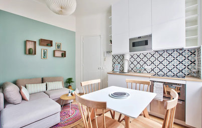
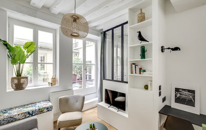
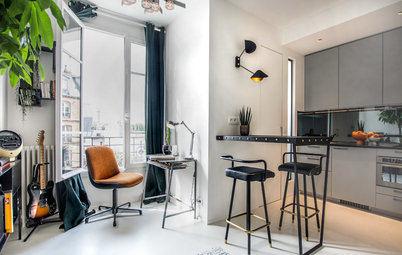
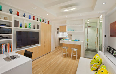
The entrance to the studio is just to the left of the kitchen. The small living room is immersed in soft, bright light. The floor and walls are finished in a combination of white paint and light-coloured wood, borrowed from Scandinavian style. Black details and geometric patterns enhance the contrasts and lend a graphic touch to the space.
The entrance to the studio is just to the left of the kitchen. The small living room is immersed in soft, bright light. The floor and walls are finished in a combination of white paint and light-coloured wood, borrowed from Scandinavian style. Black details and geometric patterns enhance the contrasts and lend a graphic touch to the space.
Cement floor tiles with a labyrinth pattern adorn the entrance, kitchen and bathroom.
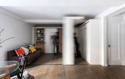
The highlight of the living area is this birch plywood panel, which partially separates it from the sleeping area. The partition slides along a rail in the dropped ceiling and allows the space to be modified in three different ways.
The highlight of the living area is this birch plywood panel, which partially separates it from the sleeping area. The partition slides along a rail in the dropped ceiling and allows the space to be modified in three different ways.
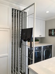
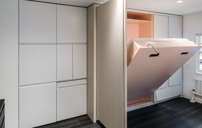
First, it can conceal the openwork closet where the washing machine and storage water heater are nestled.
It can also be moved to hide the passage to the bedroom, located near the headboard, or it can cover the bookcase and TV stand.
“The sliding wall has no technical function, but it brings the space to life by giving it some movement,” Guilbault says. “It is important to let the occupant of such a small place choose what he wants to see. It prevents monotony.”
“The sliding wall has no technical function, but it brings the space to life by giving it some movement,” Guilbault says. “It is important to let the occupant of such a small place choose what he wants to see. It prevents monotony.”
The partition, like the majority of the carpentry work, is matte-varnished birch plywood. Atelier Daaa particularly likes this material for its Scandinavian flair and graphic edges, which do not have to be refinished afterwards, as a laminate might be, for example. Although it is quite heavy, the panel slides very easily thanks to a track from Hawa fixed to the ceiling.
Check out ways to partition spaces without building walls
Check out ways to partition spaces without building walls
The bookcase and flat-screen TV module was planned out in great detail. The top is only about 8 inches (20 centimetres) deep, while the bottom, which features drawers, sinks into the platform. They house the router, amp, video game console and so on.
“We made the fronts of the drawers in the same pattern as the laundry closet. This openwork style has both aesthetic and technical purposes. It provides ventilation for heat-emitting devices and allows you to change channels without having to open the drawer,” Guilbault says.
“We made the fronts of the drawers in the same pattern as the laundry closet. This openwork style has both aesthetic and technical purposes. It provides ventilation for heat-emitting devices and allows you to change channels without having to open the drawer,” Guilbault says.
The top of the bookcase has open spaces to make the room appear larger than it is.
Behind this partition, the bedroom was designed as a sleeping box: “The difference is that there isn’t really space to move around the bed. Still, this type of alcove is just as comfortable as a real bedroom,” Guilbault says.
The bed can be accessed either from this small passage between the laundry closet and the television…
The bed can be accessed either from this small passage between the laundry closet and the television…
…or from the foot of the bed. This also serves as a seat for the built-in desk along the wall. Sitting at the foot of the bed, the owner can work facing the window while enjoying a view of the trees outside.
“The great advantage of a custom-made layout is being able to create links between separate areas,” Guilbault says.
The well-chosen finishes likewise unify the spaces in the apartment: “Just as the tiles at the entrance run straight into the bathroom to create unity, birch furniture here unifies the living room and the sleeping area.”
The double bed has been placed on a platform in order to differentiate the zones and gain some space. “This is the second modular element in this studio, but we have worked on the modularity so that you do not lose one function to create another. Rather, it is an optimised layout,” Guilbault says.
A 55-by-75-inch (140-by-190-centimetre) frame and slats were integrated into the top of the 20-inch-high (50-centimetre-high) platform by a carpenter. They lift up to reveal 106 cubic feet (3 cubic metres) of storage space, where the owner can keep his luggage.
A 55-by-75-inch (140-by-190-centimetre) frame and slats were integrated into the top of the 20-inch-high (50-centimetre-high) platform by a carpenter. They lift up to reveal 106 cubic feet (3 cubic metres) of storage space, where the owner can keep his luggage.
A small niche at the head of the bed serves as a bedside “table.” It has been equipped with a light switch for both the bedroom area and the living room and has several outlets for the owner to charge his portable electronic devices.
The closet is composed of several vertical storage units.
Take a look at these over-bed storage ideas
The closet is composed of several vertical storage units.
Take a look at these over-bed storage ideas
It has been designed as a continuation of the laundry cabinet, and is therefore 23½ inches (60 centimetres) deep. There are lights inside it, while an LED strip backlight was placed behind a filler strip to give the bedroom area a beautiful atmosphere after dark.
The office shelf extends to the end of the living room: “It was a good way to lengthen the lines of the living room, rework the spaces and add storage,” Guilbault says.
The shelf is wider on the office side than in the living room because the rear facade of the building is slightly angled. This trick makes the room seem more rectangular.
Opening up the living room created space for a custom-made 6½-foot-long (2-metre-long) linear kitchen unit that extends to the ceiling.
The cabinet doors have no hardware, to create a lightweight feel. The bottom cabinets are birch, while the the top ones are in pale-grey lacquered MDF. The countertop is made of Solid Surface.
The cabinet doors have no hardware, to create a lightweight feel. The bottom cabinets are birch, while the the top ones are in pale-grey lacquered MDF. The countertop is made of Solid Surface.
The kitchen does not have a dishwasher, but it does feature a combination microwave, an induction hob, a small refrigerator and plenty of storage space.
As in the rest of the apartment, the lighting has been thought out carefully. “The kitchen gets light from three modern ceiling lights while an LED strip illuminates the entire countertop. There is also lighting in the extractor hood,” Guilbault says.
As in the rest of the apartment, the lighting has been thought out carefully. “The kitchen gets light from three modern ceiling lights while an LED strip illuminates the entire countertop. There is also lighting in the extractor hood,” Guilbault says.
To liven up the space, tiles with a graphic feel have been chosen for both the floor and the wall. They are real cement tiles with a labyrinth motif designed by the Swedish brand Marrakech Design.
The designer placed a round table in front of the kitchen unit.
Although the bathroom is about 5½ feet deep and 4½ feet wide (1.75 metres deep and and 1.40 metres wide), it has been efficiently planned out, with a 31½-by-51-inch (80-by-130-centimetre) shower, a toilet and a vanity unit.
See how these 5 rooms accommodate in one compact unit
See how these 5 rooms accommodate in one compact unit
Nothing in this design was accidental: The polished shower base is a cheerful touch, while the white toilet and contrasting black bathroom fixtures add to the Scandinavian atmosphere.
Creating the bathroom was technically challenging because there was originally no water supply or drainage system. The designers handled the problem cleverly using a lift pump concealed inside a box that serves as a shelf in the shower.
The box is aligned with the vanity unit, a custom-made, space-saving resin model with a ceramic sink. “Our job was integration, hiding the technical equipment. That’s part of our challenge,” Guilbault says.
Thanks to Atelier Daaa, the owner now has an enhanced studio with a graphic touch that is both comfortable and functional. He feels that the cost was well worth it, because having a home he can feel good in makes being away from his family during the week a bit more bearable.
Read more:
Houzz Tour: A 515-Sq-Ft Backyard Unit Packs It All
Tell us:
What did you like about this home? Tell us in the Comments below.
Read more:
Houzz Tour: A 515-Sq-Ft Backyard Unit Packs It All
Tell us:
What did you like about this home? Tell us in the Comments below.


Houzz at a Glance
Who lives here: A young person whose work takes him away from his family during the week
Location: Montorgueil, Paris, France
Size: 26 square metres (about 280 square feet)
Budget: ₹67,75,500 (about $100,000); ₹2,43,918 (about $3,600) per square metre
Completion date: Summer of 2017, after 3 months of work
Designers: Richard Guilbault, Julien Ensarguet and Pierre Petit of Atelier Daaa
The renovation cost more than one might expect for a small space: The owner did not hesitate to spend about ₹67,75,500 (about $100,000) to renovate these 26 square metres (about 280 square feet).
In general, small spaces are the most difficult to optimise because the design has to make use of every inch. “Although the space is very limited, it is our job to integrate the same number of functions as might be found in a larger apartment: A bedroom area, a living room, a kitchen, a bathroom and an office. We also have to ensure that the space feels open,” interior designer Richard Guilbault says.