Take Your Pick: 9 Great Colours for the Gallery Wall
Boost the power of your art collection with paint that brings out its colour and detail

Selecting artwork for your home can be a labour of love. Whether it’s an original painting or drawing, a mass-produced print or a wonderful photograph, your art helps to tell a story and define your style. I think art makes the greatest impression when it’s surrounded by colour.
You may be tempted to leave your walls white so that they don’t take away from your masterpiece, but consider this: Colour brings out colour, and in the case of black and white art, colour brings out detail. If you’ve put careful thought into selecting and arranging your pieces, then it only makes sense to put the same amount of consideration into choosing a terrific background hue.
You may be tempted to leave your walls white so that they don’t take away from your masterpiece, but consider this: Colour brings out colour, and in the case of black and white art, colour brings out detail. If you’ve put careful thought into selecting and arranging your pieces, then it only makes sense to put the same amount of consideration into choosing a terrific background hue.
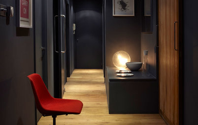
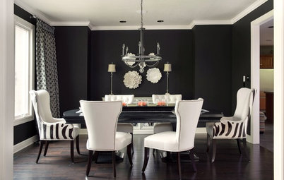
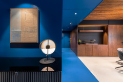
You can never go wrong if you hang your art on a wall painted with a neutral hue. To create a dramatic space, select a darker shade, such as dark bluish grey.
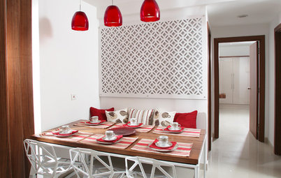
The art display in this space is highlighted by a sizeable lilac stripe. This colour not only ties in with the room’s furnishings, but it also helps to create a focal point by putting the emphasis on the art. This is a great alternative to painting an entire wall.
A sky blue wall makes a nice contrast against this mostly-white art piece. Both the art and wall colour have an ethereal look, which gives this bedroom a serene and dreamy feel.
Check out surprising ways to use blue at home
Check out surprising ways to use blue at home
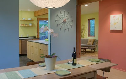
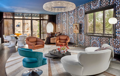
In this retro-inspired space, avocado green walls are the perfect complement to the artwork and accessories. The colour is definitely a nod to the ‘60s and ‘70s.
For a seamless look, select a wall colour that will camouflage your frames. The pale periwinkle hue in this eating area allows the silver frames to blend right in, leaving the emphasis on each block of colour.
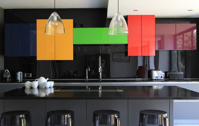
If your artwork has bright hues, don’t think that your wall colour must be equally vivid. Softer, muted paint colours will allow your piece to shine, while playing down the rest of the room.
Here, a vibrant shade of coral is the background for artwork that features subdued colours. Contrasting colour tones bring interest and balance to a room.
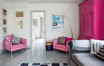
Here’s how to use pink without making it look OTT
Here’s how to use pink without making it look OTT
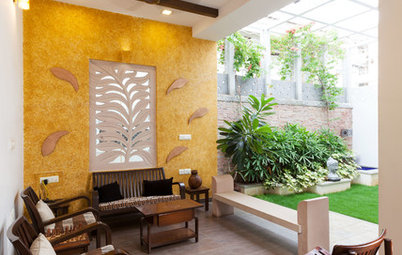
A display of photographs ties in with the white accents in this room. With so much white, a striking yellow wall colour allows the artwork and furnishings to pop without overwhelming the space.
Learn how to display family photographs
Learn how to display family photographs
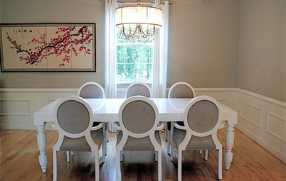
Black-and-white photographs stand out best against a deep wall colour. This focal wall reinforces the room’s entire colour scheme of black, white, grey and terra cotta.
Read more:
The Secret to a Long-Lasting Wall Paint Job
Where to Use Which Paint?
Tell us:
How have you done up your gallery wall? What paint colours have you used? Share images and your ideas in the Comments below.
Read more:
The Secret to a Long-Lasting Wall Paint Job
Where to Use Which Paint?
Tell us:
How have you done up your gallery wall? What paint colours have you used? Share images and your ideas in the Comments below.