carvaka

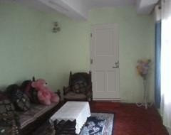
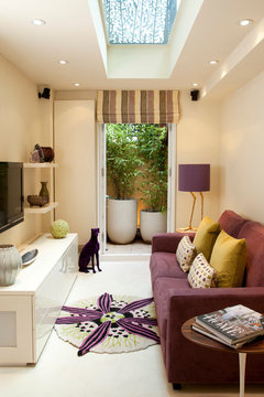
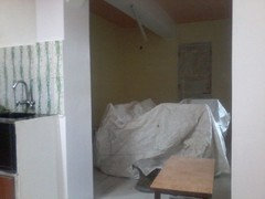
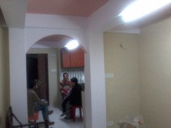
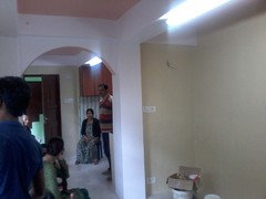
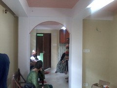
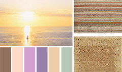
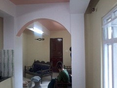
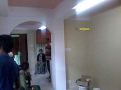
Need Help for my living room lightning please suggest me

carvaka
10 years ago
last modified: 10 years ago
Hey guys. I am from a small hilly place darjeeling. This is my living room. As you can see it is in the making. But i have no idea what i should do with the lighting. We don't get any interior help in my place, what ever we get is very costly. I need your help friends. I had thought of embedded lightning but the room height have to be reduced, as false ceiling needs to be done they said. And the cost is very high here. So I cant do that. The height is 8.1/2ft. One beam remains in the middle and one on to the right. Because of the middle beam light is a problem to me and all i have in my head is question marks. What and how to do the lighting i dont know. But i like light designs a lot. Please help. The room length is 18 ft and the width is 10ft. So it is rectangular type. I have uploaded pics showing different sides too. Please help.
I have windows on both sides. I think the window on the left of pic will be replaced by cemented wall.
On other side there is a wooden window. We will have carpet on the floor. Our living room attaches with kitchen. I have uploaded photos of it too. Thank you.

Comments (66)

  • Rina
    9 years ago
    Hi again Carvaka. What a difference! I think the green is lovely. Very fresh. I don't have much time at the moment (taking a break from work) but as I've shown below I think you could leave the archways white, and consider using the green, two shades lighter, on the ceiling too.
  • carvaka
    Original Author
    9 years ago
    hey thank you, but i wanted to use a color combination if its possible. What color should the doors and windows behind the curtains be?? I don't know the name of the green i should be using it would be helpful if someone helped me with that because this is just a Photoshop image for now.. I have tried to color the other wall of the same room and wouldnt it be too much of green???
  • Related Discussions

    Need help for my living room and hall

    Q

    Comments (1)
    Photos would be helpful.
    ...See More

    need to redo my living room and terrace attached can you suggest some

    Q

    Comments (1)
    Jennifer Ideas are many!! but inputs from your side, like what element's other than furniture you want to go??
    ...See More

    Help me decorate my living room :)

    Q

    Comments (83)
    that is what i have added if you can see the pic above.. want some suggestions on partition that i can use between dining and sitting
    ...See More

    what is wrong with my living room ? please suggest improvements .
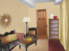
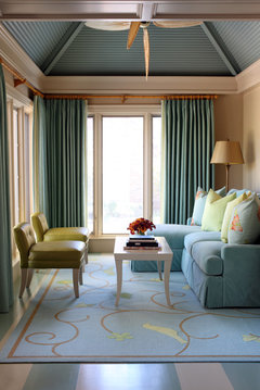
    Q

    Comments (14)
    Hi Rakhi , You can probably follow this : Furnishings : If you wish to retain the Sofa, you can highlight it with bright silk / cotton silk bright colored cushions and throws. Change the curtains to neutrals. Walls : You can also go neutral on the wall colors ( off whites , ivory , beige or light grey) This opens up your possibilities and choices with furnishings and other add - ons. If possible you can get the exposed brick wall done on of the walls ( the entrance console wall for example) and have lot of interesting frames on it ) Artwork / frames : You can add lots of art work frames ( on the sofa wall ) of various style and types ( like in the grey wall pic attached. ) You can even add sari frames like in the pics attached above. would specially advise to add artwork frames on the entrance wall to hide the MCP (electrical board) or even a nice mirror. Plants : Please add lot of greens , it really lights up the space like no other artificial prop can. You get lot of low maintenance indoor plants they brighten up the space. Please note : You should first choose whether you wish to go for a traditional look or a modern or even a blend of the the two and then choose artwork and furnishings accordingly. Hope this was helpful , Thanks, Namrataa Shetty, Da Namah design studio Please note:All the pictures attached above are Da Namah design studio's projects.
    ...See More
  • anniau
    9 years ago
    You have been doing a lot of work here! Are those tiles with the green wavy pattern?
    I think that with the rich red carpet and the blues in the next room, I would prefer the walls to be a soft white. I think this would play up the wooden tones, any pictures or hangings and the other rich colours. While introducing another colour like green walls would make the space look smaller and fragmented.
    Use the same soft white on walls and ceiling and this will bounce light from lamps and uplighters around the room.
  • Rina
    9 years ago
    I still like the green, but Anniau has a definite point. The white would work well. However, assuming you stay with the green, I would definitely not go with a colour for the doors etc, but with a pastel, warm neutral, as below. I know it doesn't look a great deal different from the raw wood in the picture, but believe me, it will.

    Unfortunately, I can't help much with actual paint suggestions. May I ask what country you are in? What brands can you get? Maybe someone else can help.
  • lessismoore
    9 years ago
    What you are picturing in your living room is pale green, with a deep red rug, and blue curtains and a mostly blue area rug. I think it would help to pick one of these colors, but not all 3. I'm guessing the rug (red) is the most permanent fixture here? So with that as a given, I'm suggesting a pale gold for your walls, a gold for your drapes, replace the area rug with a solid jute, add in some coordinating pillows etc.
  • Rina
    9 years ago
    I love that look, Lessismore, but it does rather depend on where one lives, and what the colour mood of that environment is. Not that there's anything wrong with gold anywhere! I just know that the colours I use here in sunny South Africa are probably not the colours I would use if I lived in, say, Oslo. So I think Carvaka might want to stay within the aesthetic of the (Eastern?) environment, which might allow a much more multicoloured approach. In which case, I think the soft green is a beautiful choice to cushion the rich reds and blues. A bit like a garden.
  • Rina
    9 years ago
    PS It's winter here and I feel as though I'm living in Oslo. Brrrr.
  • lessismoore
    9 years ago
    I hear you Rina and I had considered that. Culture plays a big part in what we (and by that I mean anyone) considers beautiful. But as long as the poster had come to Houzz - well, I figured I'd add a "multi-cultural" touch from a western perspective?
    Stay warm! :-0
  • carvaka
    Original Author
    9 years ago
    everyone anything and everything material in the room would be changed so consider that because i dont like my sofa and neither the rug so i would replace with whatever suits with the wall color. But the wall color be bright so, it lightens the room because it is a small room.
  • anniau
    9 years ago
    I think there are almost too many options if you are starting again with all the furniture. It would be good to pick something you really love - a picture, some beautiful fabric, the view out the window .... And then use that as a starting point for planning your room.

    Choosing the paint wall colour can come last as there's usually a lot more choice and variations in paint compared with furniture and carpet.
    Maybe you could get some pictures together of the style of rooms and the colours you like.
    Keep in mind that harmonious colour schemes will make a room look larger than having a lot of contrast between odours.
    Would warmer natural colours suit your climate better in Darjeeling?
  • lessismoore
    9 years ago
    There are many small rooms/houses here on houzz to look at.
    [houzz=
    Homes Under 700 sq feet · More Info
    ]
    [houzz=
    My Houzz: Hip Midcentury Style for a Mom's Backyard Cottage · More Info
    ]
    [houzz=
    Chelsea house · More Info
    ]
    [houzz=
    Leawood Residence · More Info
    ]
  • carvaka
    Original Author
    9 years ago
    anniau yup those are tiles. Thank you all.. I am from India. I can get paints from brands like Asian paints, Nerolac, Dulux, Berger paints etc. Anniau i also think the same. White would be very nice but our other members in the family want a different color than white. Warm natural colors would also suite our climate here as it is a hill station and a cold place. I like the color of the first pic shown by Lessismore here
    Homes Under 700 sq feet · More Info
    I like light colors you know which creates the mood, makes you lighter relives stress, for me dark color creates a dark type of environment if you what i mean.. I am not too good in English so cant express properly.
  • anniau
    9 years ago
    I agree, it's a great room and lovely colours.
    Using that picture as an inspiration, you could have a scheme of a light neutral natural colour for the walls and perhaps the ceilings as well to make the beams blend in.
    Go for a darker shade but in the same colour range for the floor - carpet or have a wooden floor with a cosy rug and also for the seating.
    And then to link it with the kitchen, add some natural wood elements like the stool/ side table or picture frames and accent pieces like cushions or a throw rug in the green. Pick a more yellow toned green than blue-toned to keep it warm.
    It sound like you have a few people in the family to get to all agree to your ideas. That makes it a lot harder to decide on a plan.
    Are they interested in looking through the Houzz pictures to pick out their favourite looks and why?
  • anniau
    9 years ago
    By the way, your English is great and vastly better than my Hindi!
    Greetings from Sydney.
  • carvaka
    Original Author
    9 years ago
    OK thanks... My family members don't know how to use the internet.. But I certainly say that we have a suggestion for our that we can do this.. I also show them the beautiful pictures from Houzz, they like the pictures a lot but keep telling me that we wont be able to make those things here. But I don't give up, I don't compare my space with someone Else's but I just want to make the most of what I have. So, I post
  • carvaka
    Original Author
    9 years ago
    hehehe thanks...
  • carvaka
    Original Author
    9 years ago
    ok
    Homes Under 700 sq feet · More Info
    with this color in mind should i leave the arches white?? Because i heard that the arches should be the center of attraction
  • carvaka
    Original Author
    9 years ago
    Anyone?
  • carvaka
    Original Author
    9 years ago
    by the way what is the color of that room?
  • Rina
    9 years ago
    HI Carvaka -- still working, but had to pop in. I'd still leave the arches white, they really are lovely. And then you should use some white in the furnishings -- eg if you don't want to go with a white sofa, as in the picture, you might have a couple of white cushions on the sofa you do choose. I find it so interesting, the turn your conversation has taken now we know that you want to change the furniture. I really like this room too -- but I can't help with the paint colour. One thing you could do is take that picture in whatever format you can manage (cell phone, memory stick) to a large paint supplier, and get someone to help you with samples of similar colours. Then you could paint boards with those colours, and try them in your various rooms and see how they look at different times of the day. You might even get your supplier to access this page on his/her computer.
  • lessismoore
    9 years ago
    last modified: 9 years ago
    The paint color the poster specified is Sherwin Williams: Believable Buff - It is a very light neutral space with the buff tones and whites, which allows for several accent colors (the purple, turquoise, magentas and gold yellows - light aqua dining set and grass green table setting)
  • carvaka
    Original Author
    9 years ago
    Hey thank you very much.. but i wont find that brand here.. Then i guess I have to go for similar type of color..
  • lessismoore
    9 years ago
    I don't know what resources you have for paint or what brands are typically available where you are. Can you have a custom color mixed? This is a pretty basic "beige" variation :-)
  • carvaka
    Original Author
    9 years ago
    ok i think i get it..
  • carvaka
    Original Author
    9 years ago
    Work in progress. Hope everything works out well.
  • lessismoore
    9 years ago
    Were you able to find a paint color ?
  • carvaka
    Original Author
    9 years ago
    Lessismoore dont ask. I found a similar paint but when i pained it was horrible.. that wasnt the paint i was looking for.... now i have to come up with something. I ma so very pathetic. And with limiyef budget its more frustrating
  • carvaka
    Original Author
    9 years ago
    Just look ay thiis and the combi.
  • carvaka
    Original Author
    9 years ago
    It looks more bad in real
  • Rina
    9 years ago
    Oh, Carvaka, please don't think you're alone. We all have this struggle .... ! The one definite colour you have to tie in with is the green in your tiles. I think the wall colour you have chosen might be too yellow to tie in with that. It actually looks very good in the first set of pictures you posted, but less good when shown with the kitchen tiles, which are so pretty. I think what you have done is establish that a really subtle colour for your walls works. But it must tie in somehow with that green. Look for samples, then place them up against the green. Would you like a soft grey? Some of them have green undertones (like a whisper of green beneath the grey). Just looking on line, I've found Dulux Clouded Pearl 4 -- I cannot be sure it would work, but on my screen (which sometimes lies!) it looks good. I also don't know whether Dulux colours are available in all the countries where it trades, and I found this one on a UK site. But you might ask about it.

    Here's an idea. You could try phoning Dulux headquarters in India and asking them about greys with a green undertone. With any luck they could give you a few colours to look at.
  • Rina
    9 years ago
    Looking again at your pics, it seems as though your tiles have some grey in them? Why not try to match that?
  • lessismoore
    9 years ago
    Rina - on my monitor they look more green (the tiles) maybe with some grey in them, but definitely green.
    Carvaka - Find any object - a piece of material, a book cover, a painting, anything ... .that has the color you really want. Take that to the paint store and see if they will mix you a sample (depending on if you have any paint left, they can sometimes add some color to make it better - ?)
    What you have doesn't look too bad, just more yellow that the inspiration photo.
    Did you paint the ceiling pink? Is that what you mean? I would say leave ceiling white.
  • carvaka
    Original Author
    9 years ago
    thank you Rina and Lessismoore but i have already painted all the walls.. It doesnt look that bad now.. But it does not match but i can match it with the materials can't I??? I will upload the pics soon
  • Rina
    9 years ago
    Yes, you can pull it together with the materials you use. Looking forward to seeing your pics.
  • carvaka
    Original Author
    9 years ago
    i think i made a blunder choosing brown for door color, i really should have chosen white. I'll upload the pics tomorrow
  • lessismoore
    9 years ago
    Accessorizing will help with overall perception of colors. This should still be neutral enough to allow room to decorate in several directions. But am still wondering about your ceiling color? Did you paint it pink?
  • carvaka
    Original Author
    9 years ago
    The look of the room that i have now.. Hey what color of rug should i purchase???
  • lessismoore
    9 years ago
    Here is a visual of your colors with two rug suggestions. I would stay light color, neutral. You have small rooms and it will make them feel larger and lighter and give you more opportunities to choose other furniture.
  • carvaka
    Original Author
    9 years ago
    hey and i have been thinking to add some lighting into the room.. In the pics here, i have highlighted the spot in which i want add some lighting. Wall lights that give lights upwards and down. But i dont have the pics.
  • Rina
    9 years ago
    Hi again. Yes, I like the thought of a light there. The wiring looks as though it might be a bit too high, depending on the design of the lamp itself, of course.
  • lessismoore
    9 years ago
    Rina, Caravake - in the shot at left, I see the image of a great painting. What do you think? The light on the back of her bun and how it seems to create a corona against the dark door, the attitude of the figure ... charmed me :-)
  • Rina
    9 years ago
    Lessismore, it's beautiful. You're right. (I'm a bun wearer, maybe I'm prejudiced? If only I were an artist.) But if Carvaka likes the idea of an artwork from the picture, that image could be used to create a fascinating print to be framed, and be part of the history of this home.
  • lessismoore
    9 years ago
    The lighting reminded me of the Dutch artist Vermeer with the side light he used on so many subjects.
  • Rina
    9 years ago
    Oh, yes!
  • carvaka
    Original Author
    9 years ago
    Guys i don't know how you all come up with such ideas, i get confused.. But i like the idea. I hardly know a little about painting but that would be oil painting right..?
  • carvaka
    Original Author
    9 years ago
    And by the way you guys were so much on painting that you forgot to tell me about the lights sugggestion I was asking for..grrrr.hehehe
  • lessismoore
    9 years ago
    last modified: 9 years ago
    Yes carvaka - it would make a nice painting (oil, or watercolor, or pastel, or acrylic too - ), that image of the back of the woman that I saw in your photo of the room. Just an observation.
    On your lighting. Rina suggested that you may want it a bit lower than marked in photos.
    You thinking of lights that light both up and down? I think you only need a down light.
  • carvaka
    Original Author
    9 years ago
    OK... but the wire wont be lower as it is fixed now. The wire in the pics below is the wall facing each other. They were leveled on equal height but the beam on one wall makes it seem a little above. But i think you guys are absolutely right that up and down lights wont look good there. I think you are right about down lights lessismoore. Would it look good if i go with two different lights on opposite walls??? it would look odd right.
  • Rina
    9 years ago
    Much better to use a pair of identical lights. You might get a style that has the shade and bulb hanging below the point of fixing, which would have the same effect as lowering the light a bit. This one is from a German website but it's worth looking for something similar locally.

    http://www.select-interiormarket.com/en/vaughan-wall-lamp-wb0011-br-eu-bathroom-downlight
  • carvaka
    Original Author
    9 years ago
    you are right Rina.. I like the light that you've shown here.