maryanne_tranter

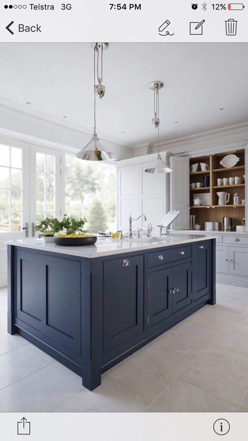
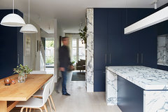
Bold and Blue island. Anyone chosen a similar shade?

M Tranter
7 years ago
last modified: 7 years ago

Considering a Blue Shaker Style Island - has anyone chosen a similar shade in Australia and thoughts on whether it will date?

Comments (36)

  • Bernadette Staal
    7 years ago

    everything dates over time but I think you are getting into this look at the beginning of it's time of fashion. Obviously if you painted it white it would possibly never date but I think right now it is the trend and the picture you have provided looks absolutely lovely. I say go for it.

  • scottevie
    7 years ago

    I think it is a pretty look. Sometimes it is best to do what suits the masses (eg. If you know you will be selling in the next couple of years), but when that is not the case then go with what sings to you and makes you happy.

  • PRO
    MB Design & Drafting
    7 years ago

    Yes fantastic! Will look great for years. This style never really dates when in the right house. A kitchen like this would look out of place in a modernist dwelling but would look great in a character cottage.

  • Vy
    7 years ago

    I love the blue and the answer is no the blue in that shade won't date..

  • bigreader
    7 years ago
    It's beautiful, that style and colour will out last at lot of other looks.
  • bargainhunter
    7 years ago
    The kitchen in our last house is blue. I think from memory the colour was periwinkle. It was a vinyl wrap door not paint.
    The house is on the beach and the kitchen still looks good. The only thing it would probably need now would be nice stone tops
  • Double D
    7 years ago

    No I don't think it will date, if it was a lighter blue I would say yes, but that shade of blue will stand the test of time, love it, especially when the other cupboards are a different colour.

  • pariscafe
    7 years ago

    In my previous home I had a blue kitchen 'Sea spray' from Wilsonart. I had that kitchen 15 years and never grew tired of it. When I went through each morning it always looked fresh and the new owner agreed as she kept the cupboards and just installed new stone bench tops. In my current house I went safe and did what everyone else was doing and chose an all white kitchen. I somewhat regret playing it safe and would love the dark blue island. I'd go for it given the chance!

  • robandlyn
    7 years ago

    As long as you stick with a really deep blue, almost charcoal, it will be great. Don't go any lighter or it will date.

  • PRO
    Artistry in Cabinets Pty Ltd
    7 years ago

    Hi, we competed a job with a similar look this year.

    The colour our client chose is more charcaol than blue but the contrast looks amazing. We are based on the gold coast and would love to help you with your project.

    Artistry in Cabinets

    07 5519 4850
    www.artistryincabinets.com.au

  • jjkid1
    7 years ago
    last modified: 7 years ago

    blue is classic. if you love it, do it.

  • Carmen Q
    7 years ago

    We have painted the back of our island blue. Looks great, suits the room. We painted vj boards ourselves for the island backing rather than using vinyl wrap etc, so we can paint it again if we get sick of the colour. Worth considering as it is a lot cheaper and gives you the option of easily updating.

  • kschae
    7 years ago
    last modified: 7 years ago

    https://instagram.com/p/95D3AkEDTs/ I was advised by one kitchen company to stick with Charcoal not Blue but very happy I stuck with my colour design. Dulux Madonna. Have faith in your instinct, be confident in your choices.

  • Ali Fairbairn
    7 years ago
    We've just done a V groove kitchen it's dulux Oolong. With white overheads. We Love it!
  • Kerrie Langloy7
    7 years ago
    Love it! Not liking the oddly angeled kitchen above though & that island looks way too small too me to carry that dark blue.
  • brennz
    7 years ago
    Shaker style has been around since, well, the original Shakers ! It's beautiful & in a similar themed kitchen will never look old. If you love it, go for it. Pleasure in your surroundings is profound & satisfying. Love to see a pic of your finished project. Cheers.
  • amorro
    7 years ago

    I agree with brennz, shaker style never goes out of fashion, it's a classic look and the look I went for in my kitchen. I also went for a contrast colour, British Paints "Ace of Spades" (http://www.britishpaints.com.au/colours/colour-chart/greys/ace-of-spades) but not on the bench, on the wall of cupboards which houses the fridge and double wall ovens. The bench is antique white. I also used the same handles in your picture but in black. I'm really happy and glad I didn't go the all over white. The contrast brings depth to the room. The colour is a sort of charcoal blue, but deep enough that it won't date. I could probably post a picture if you wanted to see how it looks. I think if you keep coming back to the picture you've posted, and each time you look at it you love it, then go for it.

  • M Tranter
    Original Author
    7 years ago
    Amorro - I'd love to see a photo
  • amorro
    7 years ago

    No problem M Tranter, I'll post one tomorrow.

    M Tranter thanked amorro
  • PRO
    Artistry in Cabinets Pty Ltd
    7 years ago

    Yes i agree, the Shaker door is an old classic and will almost never date. It hasn't up until now and i don't think it ever will. We seem to be manufacturing more and more shaker style kitchens now than ever before. Not only is it a classic, it is also the most cost effective way to manufacture this type of joinery. With the shaker profile being so simple it cuts down on machine time routing the pocket and also cuts down on the cost of the 2pac paint work. Being one of the more simple profiles, it takes less sanding in preparation for painting. It will always be one of my favourites.

  • PRO
    kitchens for living
    7 years ago

    A different shade of blue.

    Totally agree the design wont date & we are seeing more of it now than ever.

    M Tranter thanked kitchens for living
  • PRO
    El Debel Designs
    7 years ago
    I love the combination of stone and that deep blue. It's a great centre piece. Everything else is kept simple. The scale is perfect. If you can keep it to this scale it will have an impact. Good luck.
  • PRO
    El Debel Designs
    7 years ago
    And the wall cupboards are a in a grey tone that fits with blue. They are not white.
  • Carmen Q
    7 years ago

    So many great pictures - I might just go and clean my kitchen and take a photo. Perhaps then someone will notice all my hard work.

  • Emma McDowall
    7 years ago

    Can you tell me the actual paint colour used on both the cabinets and island ? Thank you

  • PRO
    Scott Manuelle Constructions
    7 years ago
    Hi,
    we chose a charcoal blue for our wall cupboards and timber look for island. We LOVE our kitchen.
    I hope you went bold!
  • Emma McDowall
    7 years ago

    Thanks, love the wood and charcoal together ...

  • Emma McDowall
    7 years ago

    Hi artistry in cabinets... Can you tell me the charcoal blue paint colour your client chose in your photo? Also the White... What White were the cabinets ? I am currently looking at going for a similar colour scheme in my new kitchen ... Thanks

  • PRO
    Artistry in Cabinets Pty Ltd
    7 years ago

    Hi Emma

    The 2 pac paint was a colour match to Laminex Charcoal laminate and the white was just a standard White Satin 2 pac.

  • robyn
    7 years ago

    I like the look you have chosen, the blue island looks good. I've got an oldish kitchen in that deep blue and everyone still comments on how good it looks. My future plan is to put on a stone bench top to update it.

  • PRO
    Katrina Okoronkwo
    7 years ago

    It's such a rich & neutral blue, almost a slate colour, not a trendy blue that will date. I say go for it - it's GORGEOUS and classic.

    And yes, you can always have it refinished in 5yrs if needed!

  • PRO
    Mcmahon and Nerlich
    5 years ago

    Hi M Tranter, we just finished our Blue Ivy house in Malvern, although more contemporary in style, we went bold with the blue in a very similar shade to yours! We actually fine-tuned the shade on site, as the blues will appear different depending on orientation and light. We never worry about 'trends' but choose material and colour palettes to suit each client, and the bold colours always balance out with the other elements in the space. Good Luck (and go for it!).

    The Blue Ivy House · More Info

    The Blue Ivy House · More Info

  • Samantha Barkoff
    2 months ago

    What flooring is in this picture?

  • Samantha Barkoff
    2 months ago

    What flooring is in this main picture? Greyish flooring?

  • PRO
    Mcmahon and Nerlich
    2 months ago

    Hi Samantha, the flooring is from Tongue & Groove, Grande range in “Bistre” which is very light with blonde tones. It is somewhat high maintenance in this colour to keep clean though due to the lightness and kitchen location!