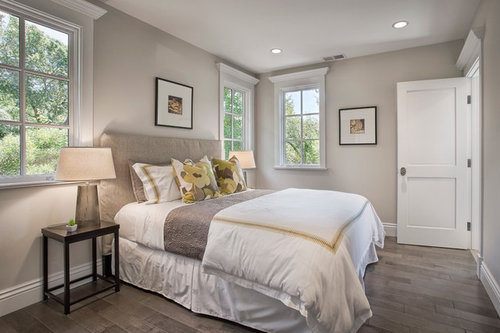
What is the wall color?
rockland
11 years ago
Featured Answer
Sort by:Oldest
Comments (9)

Erika Keys
11 years agoRelated Discussions
what color should I paint my wall of the staircase in my lobby
Comments (6)If you want to highlight the staircase wall then your could use earthy colours such as a yellow ochre! The wall could be enhanced even more by using suitable frames and making a good collage composition for all the photos that you have (I can see many lying on the dining table). This colour would match well with wooden furnitures...See Morewhat rear wall color can i go with if this was my combination
Comments (1)Definitely YES!...See MoreWhat should be done on front wall and what colour should be the curtai
Comments (5)I'd suggest dark red curtains if you need curtains at all -- the windows are beautiful as they are, and I'm not sure whether some kind of blind might not give you the ability to darken the room when you want to. On the wall, if you are real fans of any movies or TV shows, three big posters would be fun. Otherwise, I would still suggest using three pieces of art there of that size, all equal in size and somehow relating to each other. Three floral works, or three works in the same style, perhaps. I think a large plain textured rug in a light neutral from one of the cushion fabrics would tie the space together well. You might also consider a lovely low coffee table on the rug to lay out your snacks and drinks for serious media nights....See MoreTrim Color in BM Chantilly Lace or BM Simply White
Comments (6)The potential yellowness discernible in Simply White is because it is actually a more colourful white from the Yellow Hue Family. That little kick of colour can work well on ceilings, as that plane can often make a colour appear a little darker & more greyed anyway. So sometimes a choice of more neutral greys here have a possibility of ending up a little grey & shadowy. This is obviously dependent on the available light. Chantilly Lace is a more neutral white from the Green Yellow Hue Family. In character in balanced light it can appear ‘just white’, but in some light people see a hint of its inherent greenness, some might even read it as blueness. Again depending upon how well balanced the available light is. Super White OC-152 is that bit more neutral & so could read a touch more crisp again. Many people prefer a more neutral, crisp trim. It can give you more options for alternative wall colours, should you decide to repaint down the line. Neither Simply or your trim choice would be sat next to each other though, as the wall would come between them. I think the biggest concern would be sitting Simply White next to Classic gray for the reasons mentioned before. If you are set upon Classic Gray then I would repaint the ceiling and swap to one of the more neutral options. I would shortlist your line-up and sample upon board or lining paper in your space so you can move them around....See More
Karina
11 years ago
frankt1643
9 years agoddeshaies
7 years agozimmk79
4 years agosusu30
4 years agoMillygb
3 years ago
Stephanie Simone
3 years ago


KCS Residential Design